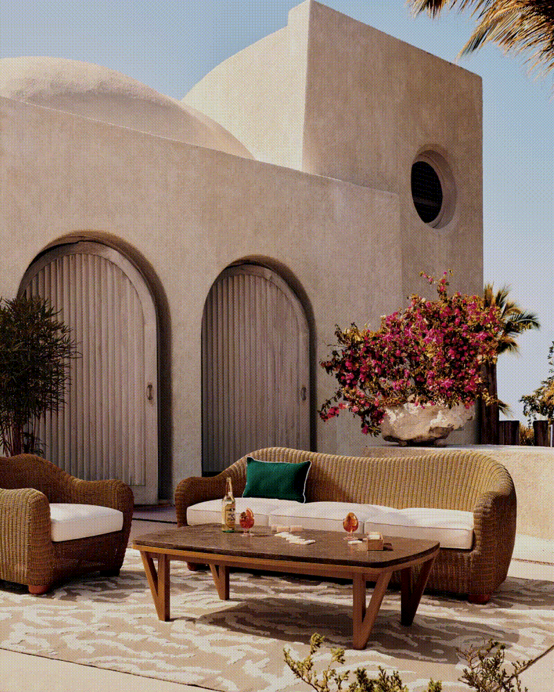
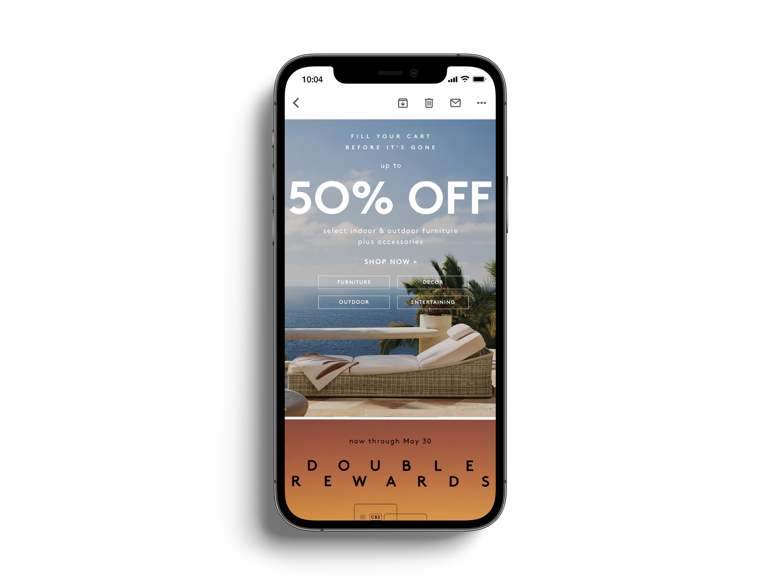
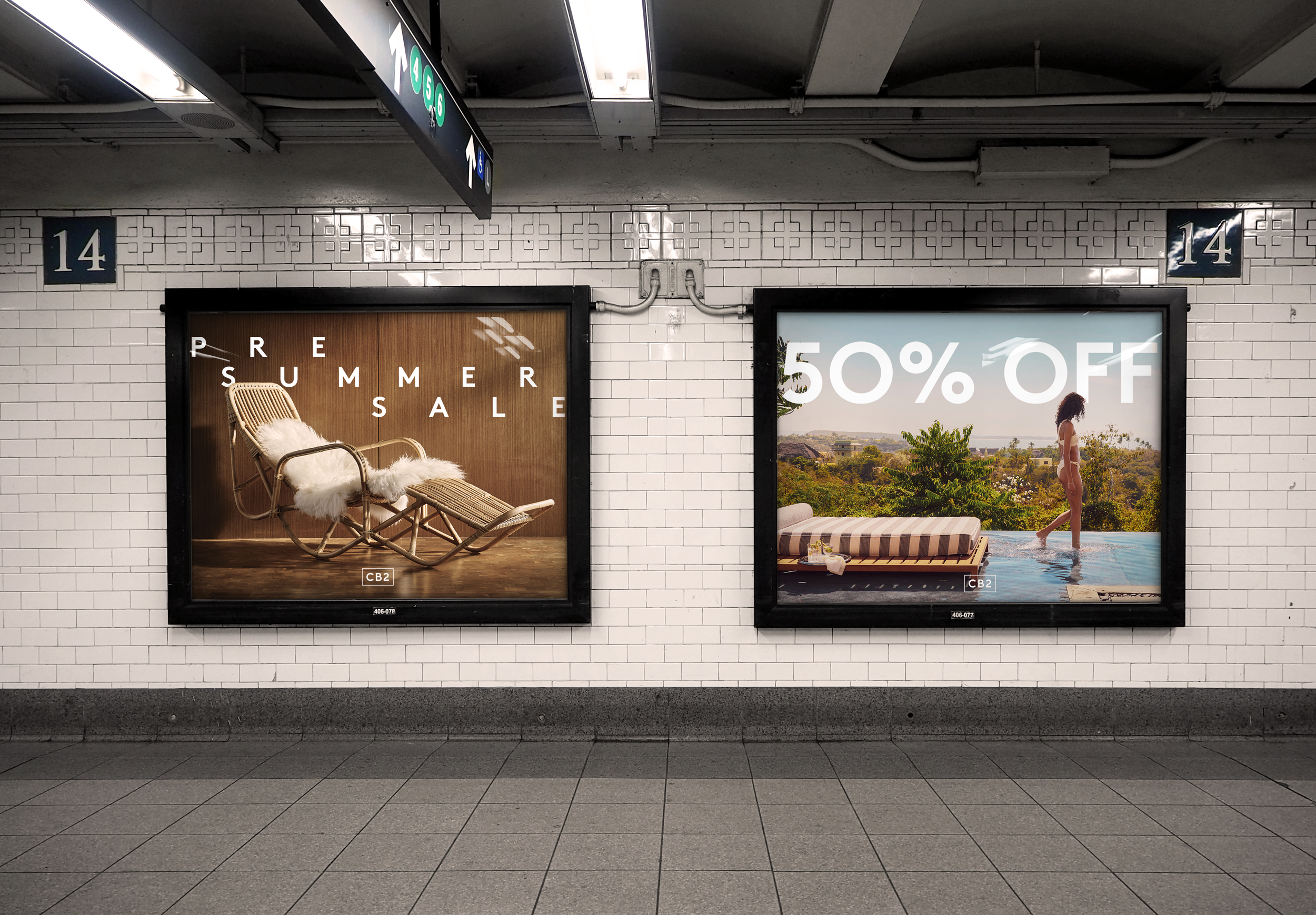
CB2 Pre Summer Sale
Creating a memorable look & feel to help celebrate one of CB2’s largest sales events of the year.
Curtis Potter for Creative Direction


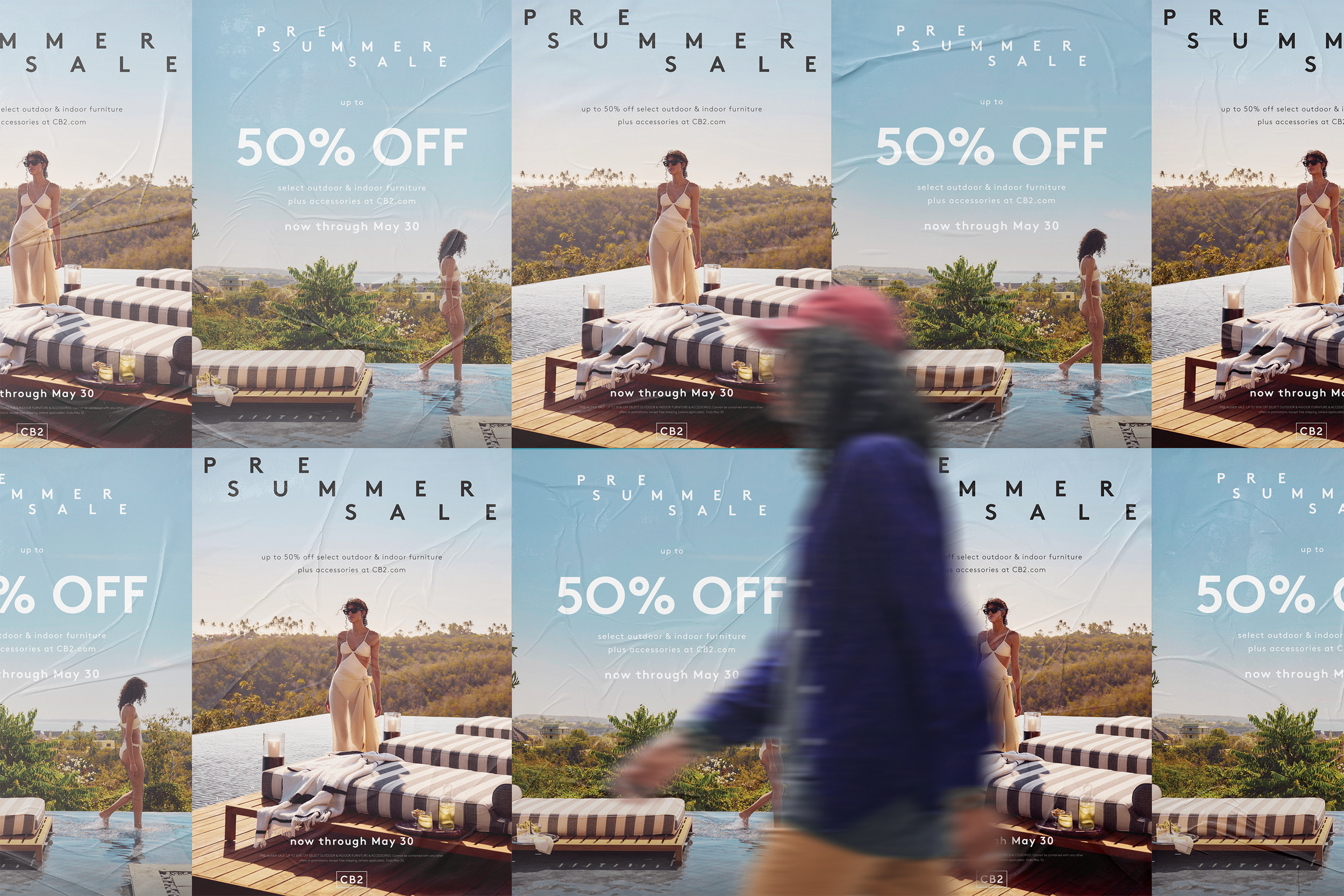
OOO Posters
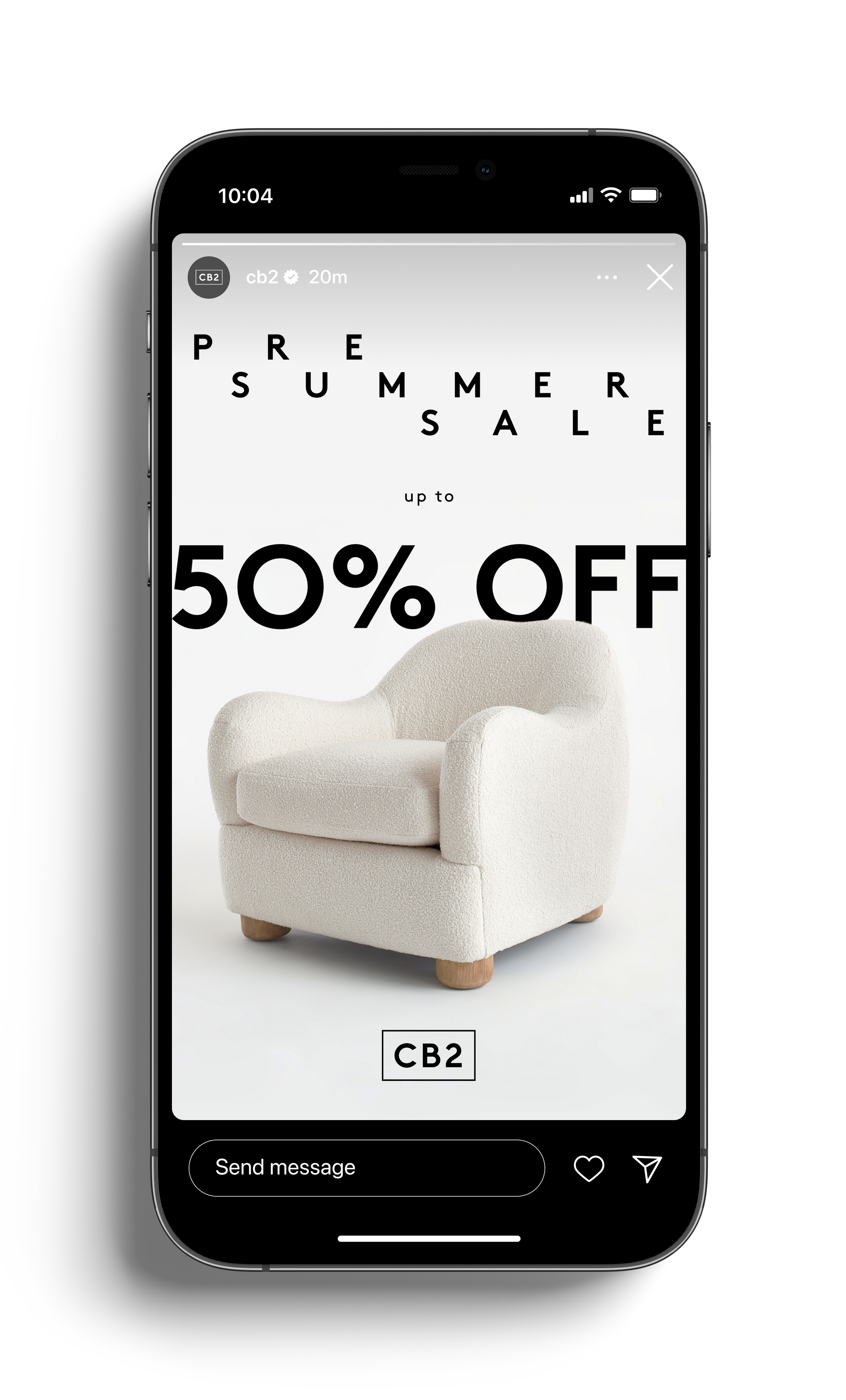
IG Stories A

IG Stories B

Sale/look & feel homepage takeover

SMS

SMS animation
SMS animation


SMS animation

SMS animation


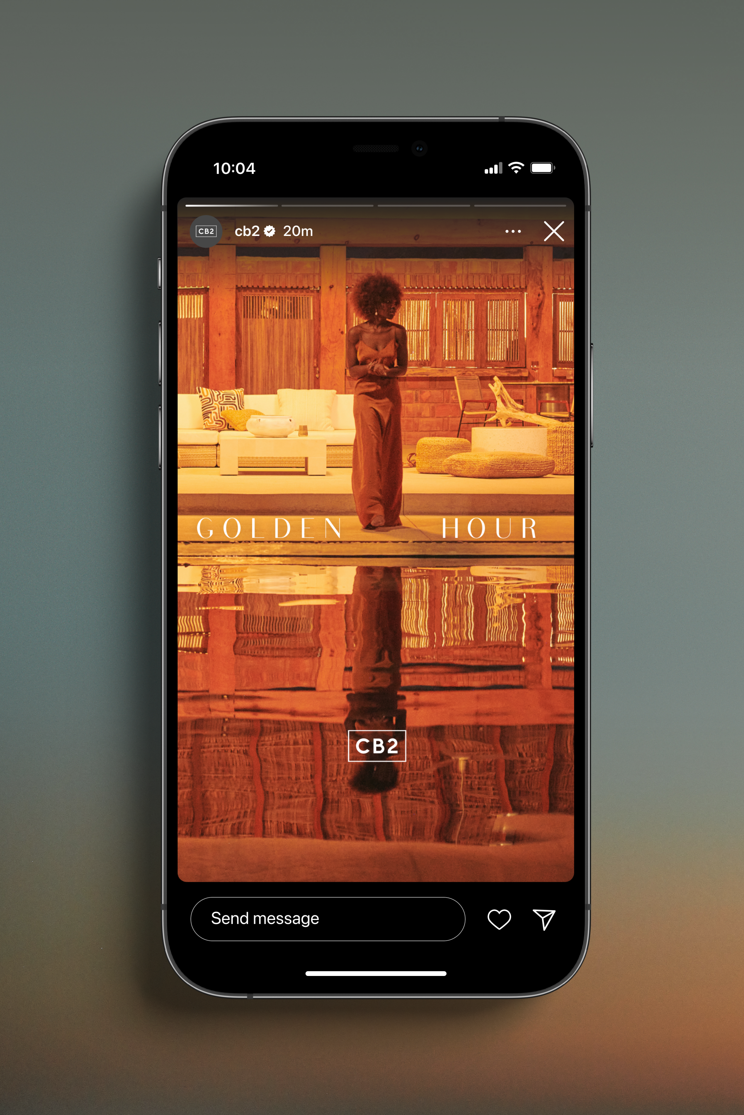
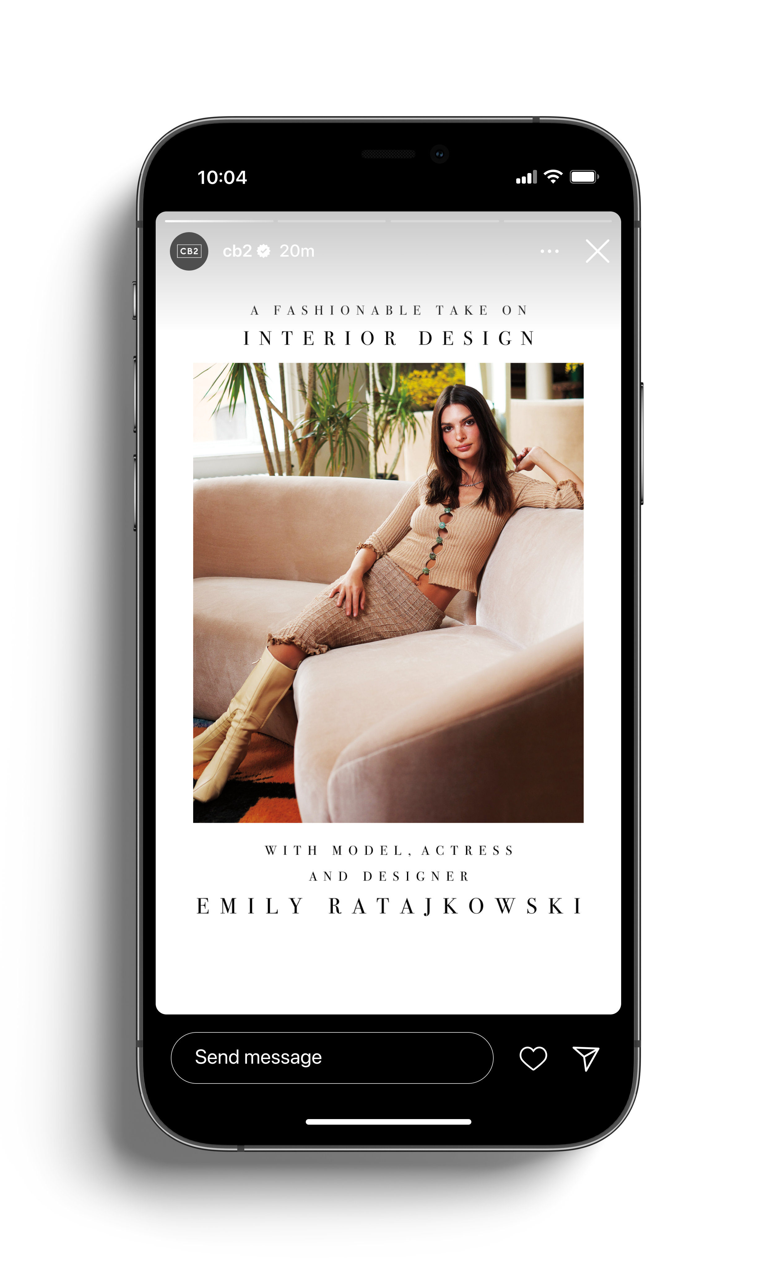
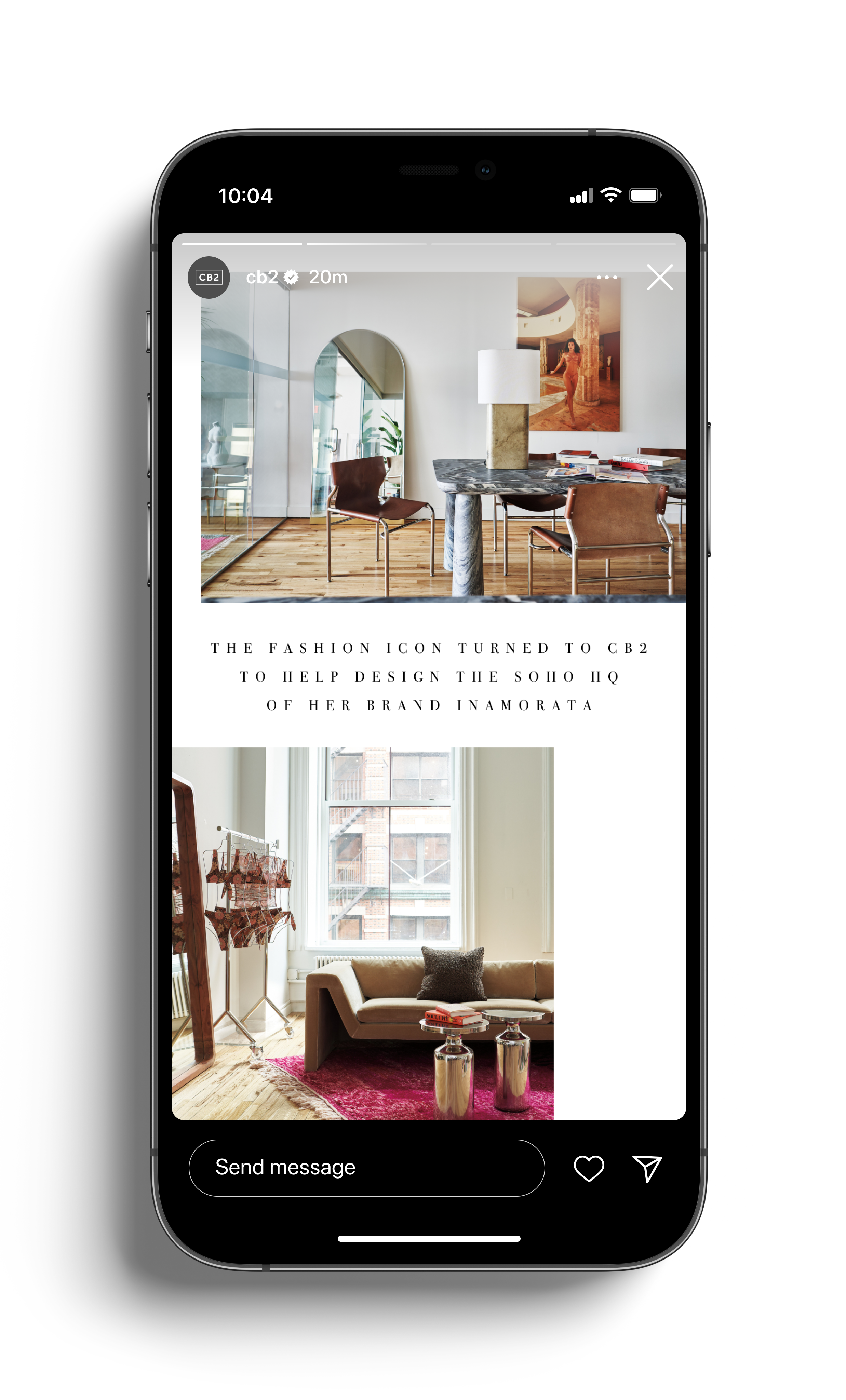
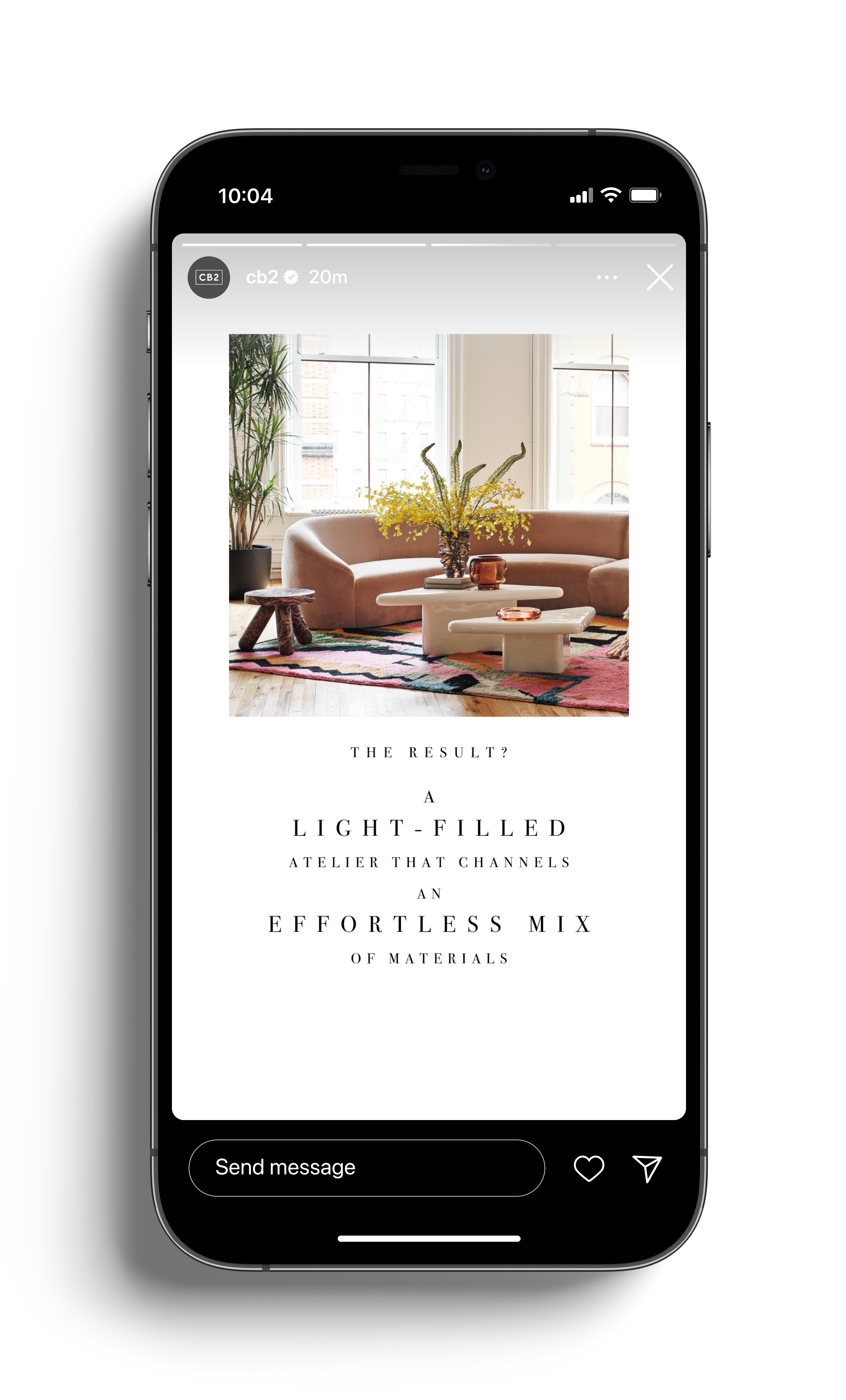
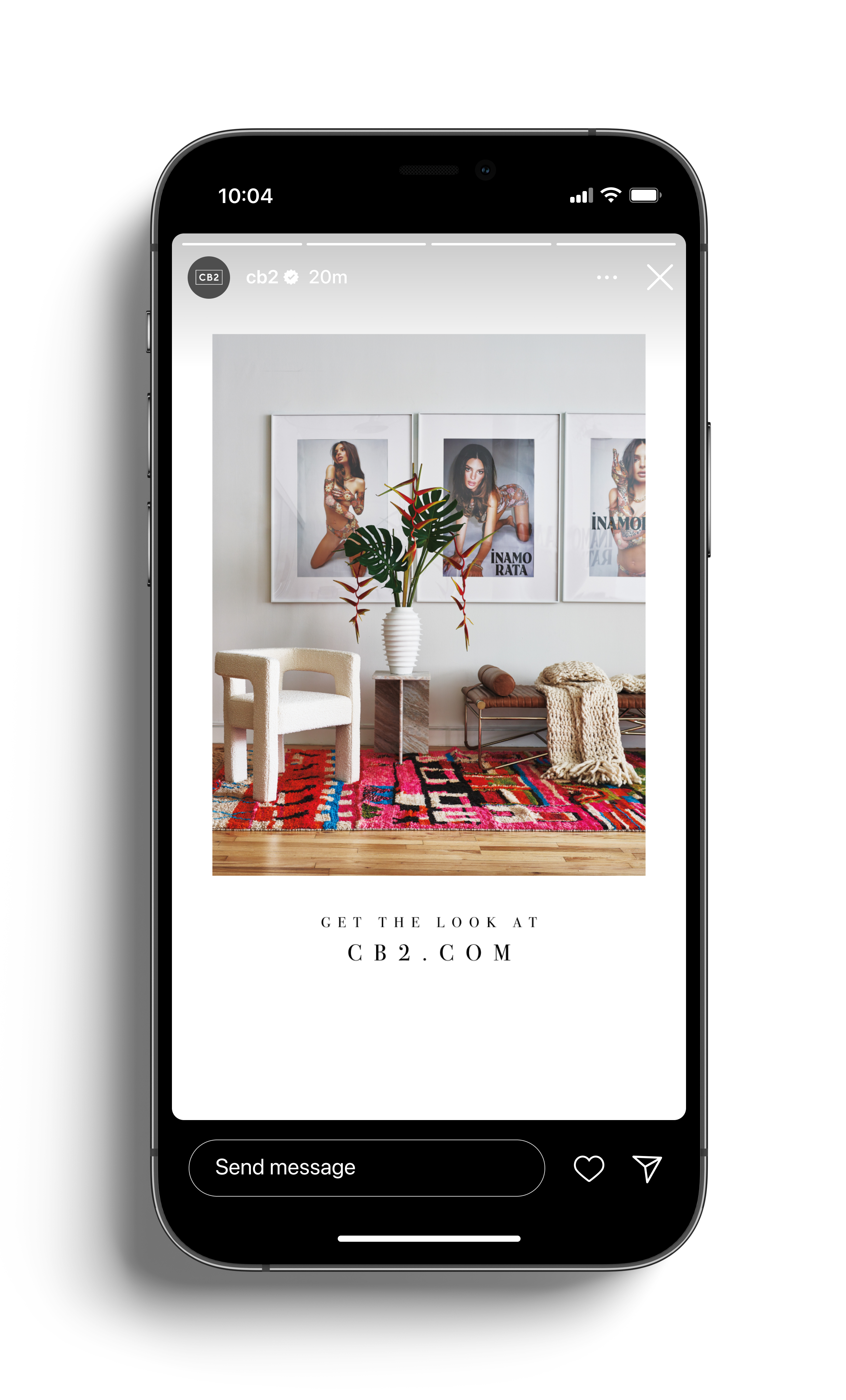
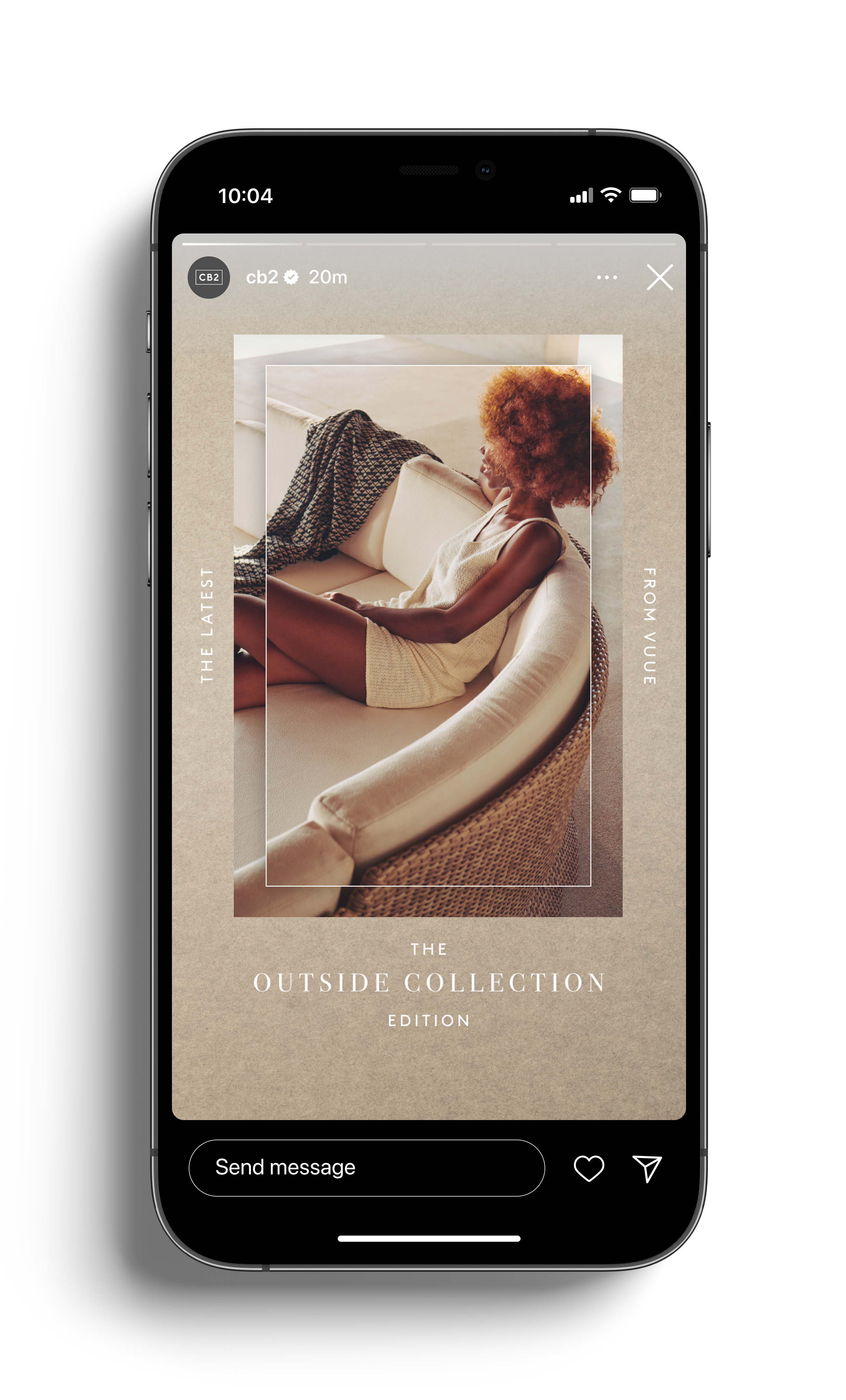
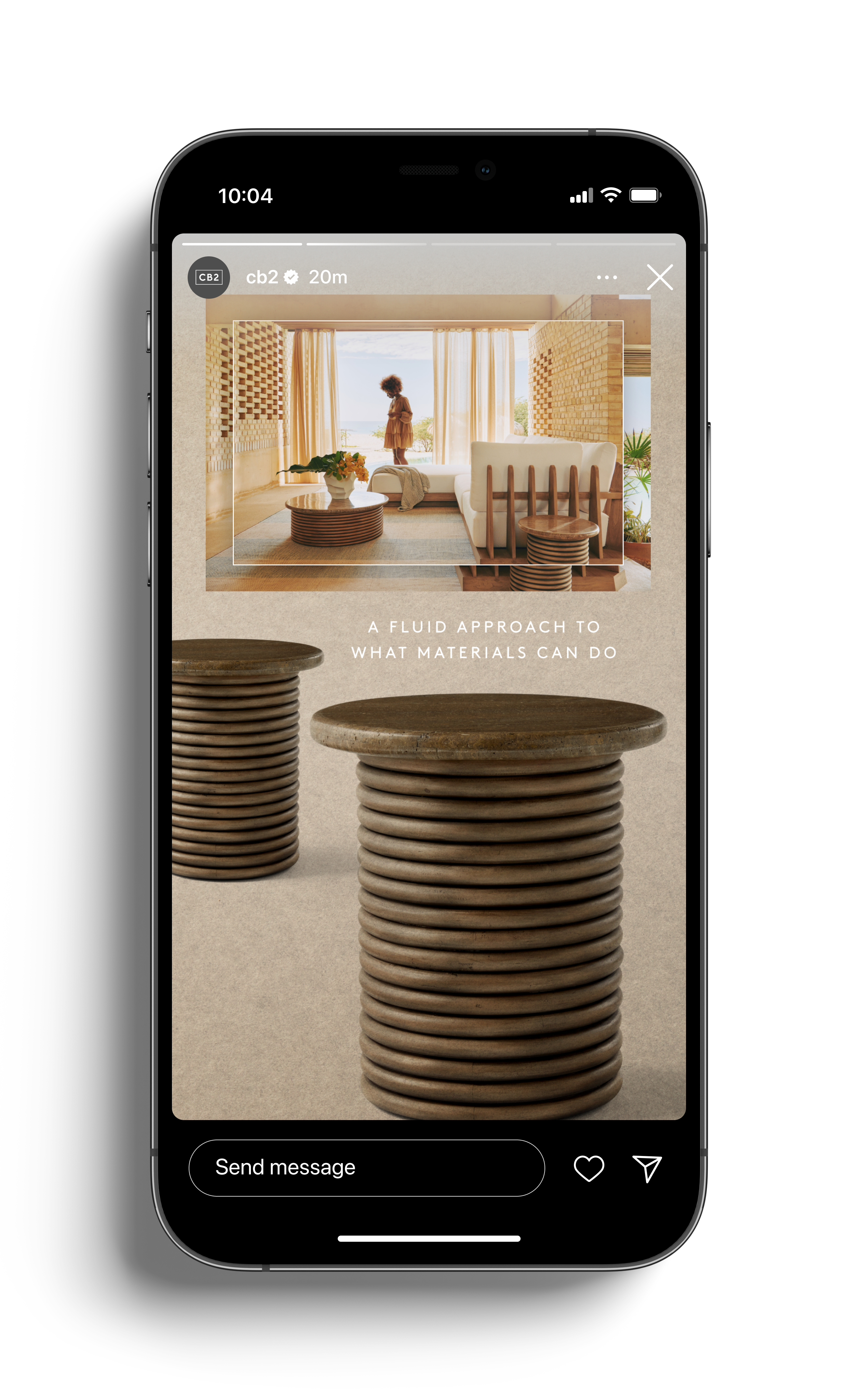
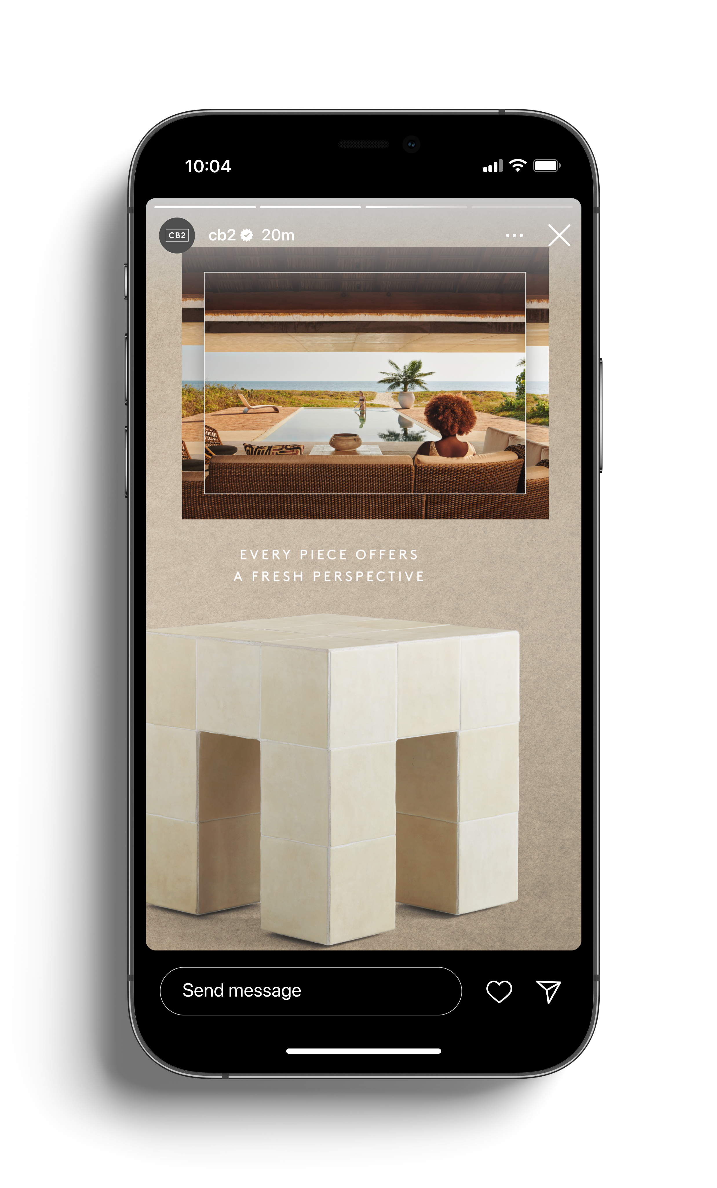
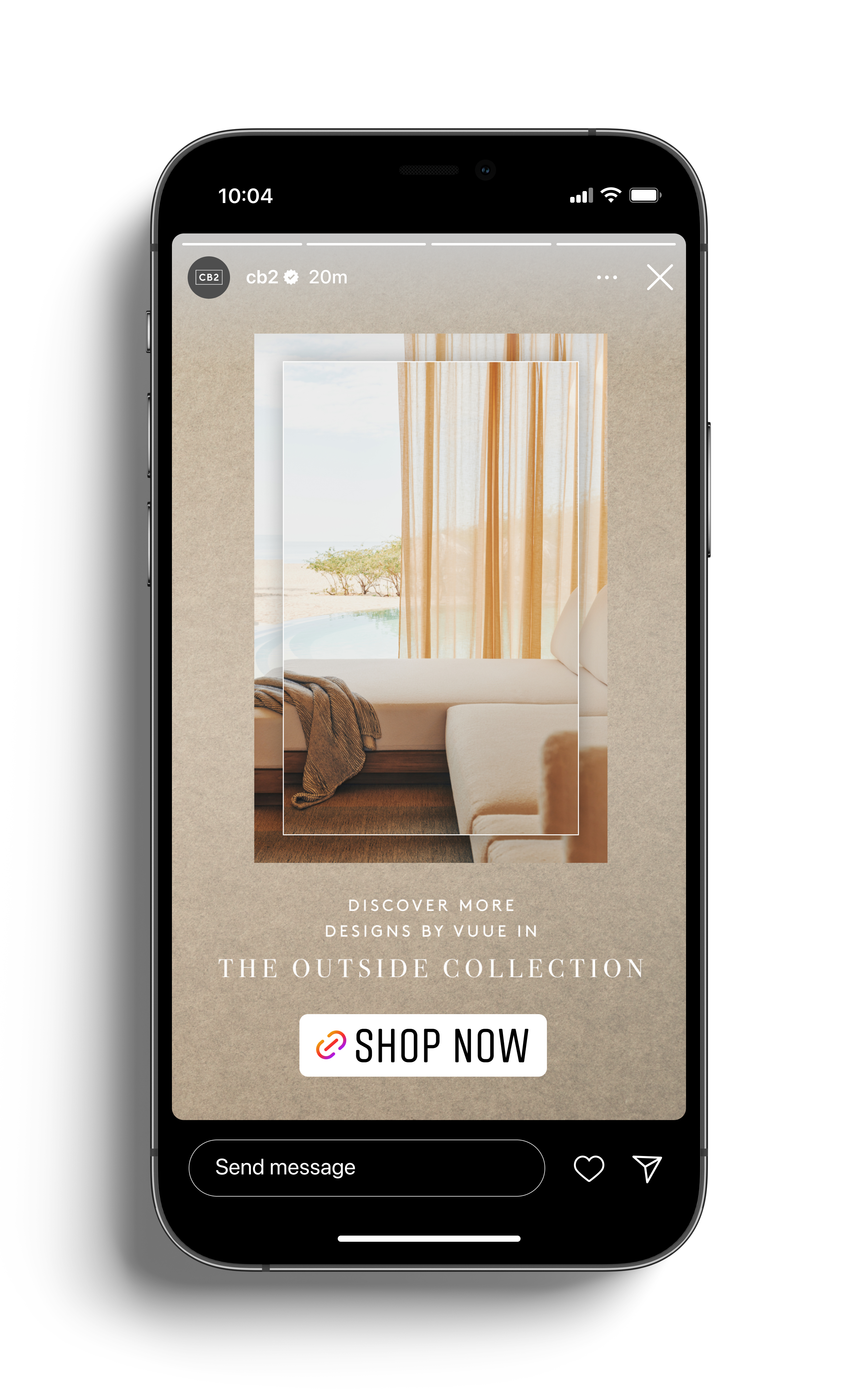
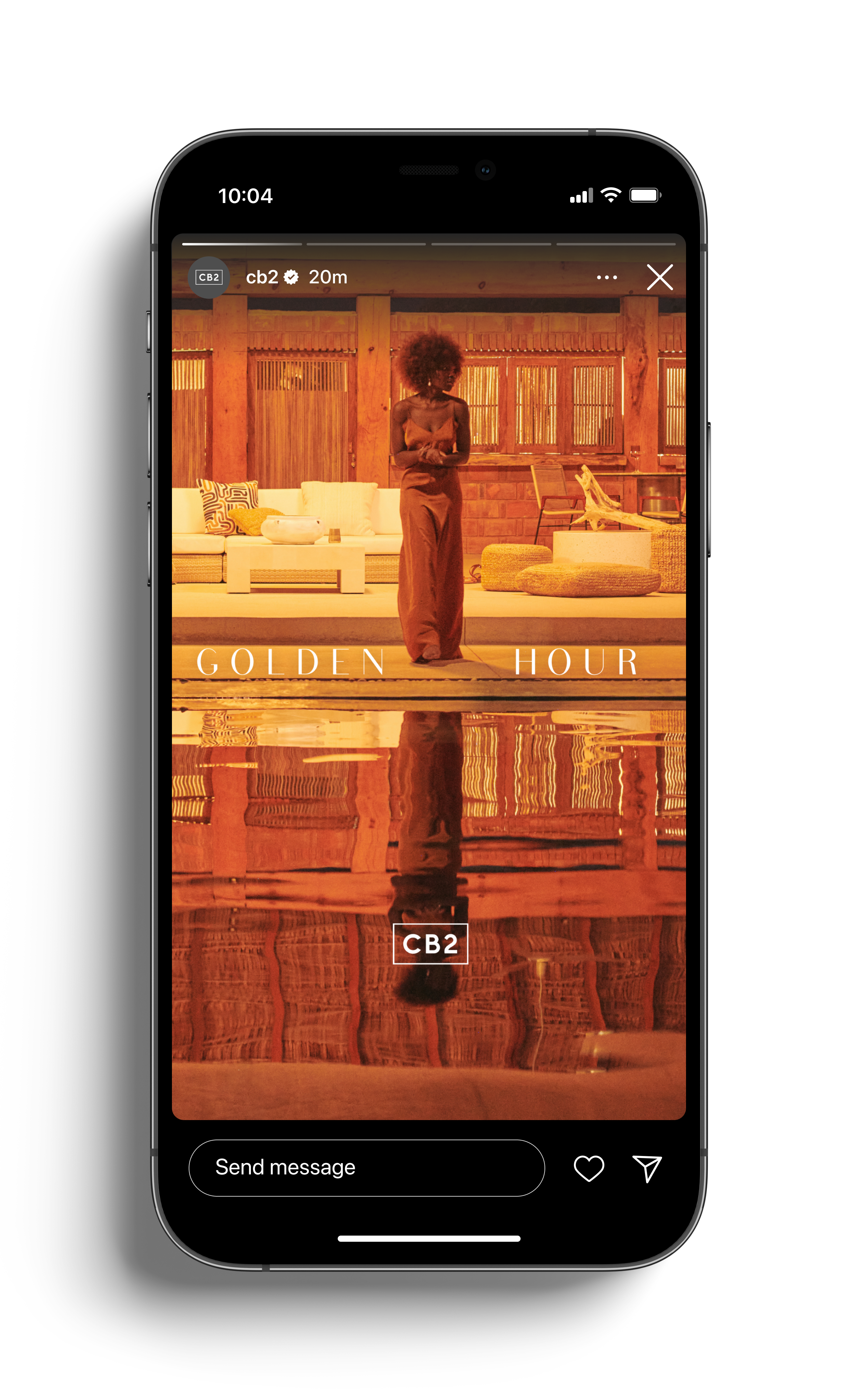
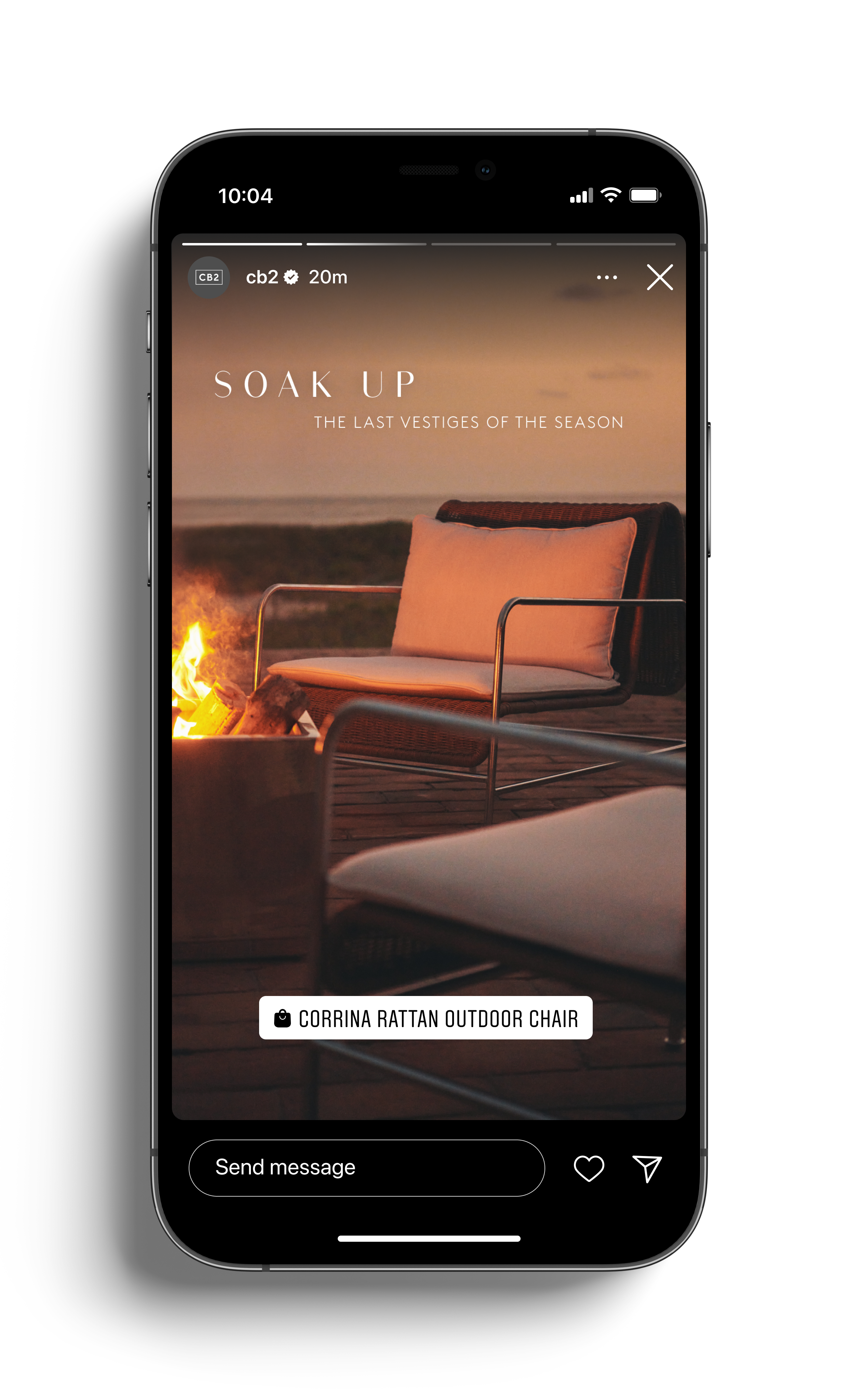
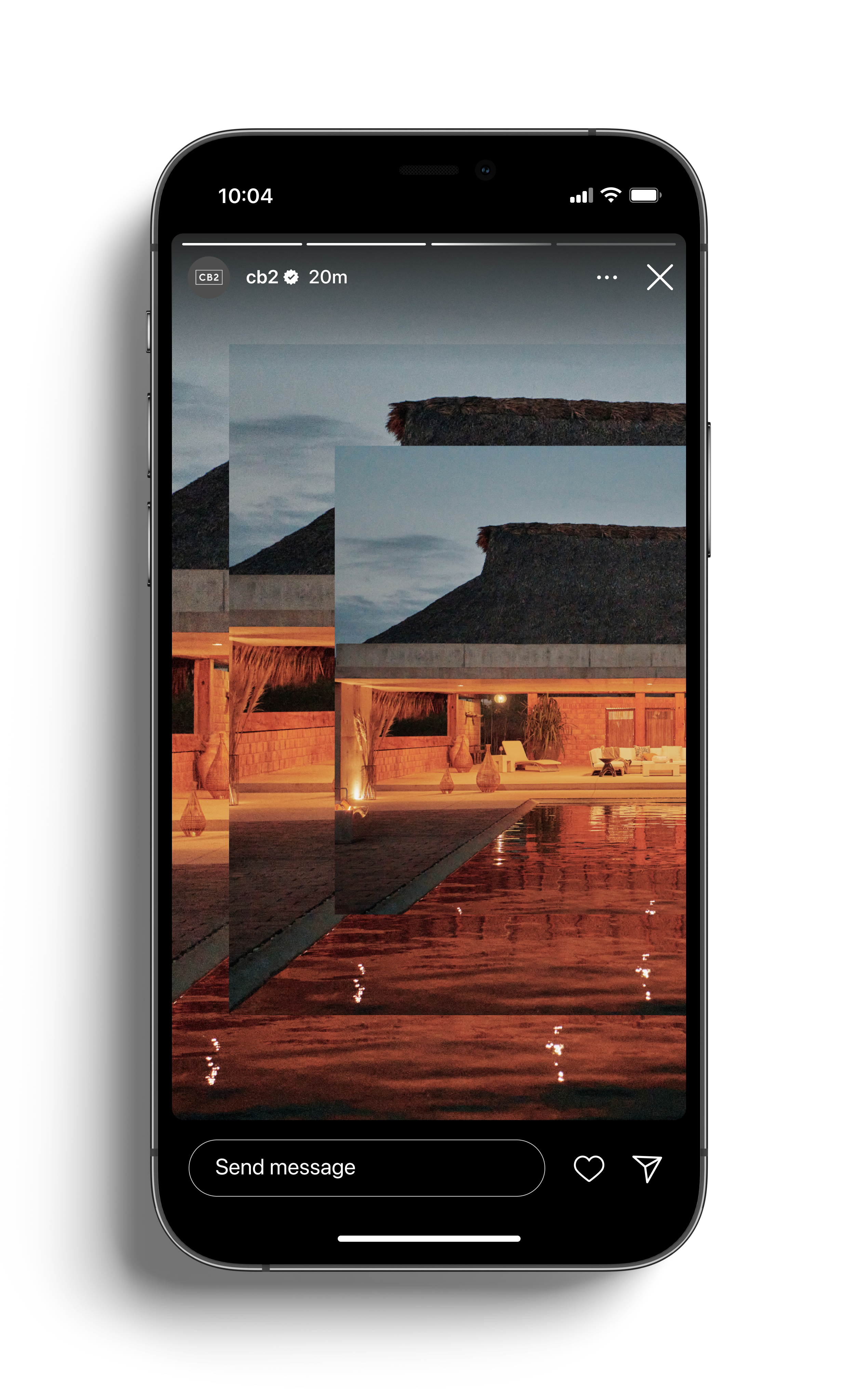
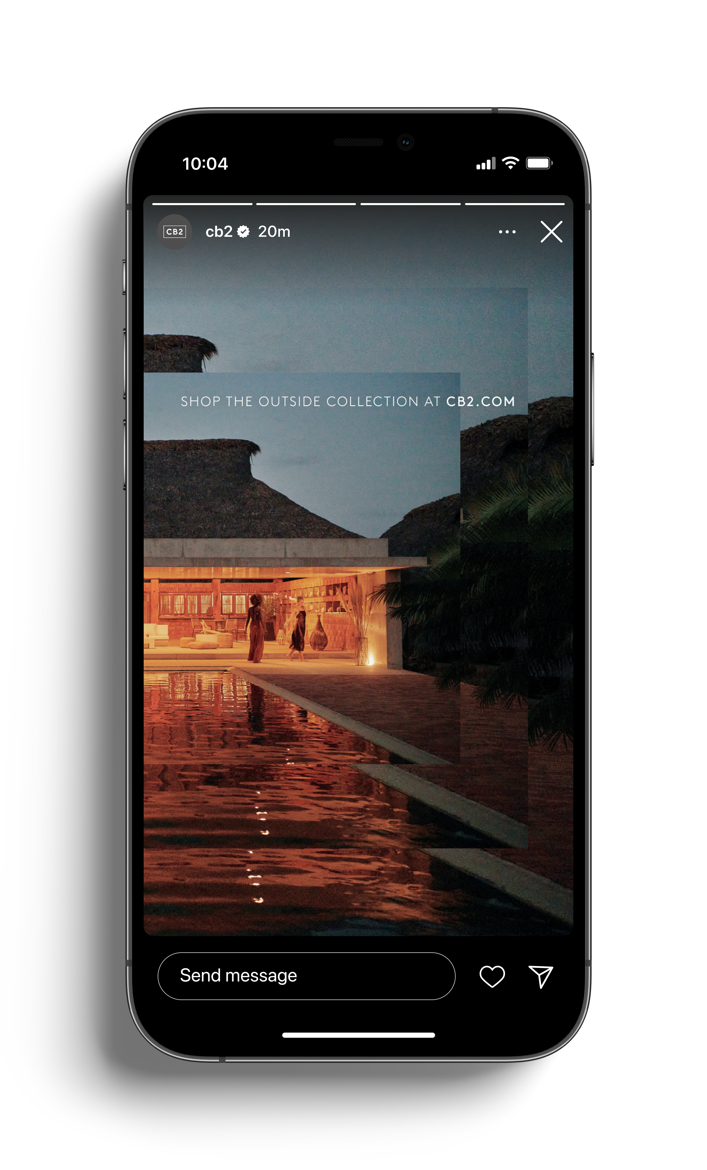
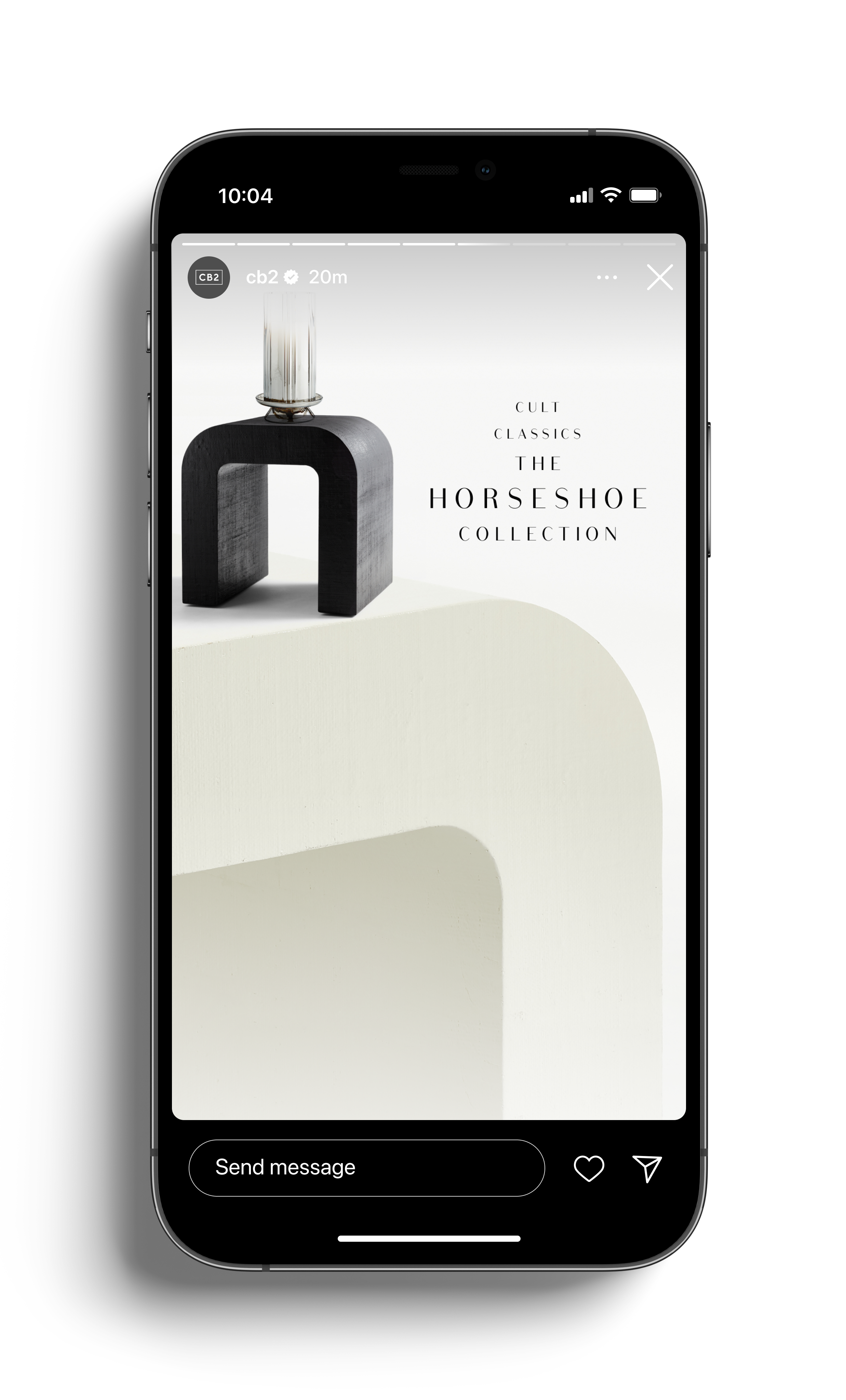
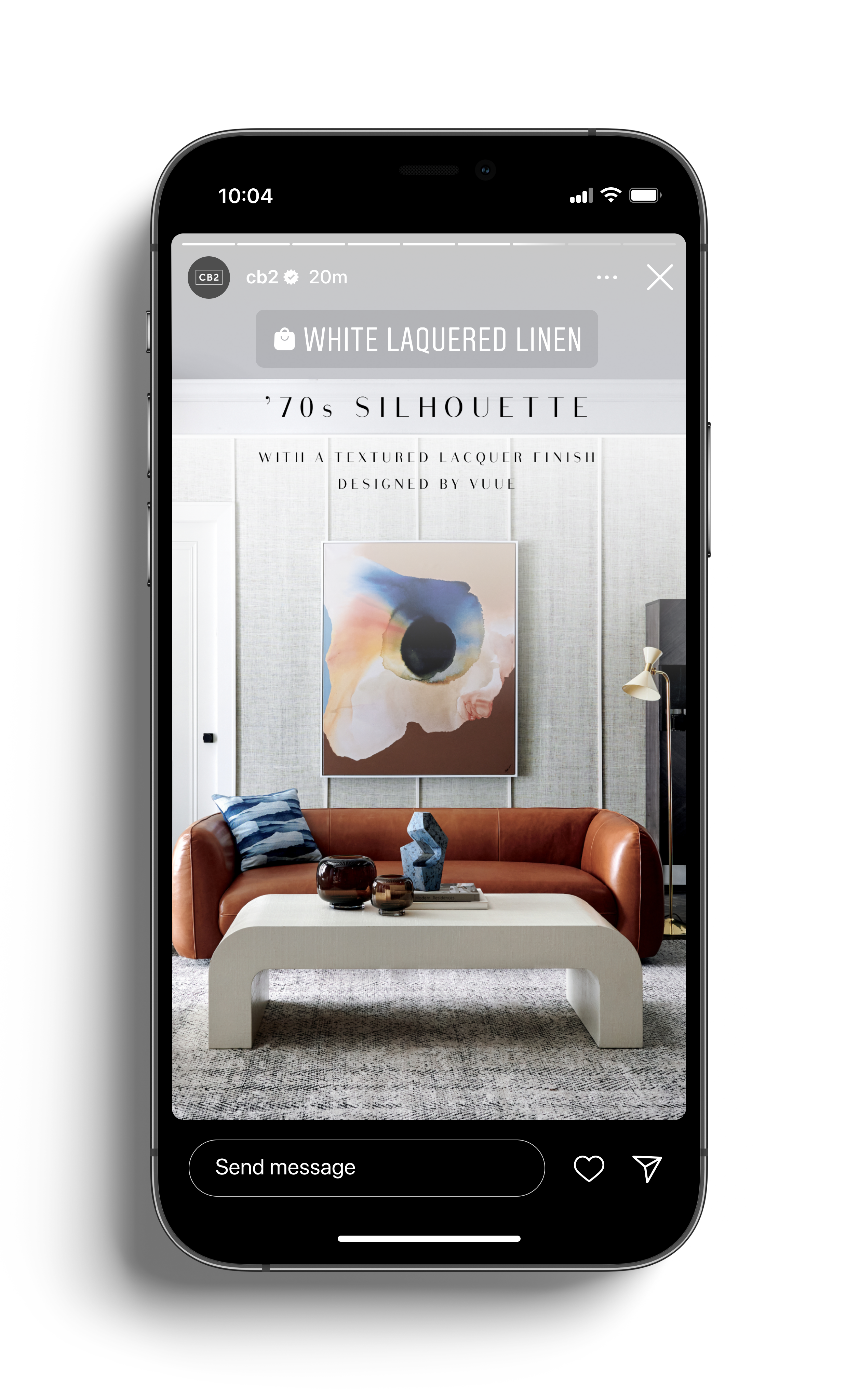
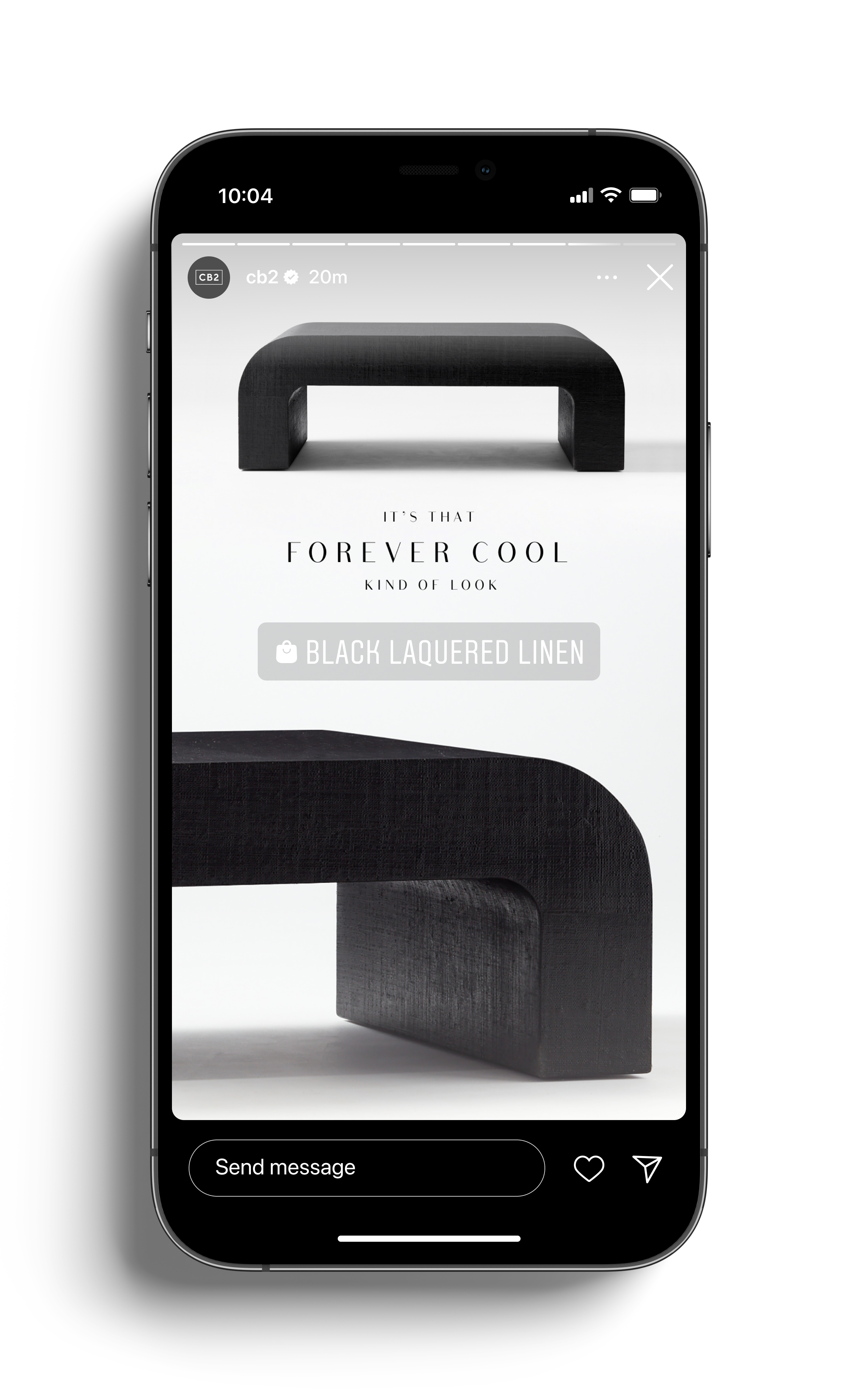
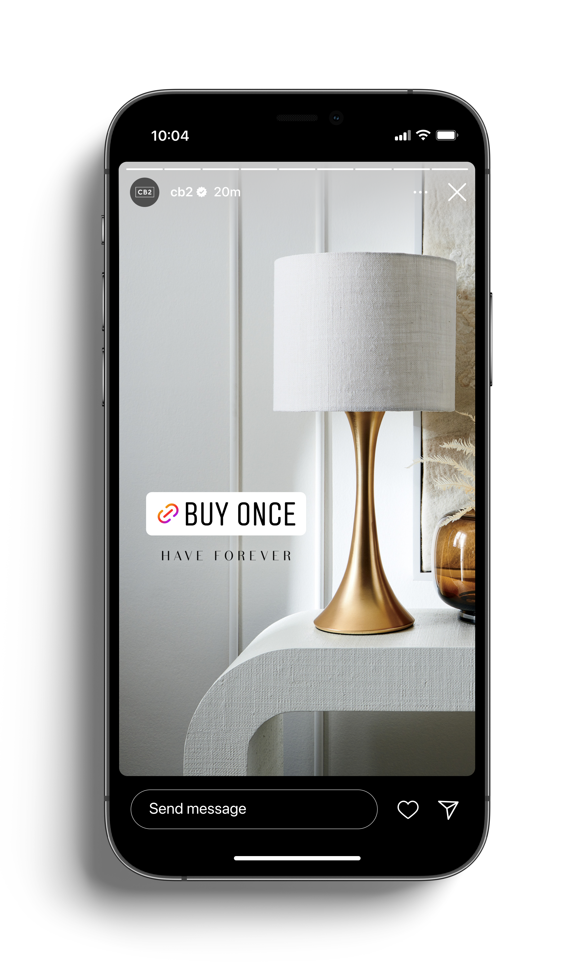
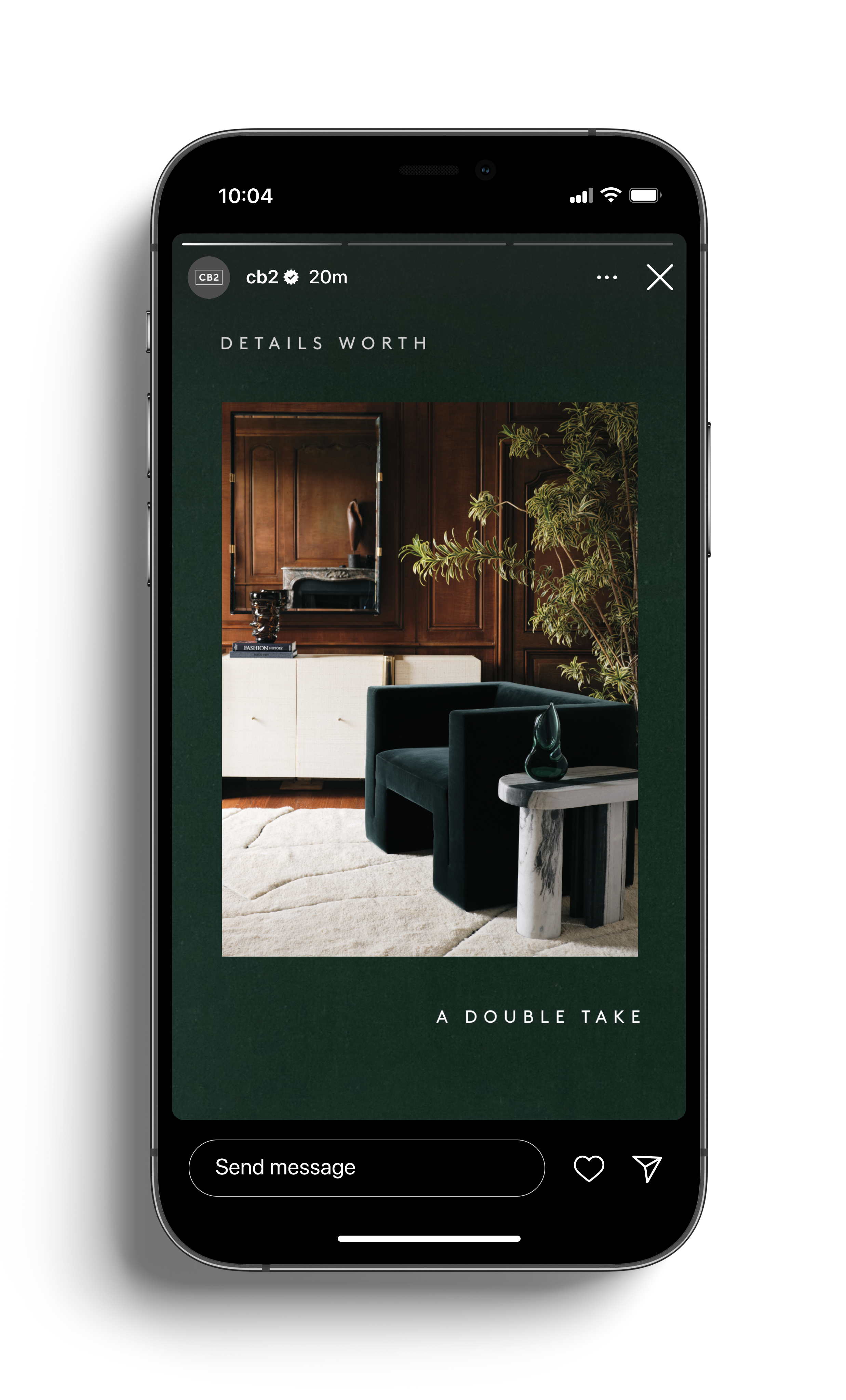
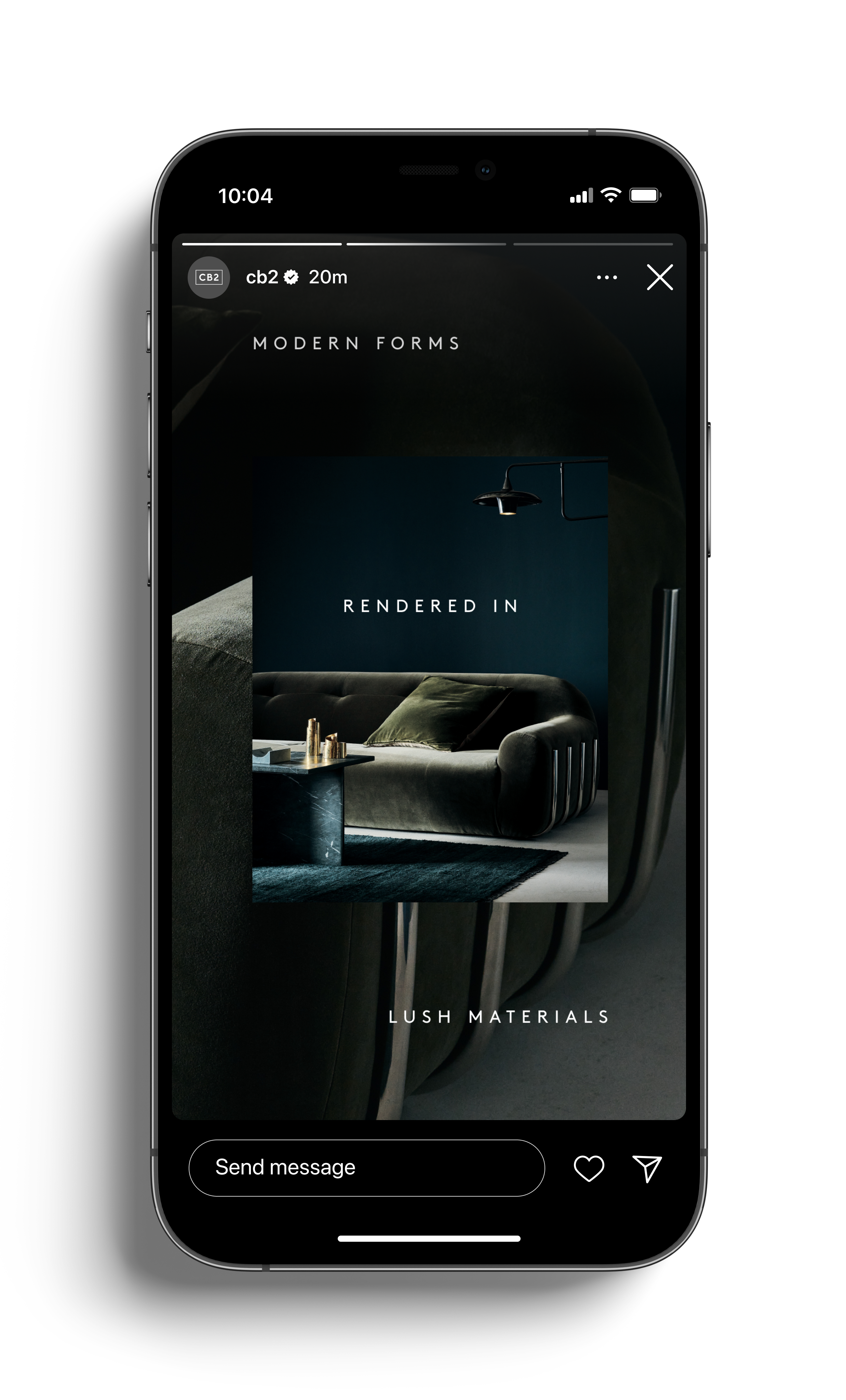
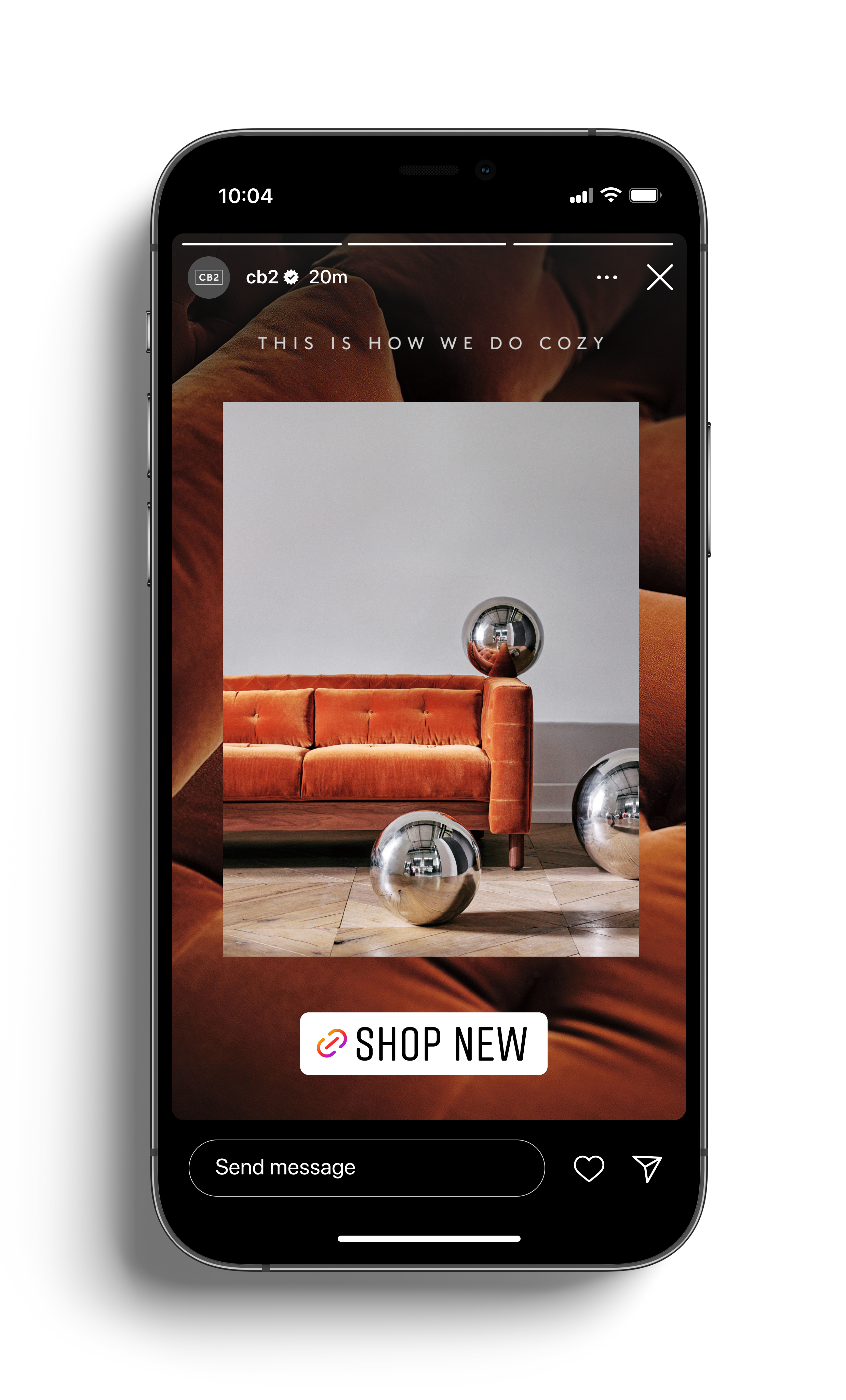
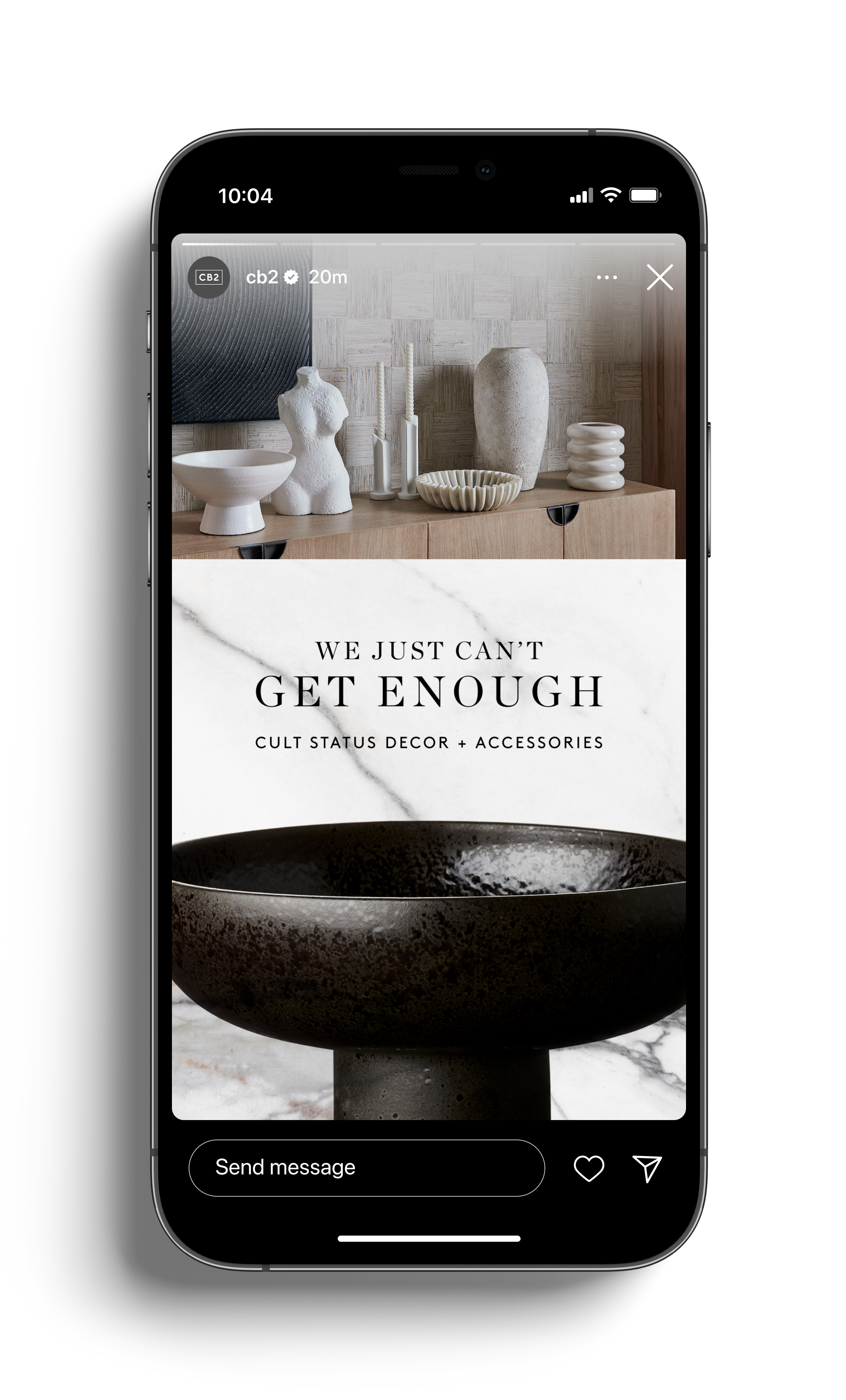
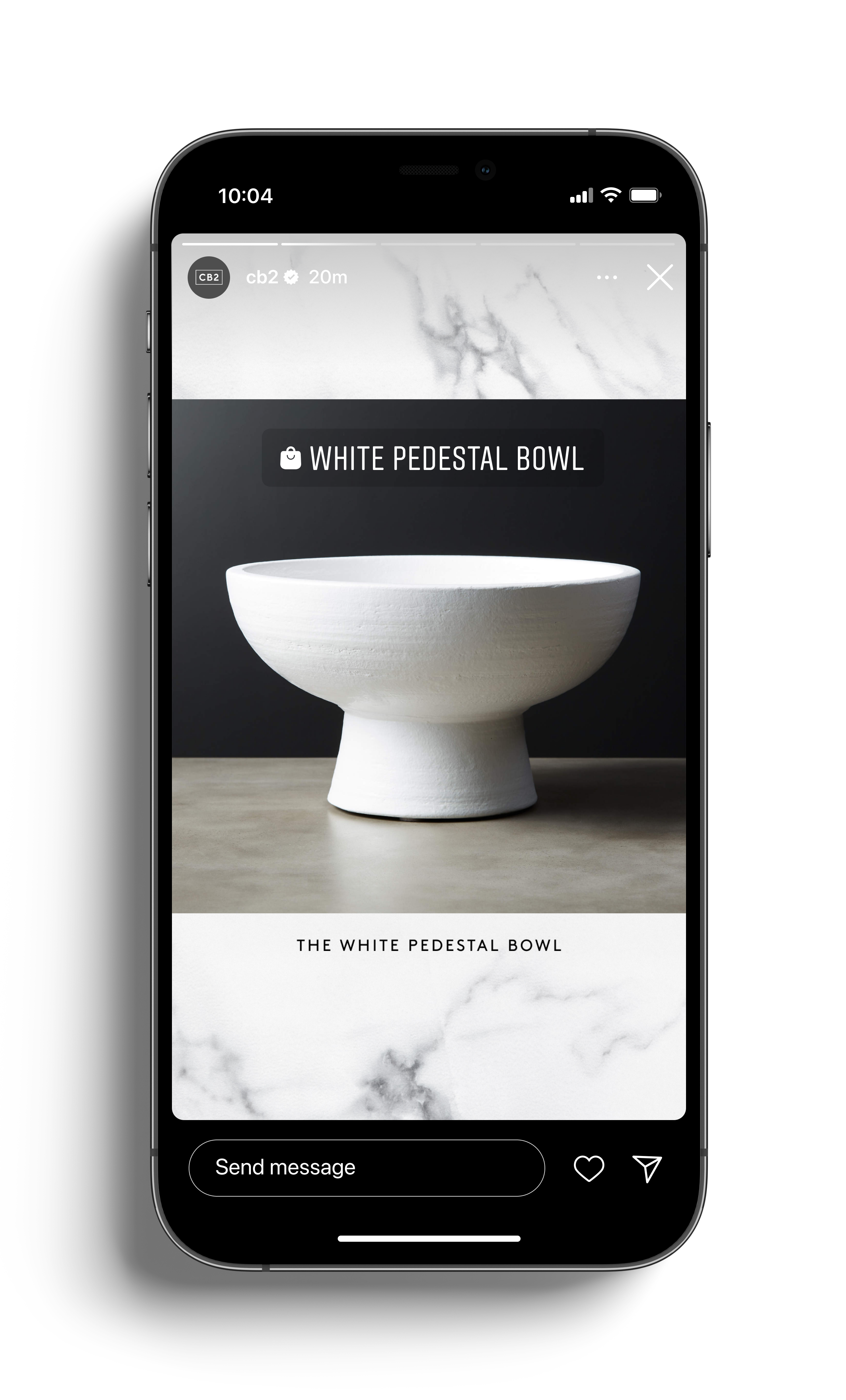
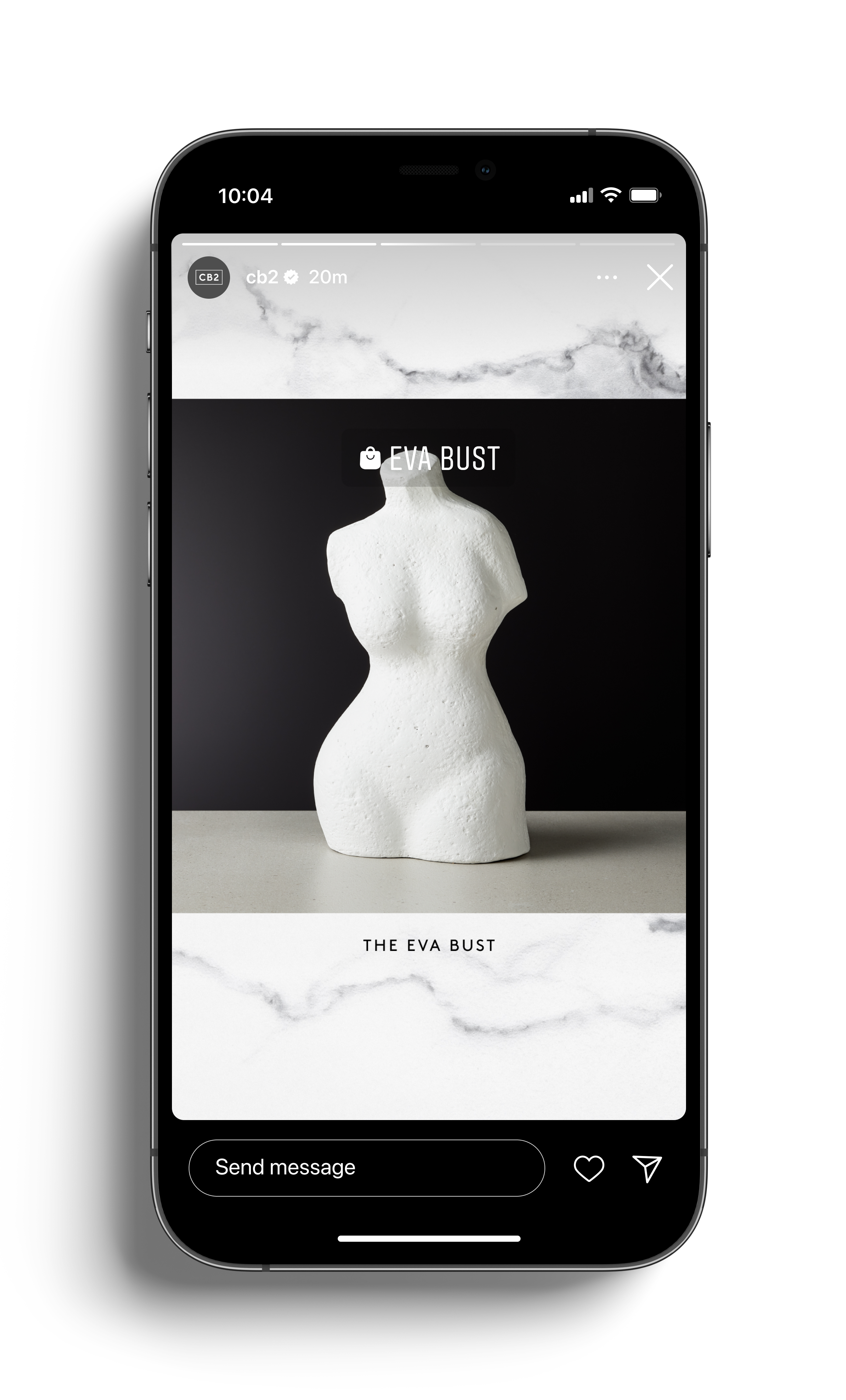
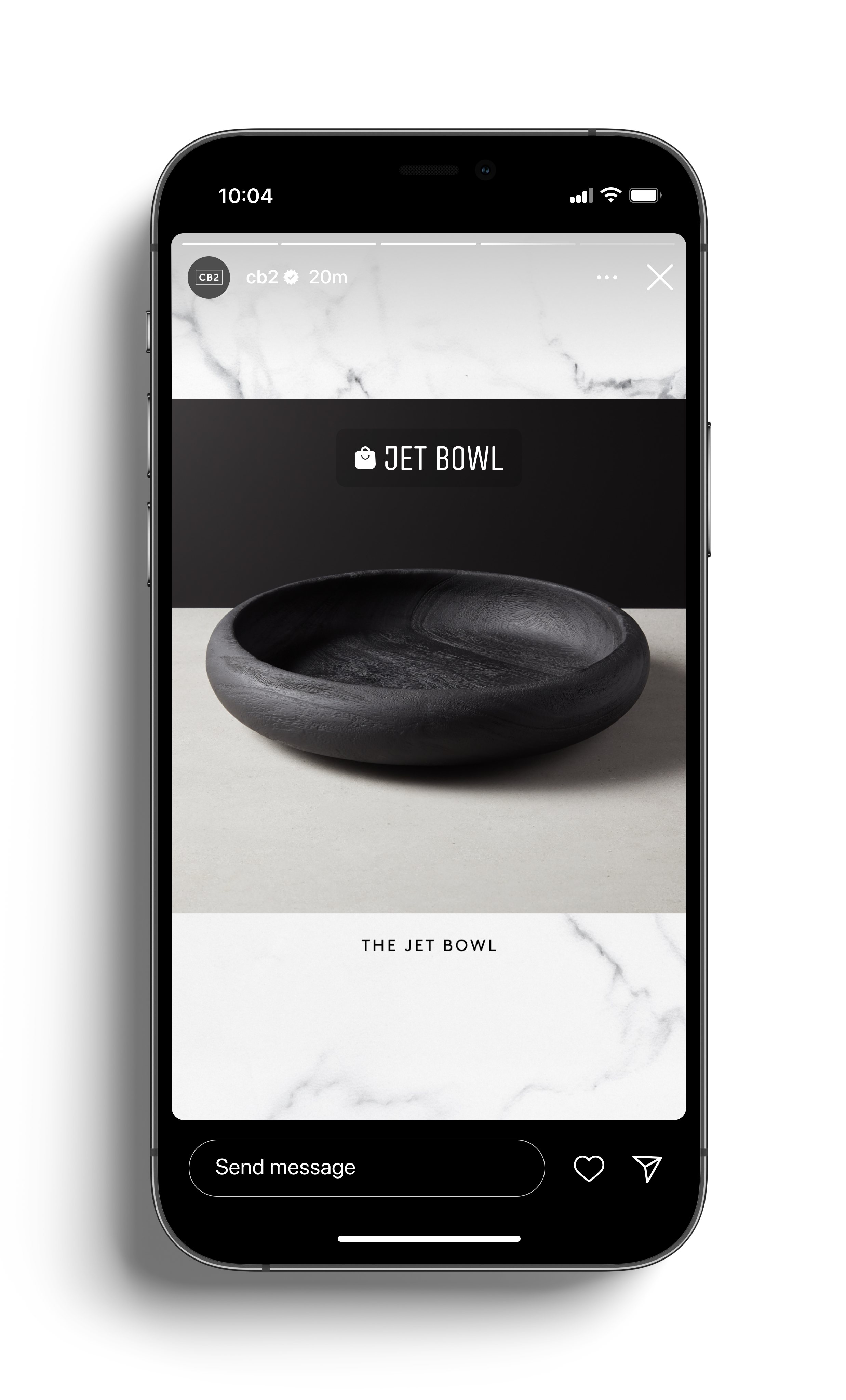
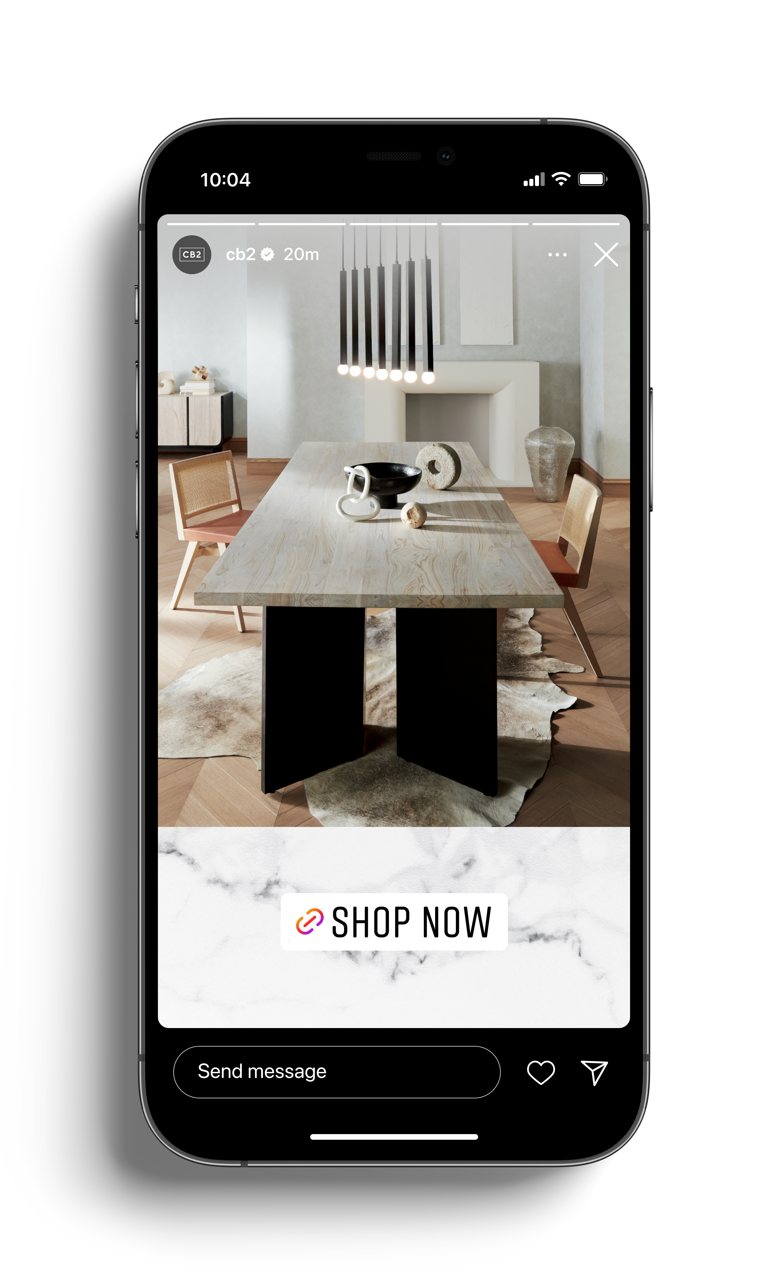
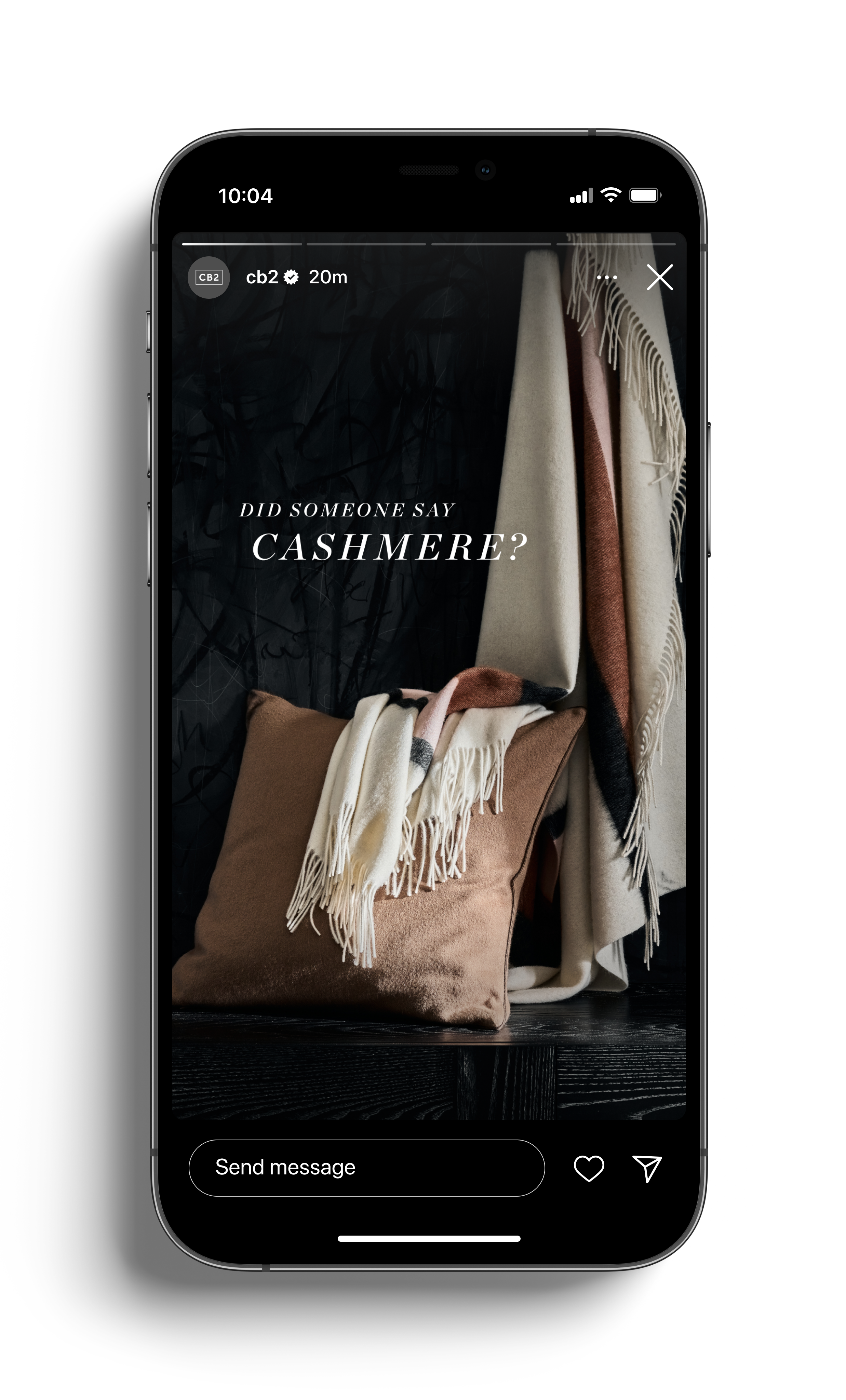
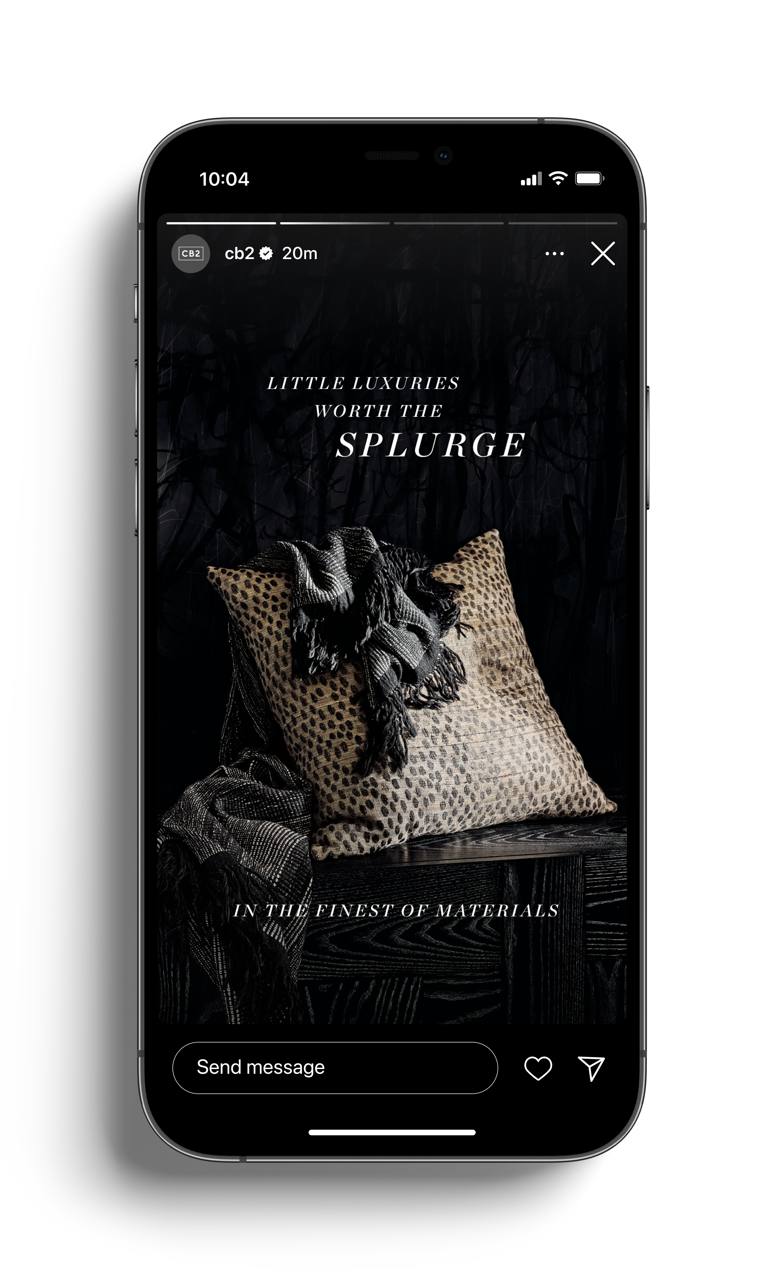
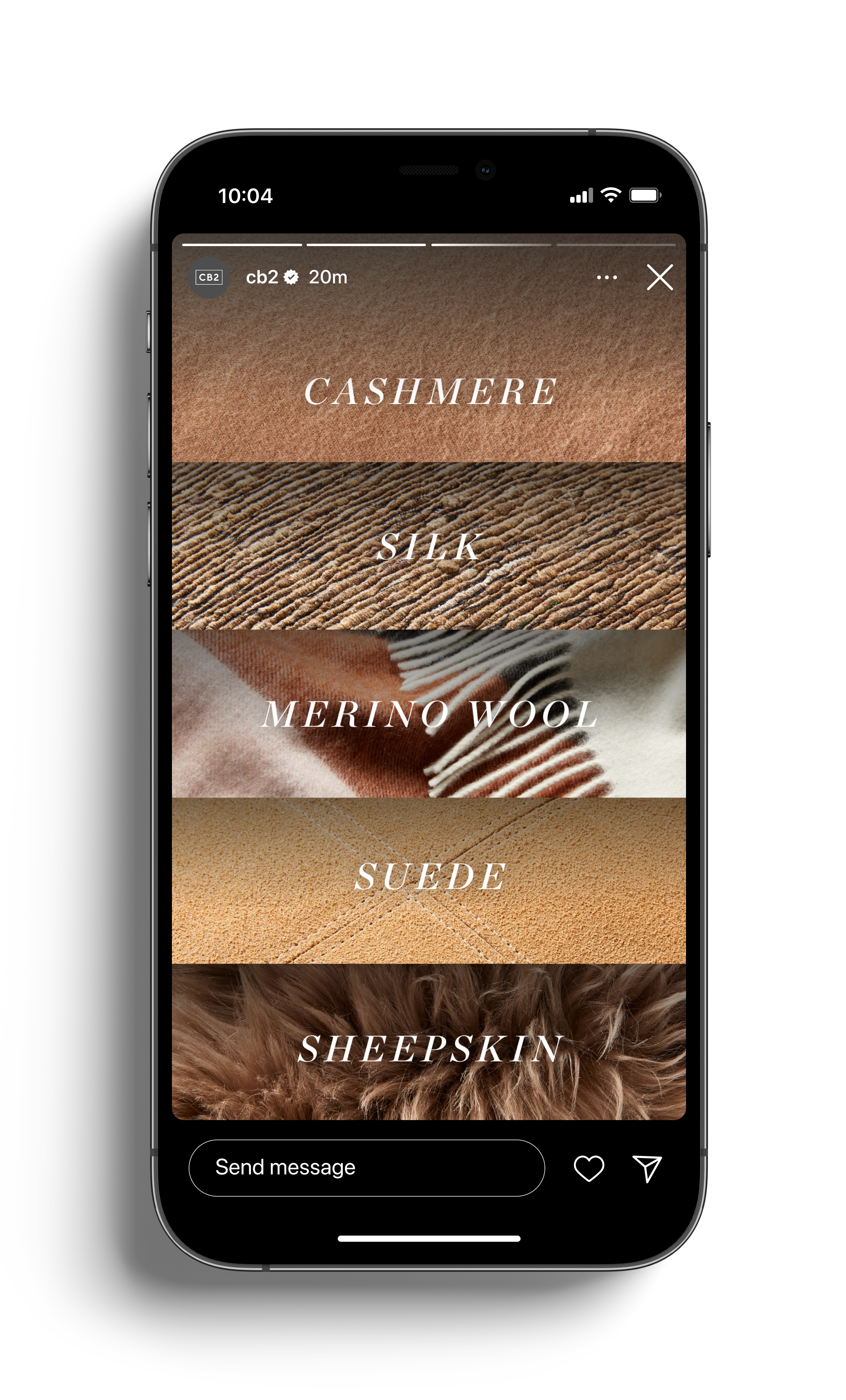
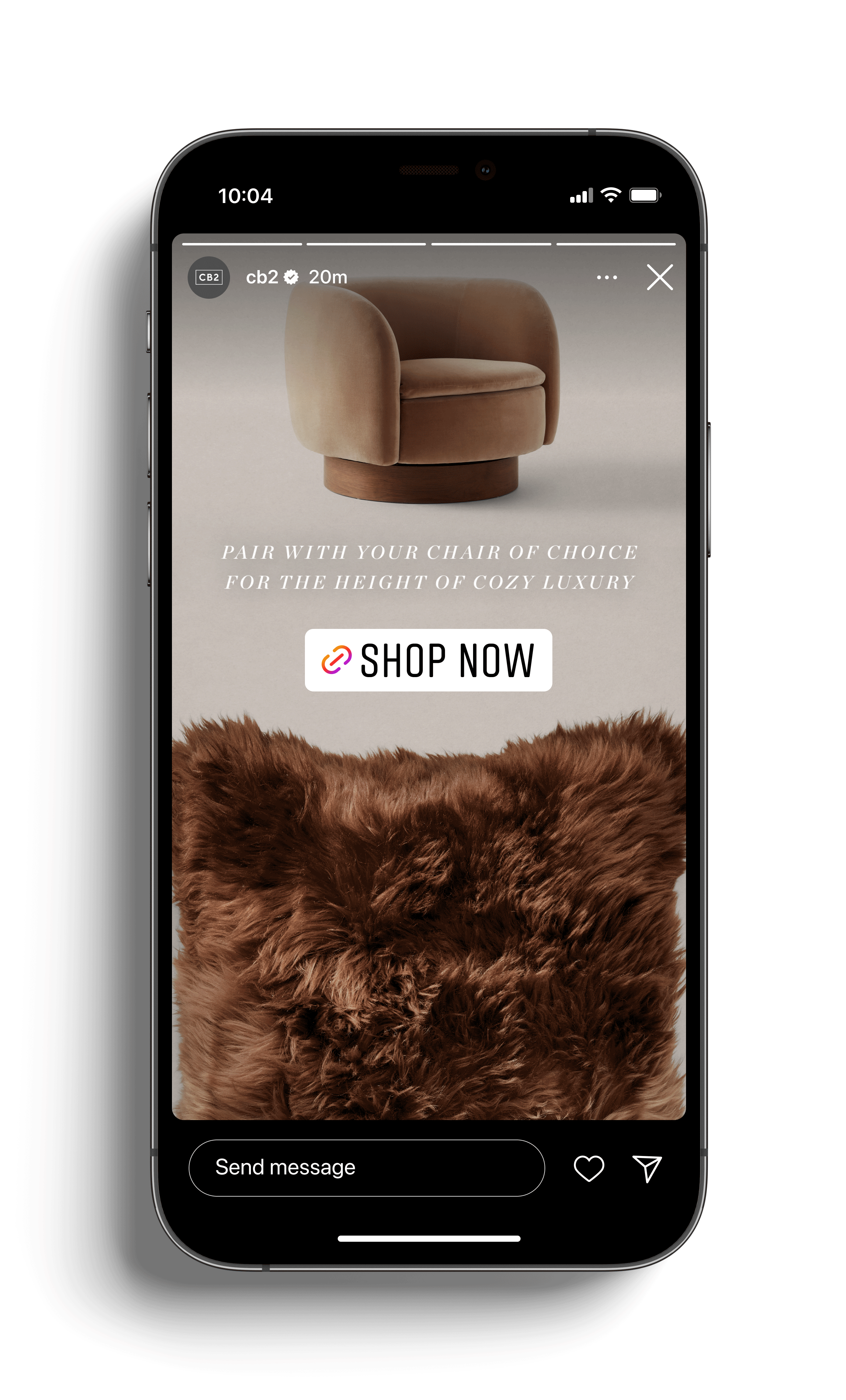
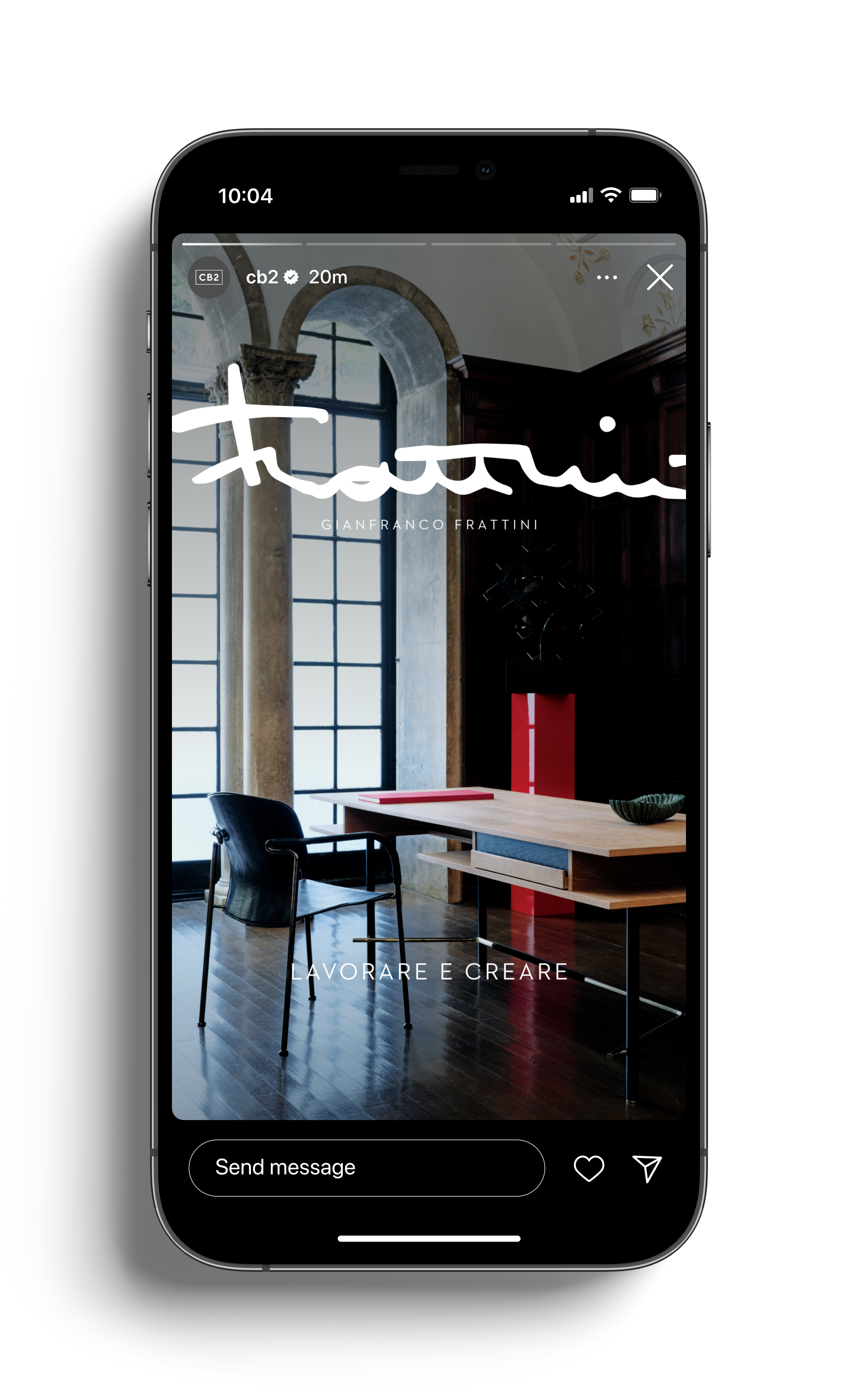
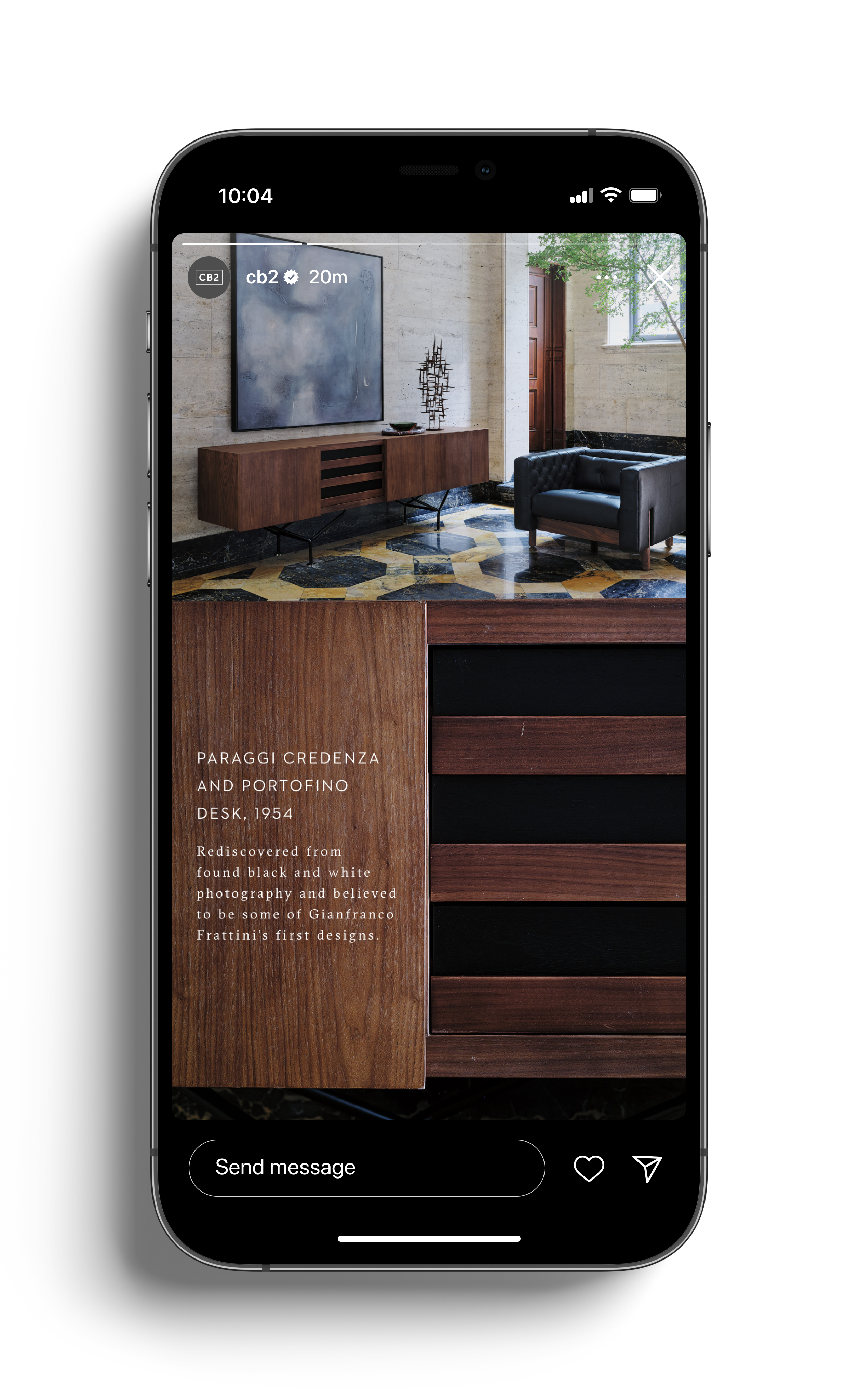
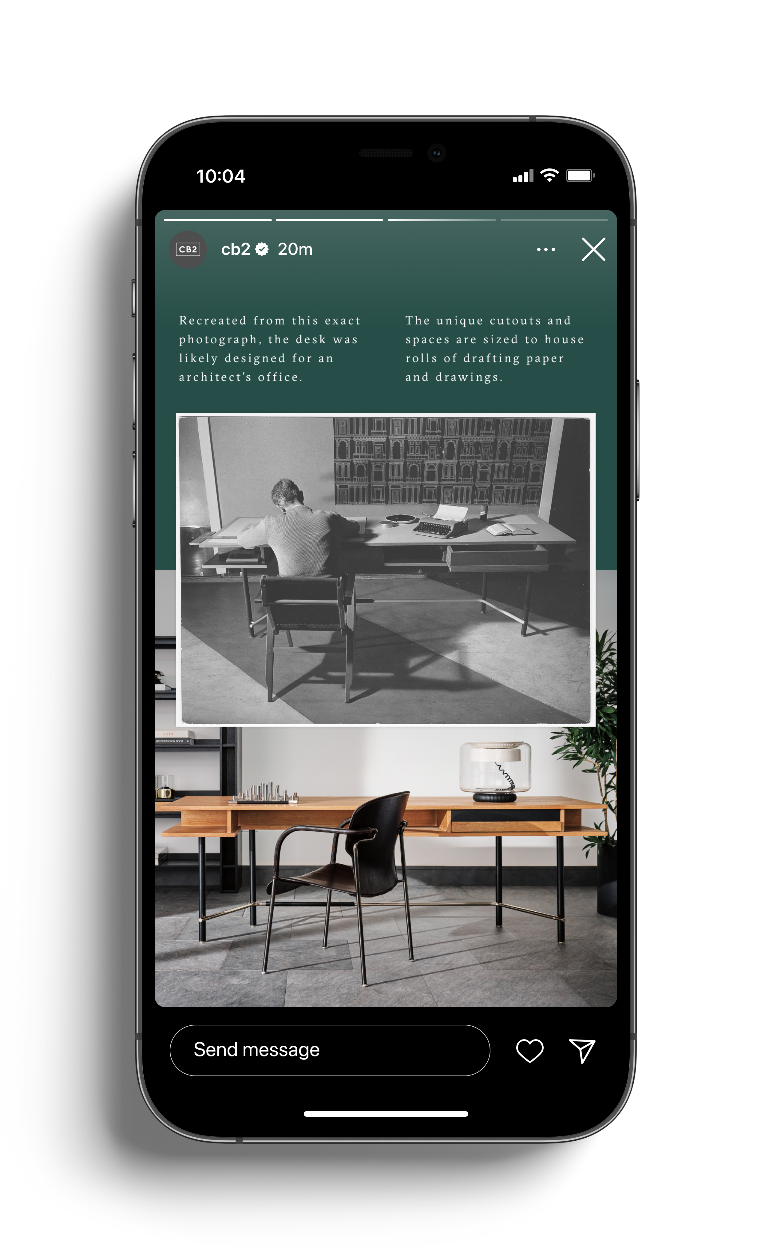
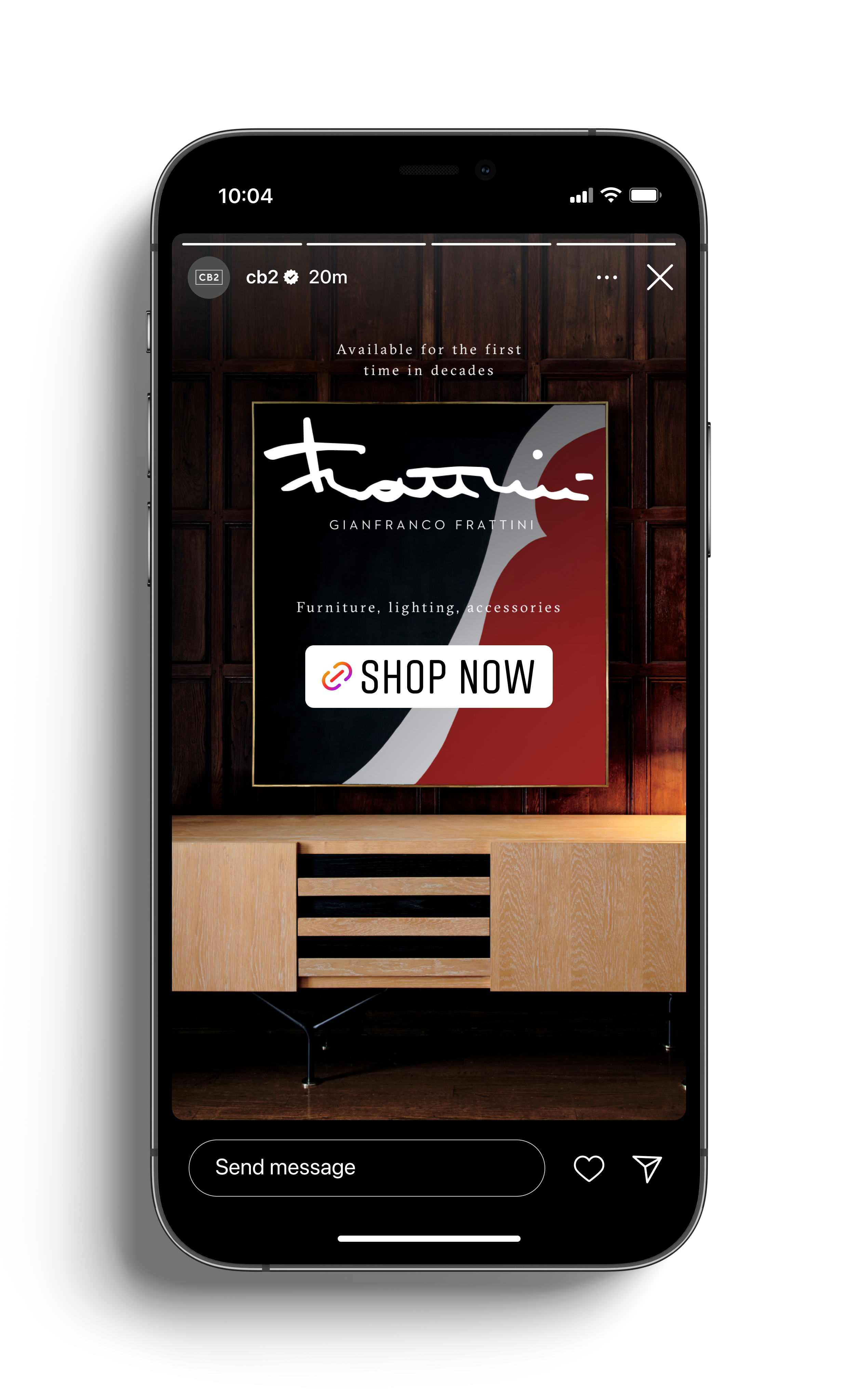
CB2 Stories
Seasonal Instagram stories for CB2.
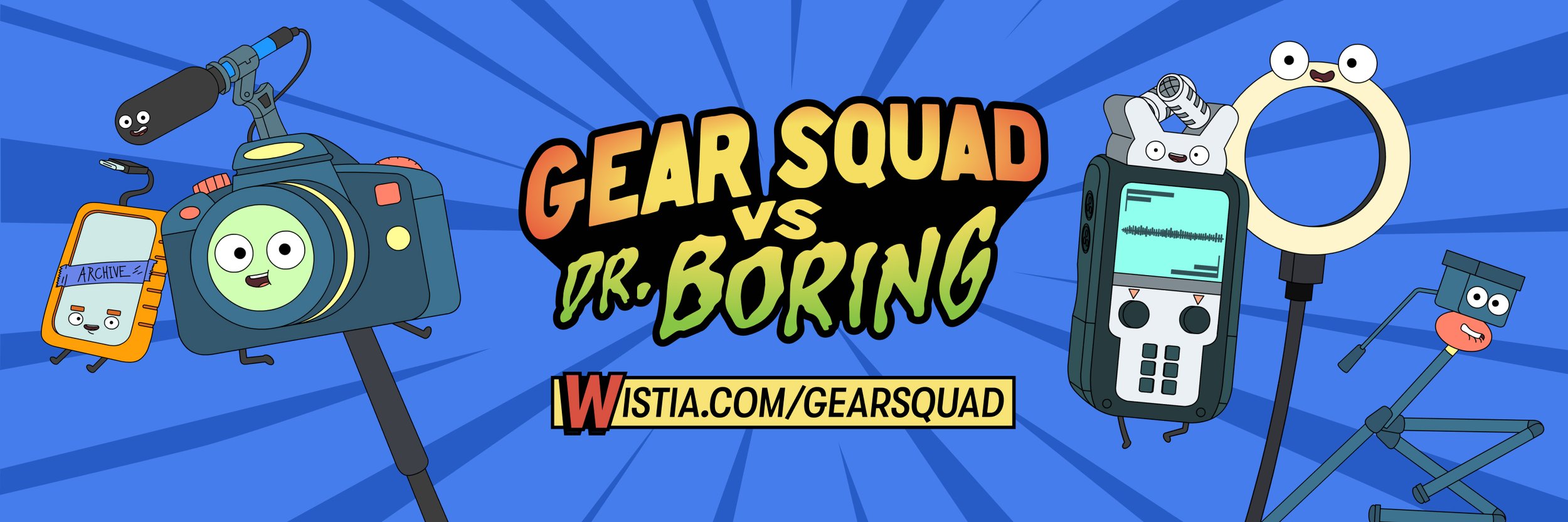
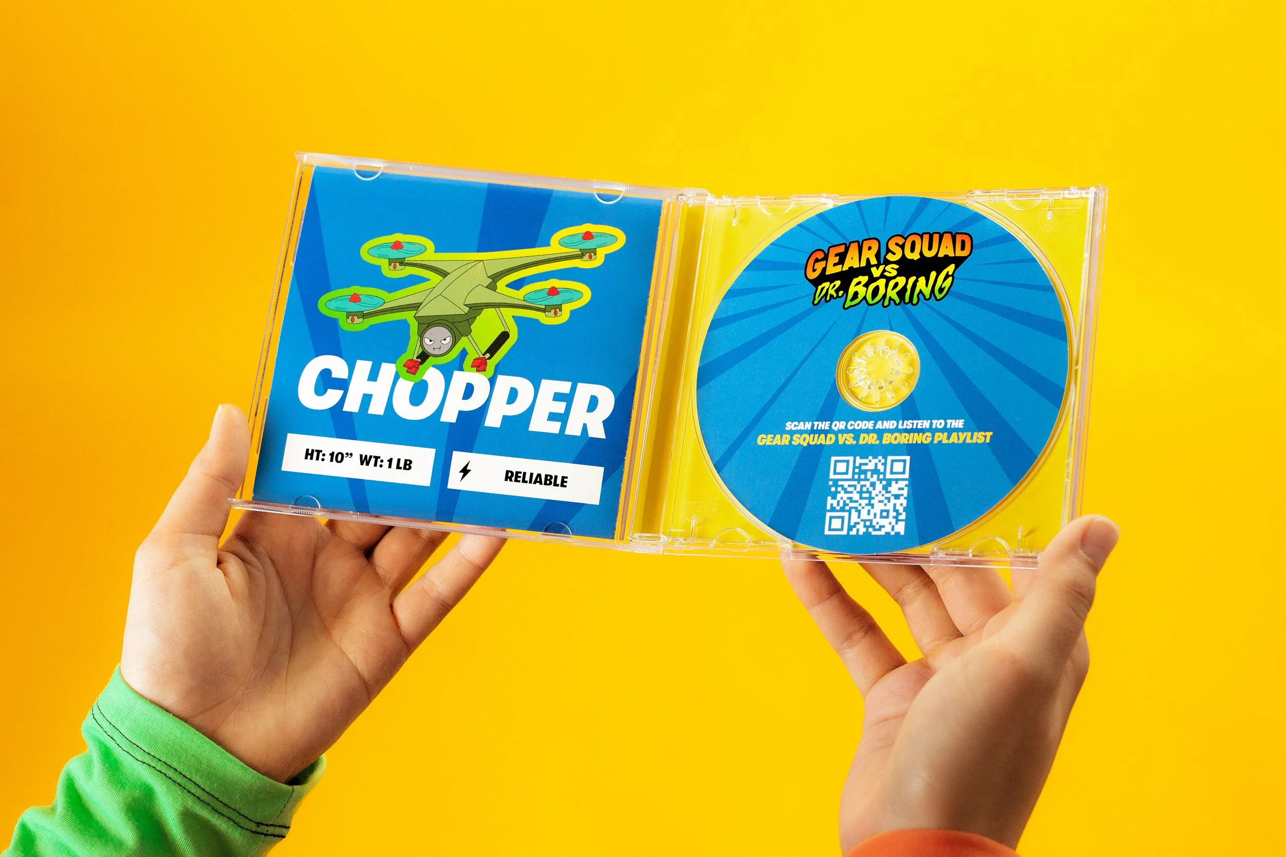
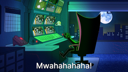
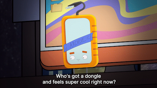
Gear Squad vs Dr. Boring
Campaign for the launch of Gear Squad vs Dr. Boring — a B2B/SaaS marketing cartoon series produced by Wistia.
Designed along with Danielle Bushrow, Erica Griffith, and David Sizemore
Stephen Petto for Photography
Notes included.
Watch Gear Squad vs Dr. Boring here
Gear Squad vs Dr. Boring is a Wistia-produced cartoon series born out of one core idea: Defeat B2B Boring.
With so many POVs around B2B marketing (the main being that it’s often stale/conventional), Wistia set out to create a comedic series that discusses the pain points of marketers within the SaaS space (through the lense of video hardware characters) and how they can leverage creativity and innovation.
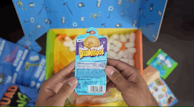
Working alongside internal brand, copy, marketing, and design teams, we were able to build out a number of assets for launch — from email to paid + organic social to custom swag kits.
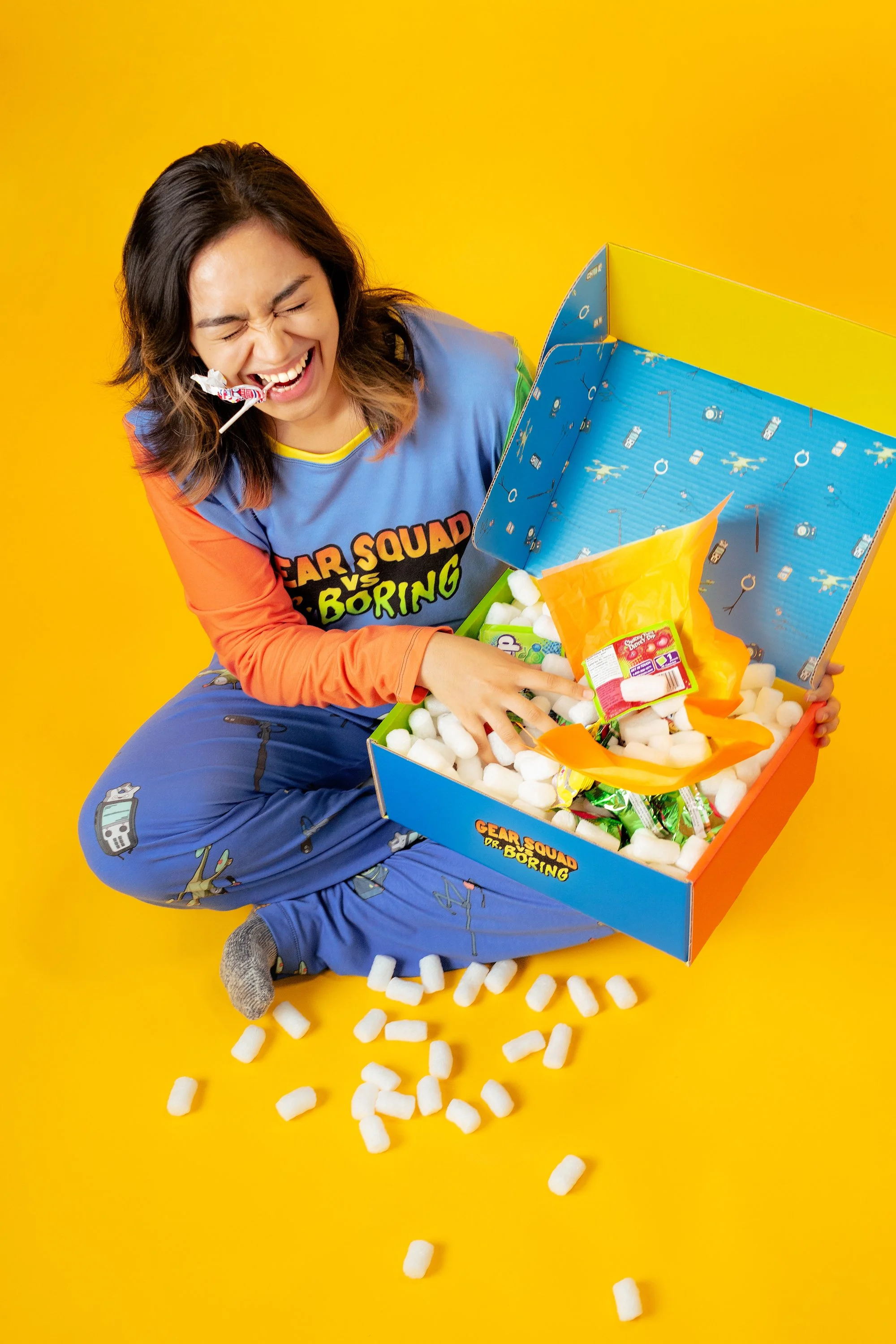
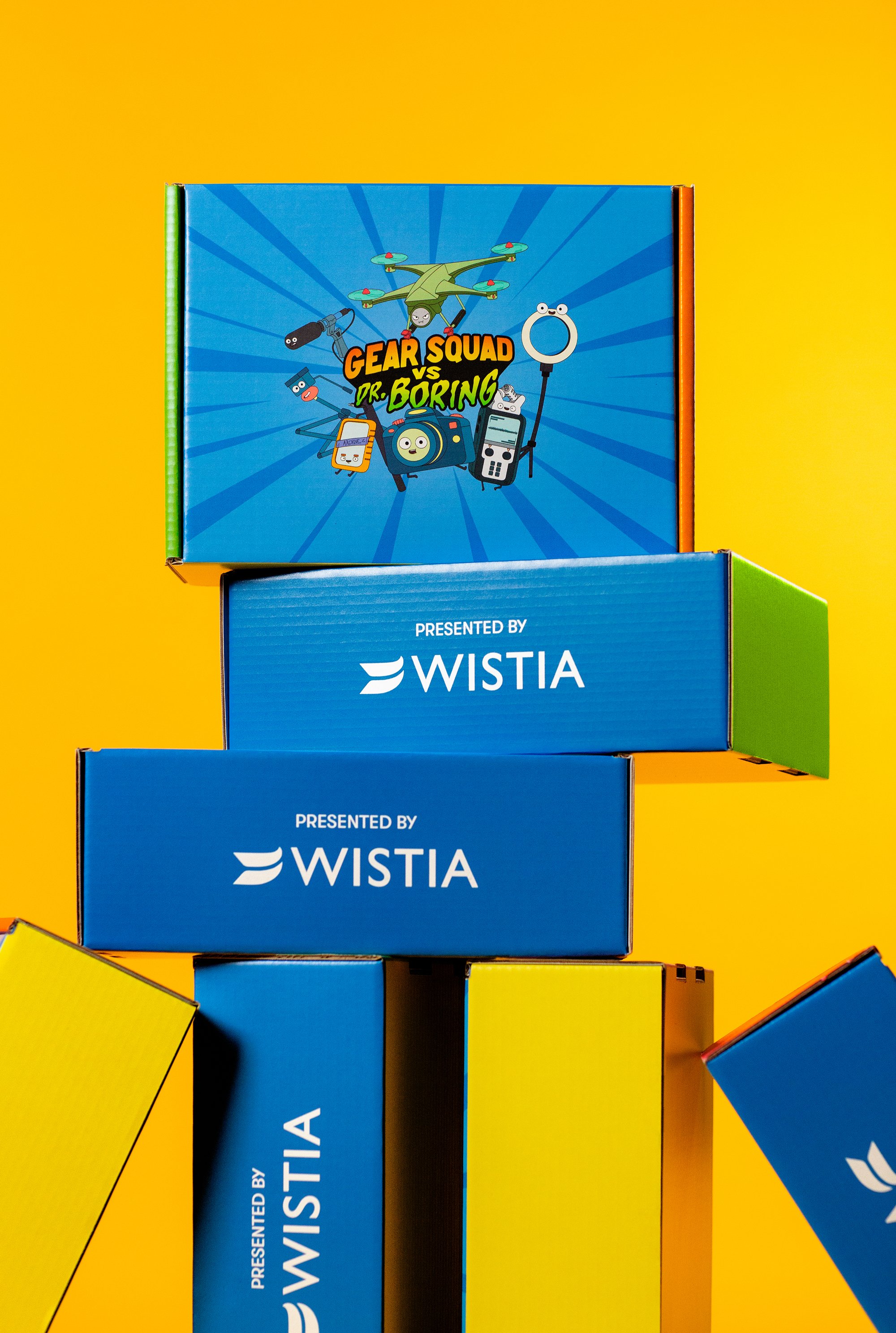
Tapping into the 90’s Saturday Morning cartoon aesthetic, swag kits served as delightful physical component of the launch in the hands of influencers as well as fans of Wista and the series.
I lead art direction and design of the swag kits which included sourcing domestic/international vendors for production, design of all items, overseeing QA, and final assembly of boxes.

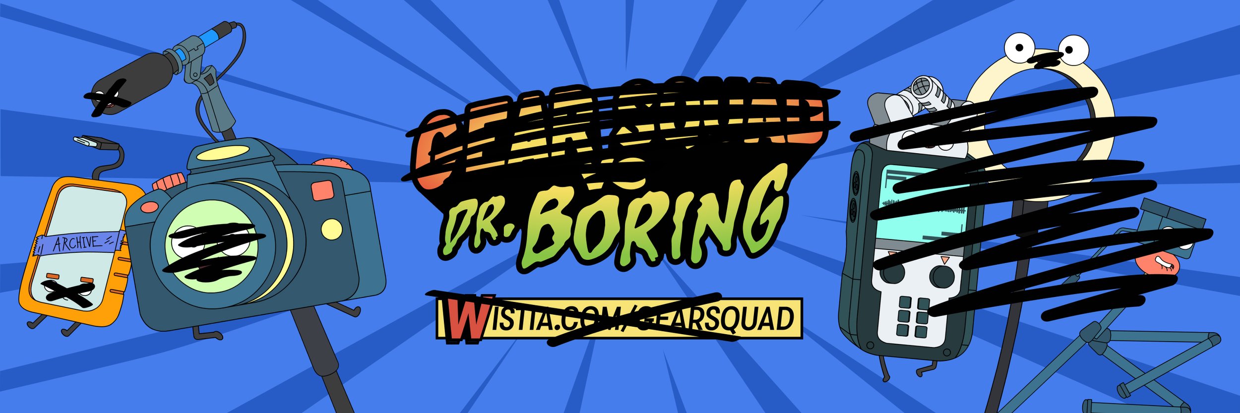
Dr. Boring, the evil genius who’s constantly plotting to destroy fun and innovative marketing ideas, decided that upon the launch of Gear Squad, he’d go ahead and takeover Wistia’s social accounts!
For the social takeover, the brand and creative team imagined a world in which Dr. Boring childishly hijacks Wistia’s social accounts and promotes his theories around uninspiring marketing - with the goal of generating interest in the series. For the take over, I worked on organic assets: profile photos, banner graphics for FB, LinkedIn, Twitter, and IG.

Dr. Boring takeover on Facebook

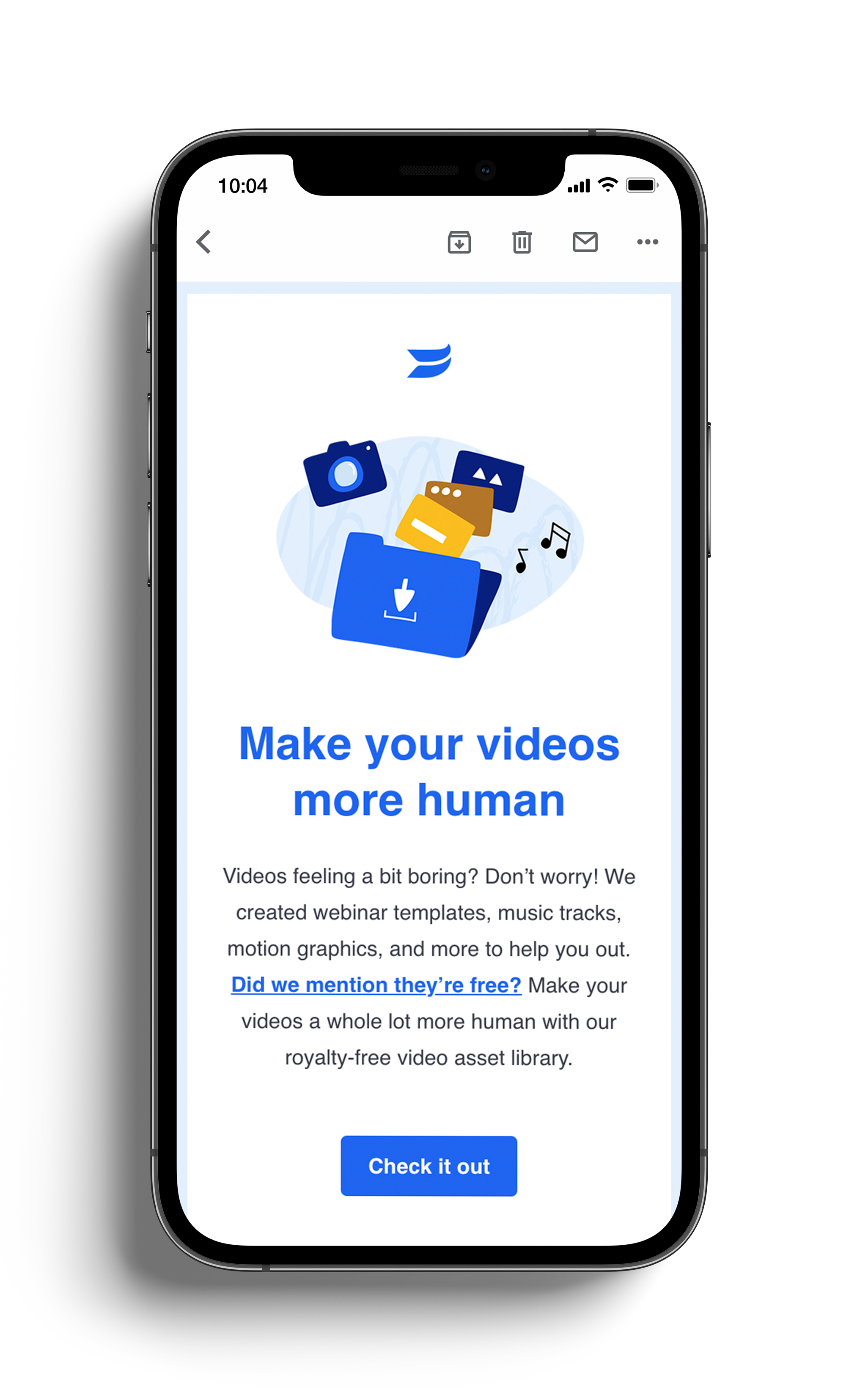
Email played a key part in engaging prospects and so, growth designed a strategy around email to help bring awareness to the launch of the series.
Utilizing assets that our team had built out and working alongside copy, I created emails (specifically for top of funnel) that would not only speak to the launch of Gear Squad vs Dr. Boring, but also shed light on net-new resources that the Wistia team launched — specifically the Asset Library.


High-level view of some of the creative produced for the series across the entire team. This includes physical, organic social, paid social, display, and more.
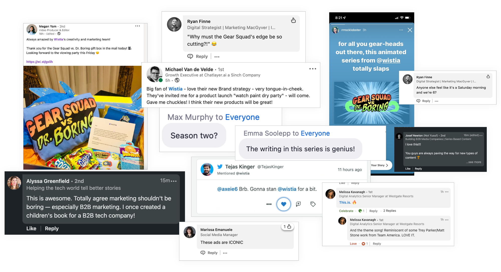
Within the first 30 days of series launch, Gear Squad vs Dr. Boring reached more than 1.25MM unique users which surpassed projected expectations.
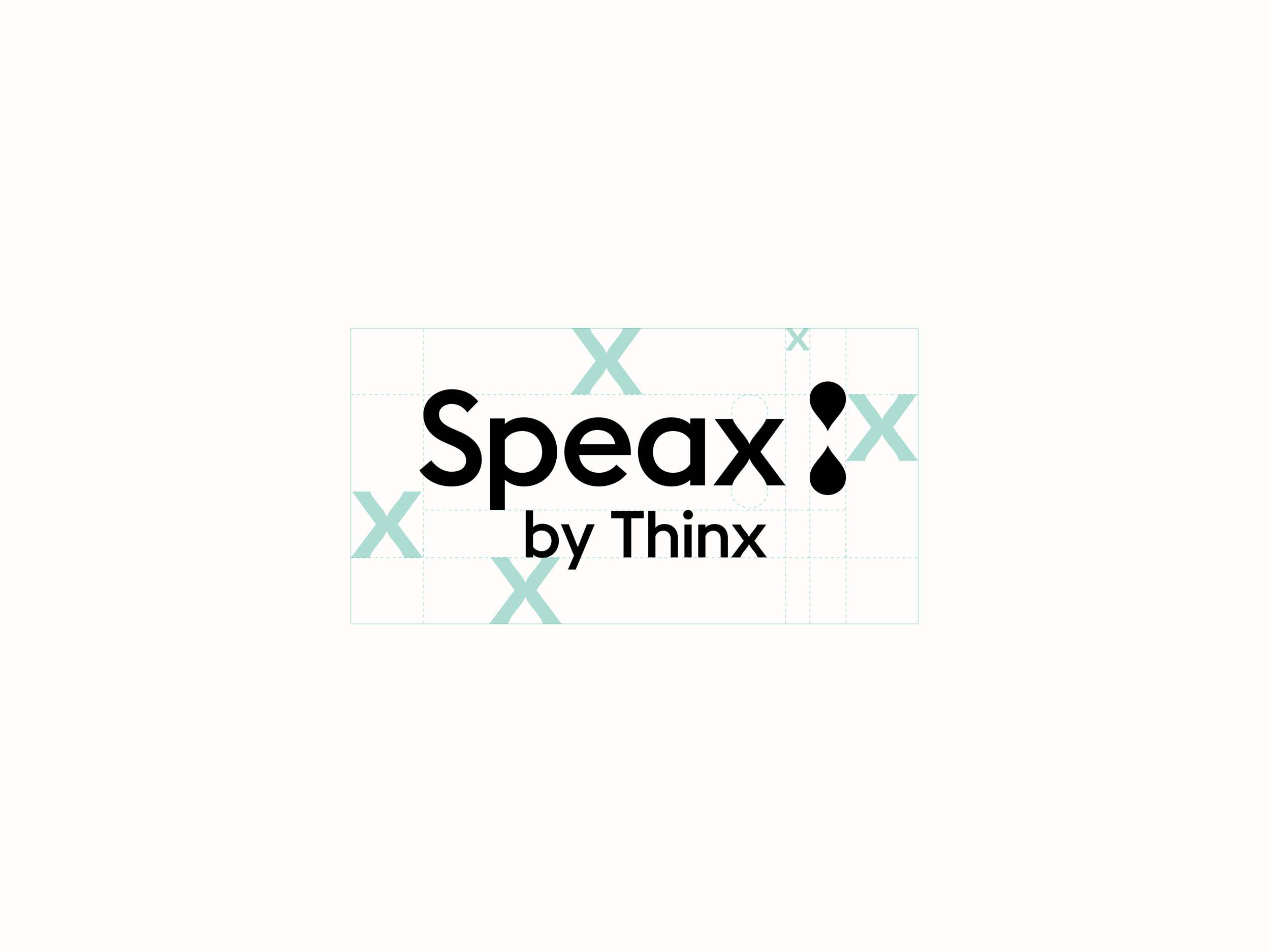
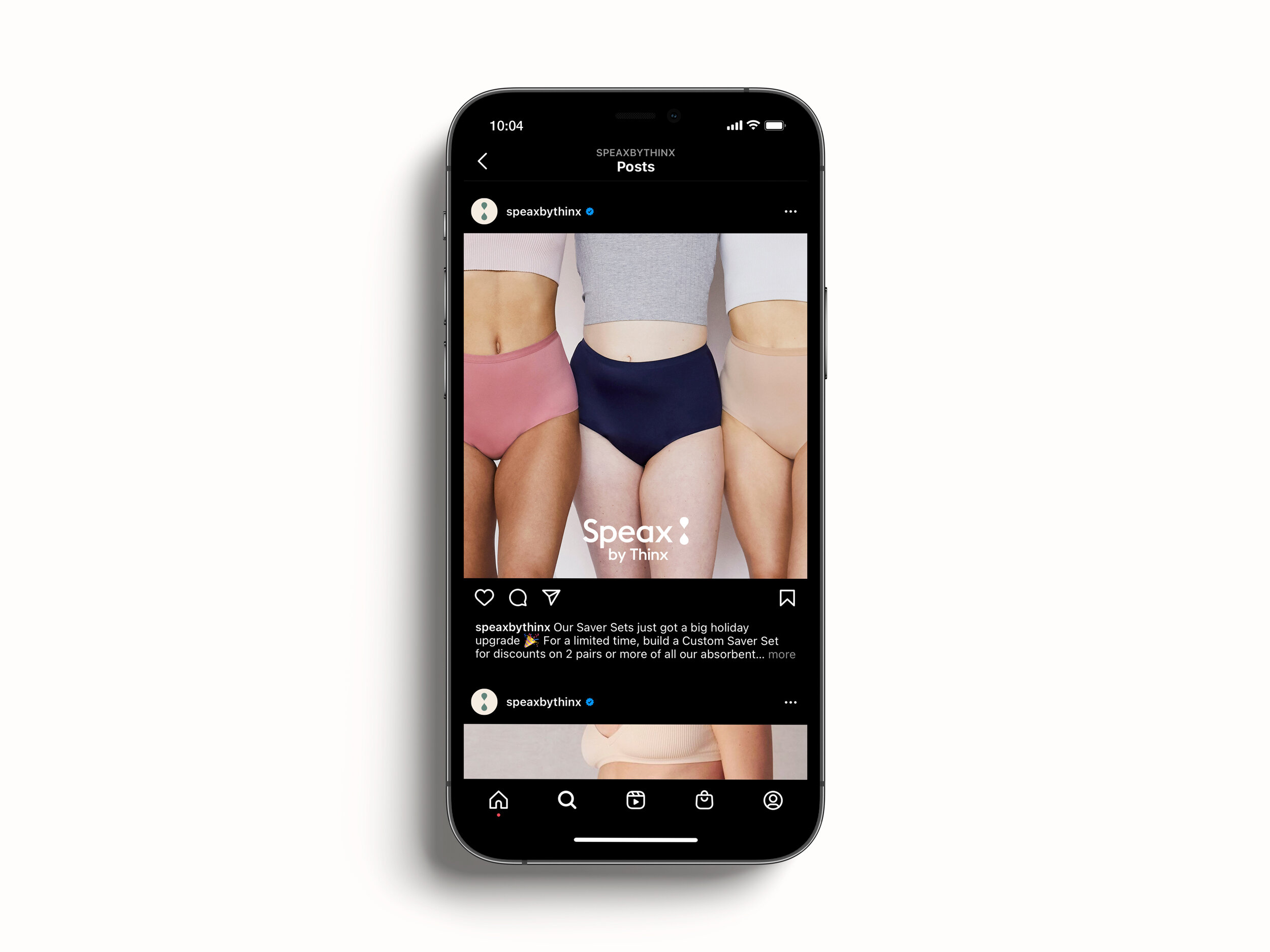
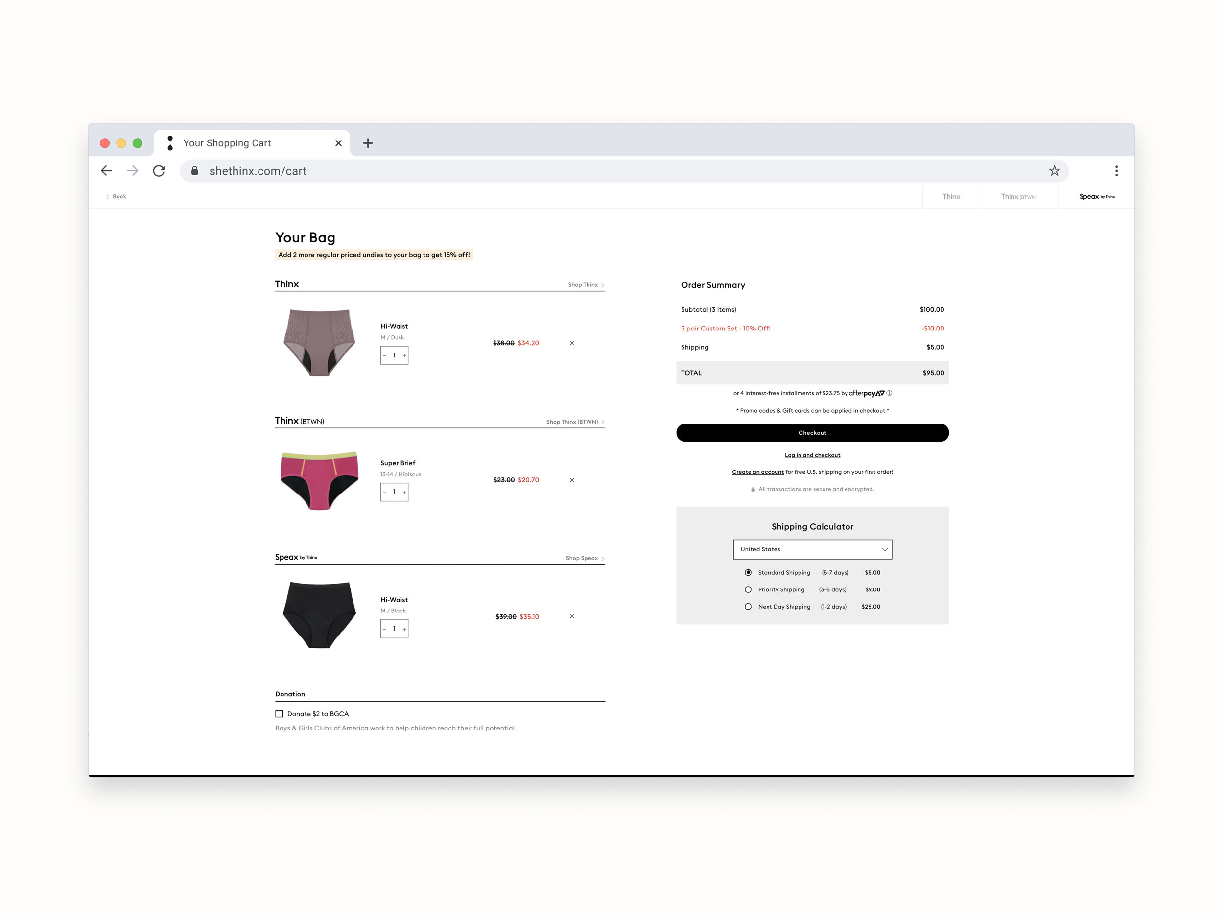
Speax by Thinx
Identity update for Speax by Thinx.
Meng Shui for Creative Direction
Notes included.
Speax by Thinx (formerly Speax) focuses on underwear that supports bladder incontinence. Being one of the three flagship brands under Thinx Inc. BUT not having much of a visible/clear relationship to the other two brands — Thinx & Thinx(BTWN) — Thinx Inc. wanted to change that. In-house, we worked together to do an update to the Speax by Thinx identity and color palette.

Before

After
The final output consisted of a lockup with “Speax” and “by Thinx”. A large component was also finding a balance of how, visually, this would all come together while maintaining a clear hierachy.
Primary logo: To be used for all larger brand placements.
Secondary logo: To be used in conjunction with the tri-brand lockup for Thinx, Thinx(BTWN), and Speax by Thinx.

Secondary logotype: To only be used across smaller brand placements.

The liquiform — a mark that has been used across both Thinx and Thinx(BTWN) logos — was permanently shifted onto the Speax by Thinx logo .

A fresh primary and secondary color palette was applied to the identity update.


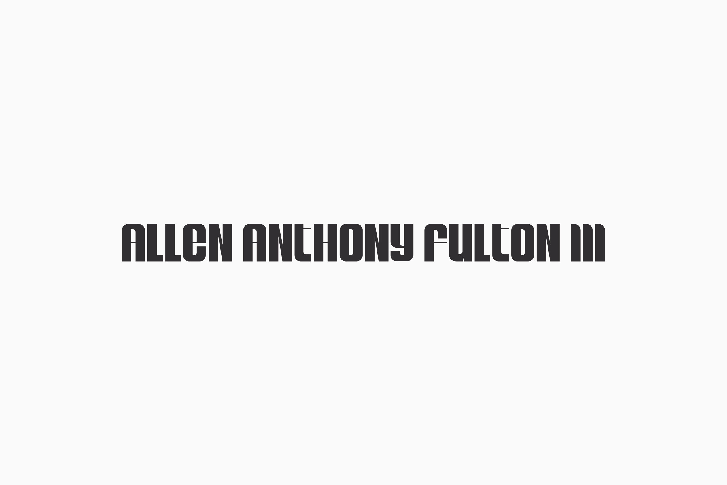
AAFIII
Identity development for Allen Fulton.
Notes included


Based in Los Angeles, Allen Fulton wanted to finally bring his love for casual/athleisure wear to life. We worked together to develop a strong yet fun identity which would be used across various items and accessories.

Primary condensed logotype


Secondary expanded logotype
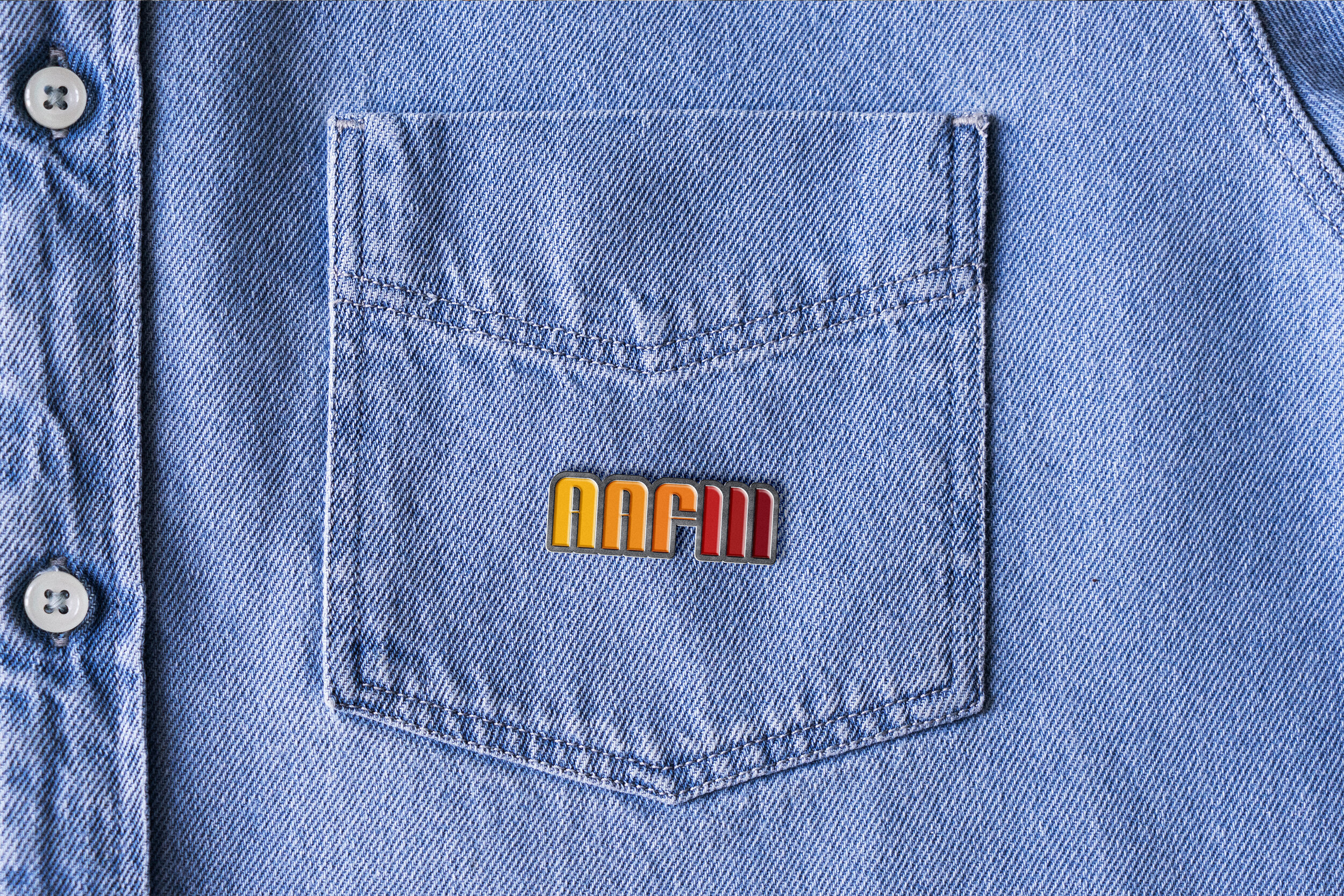
Tertiary logotype translations.


Key edits made across letterforms within final logotype include slightly higher/thinner cross bars as well as an opening in the counter of letters such as “A” and “E”
Palette A was crafted to capture a customized spectrum of bold colors that would be used across both condensed and expanded logotypes as well as the logomark.

Palette A
Colors “A, B, C, G, H, I” used for primary logotype while “A – I” (full spectrum) used for secondary version

Palette B

Mark


Fearless and confident, the face of the lion served as the perfect accompanying mark. Before landing on the final positioning of the head, there were a number of views and details that were explored.

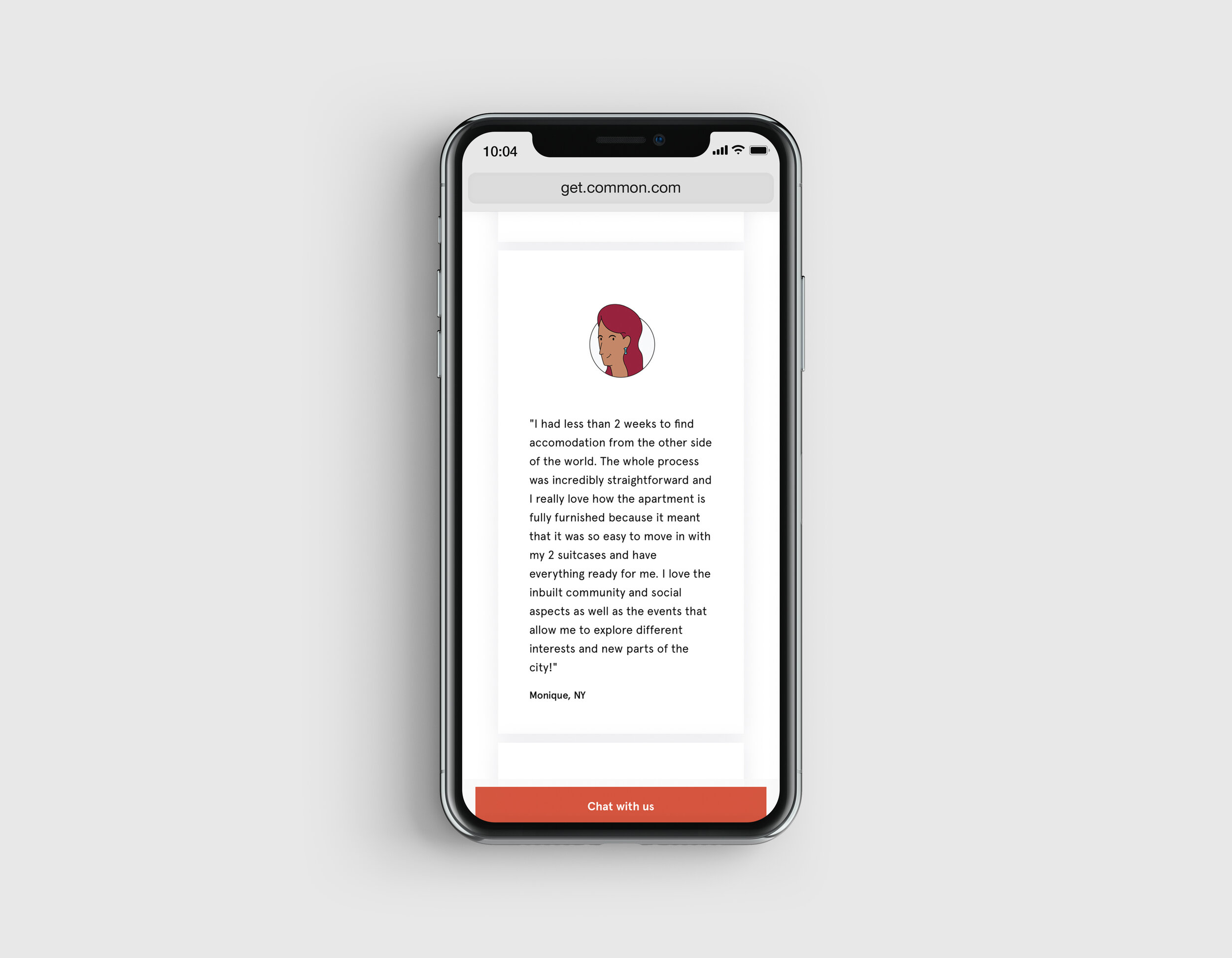
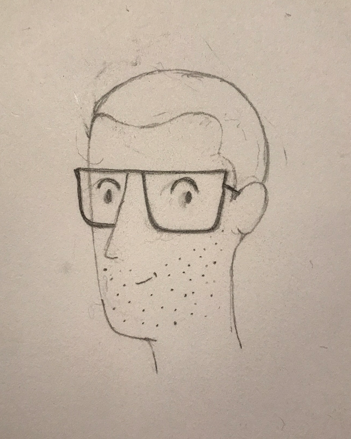
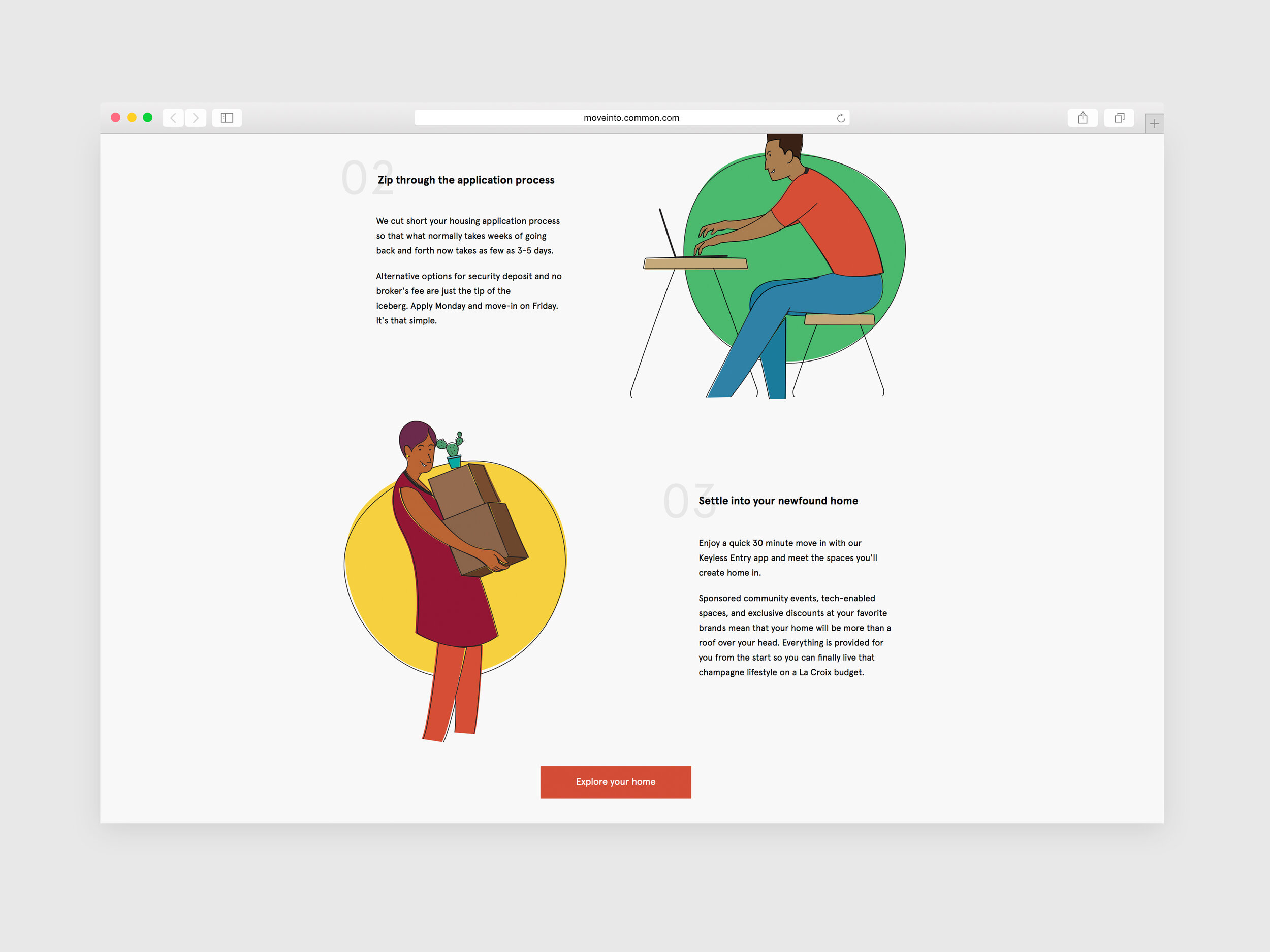
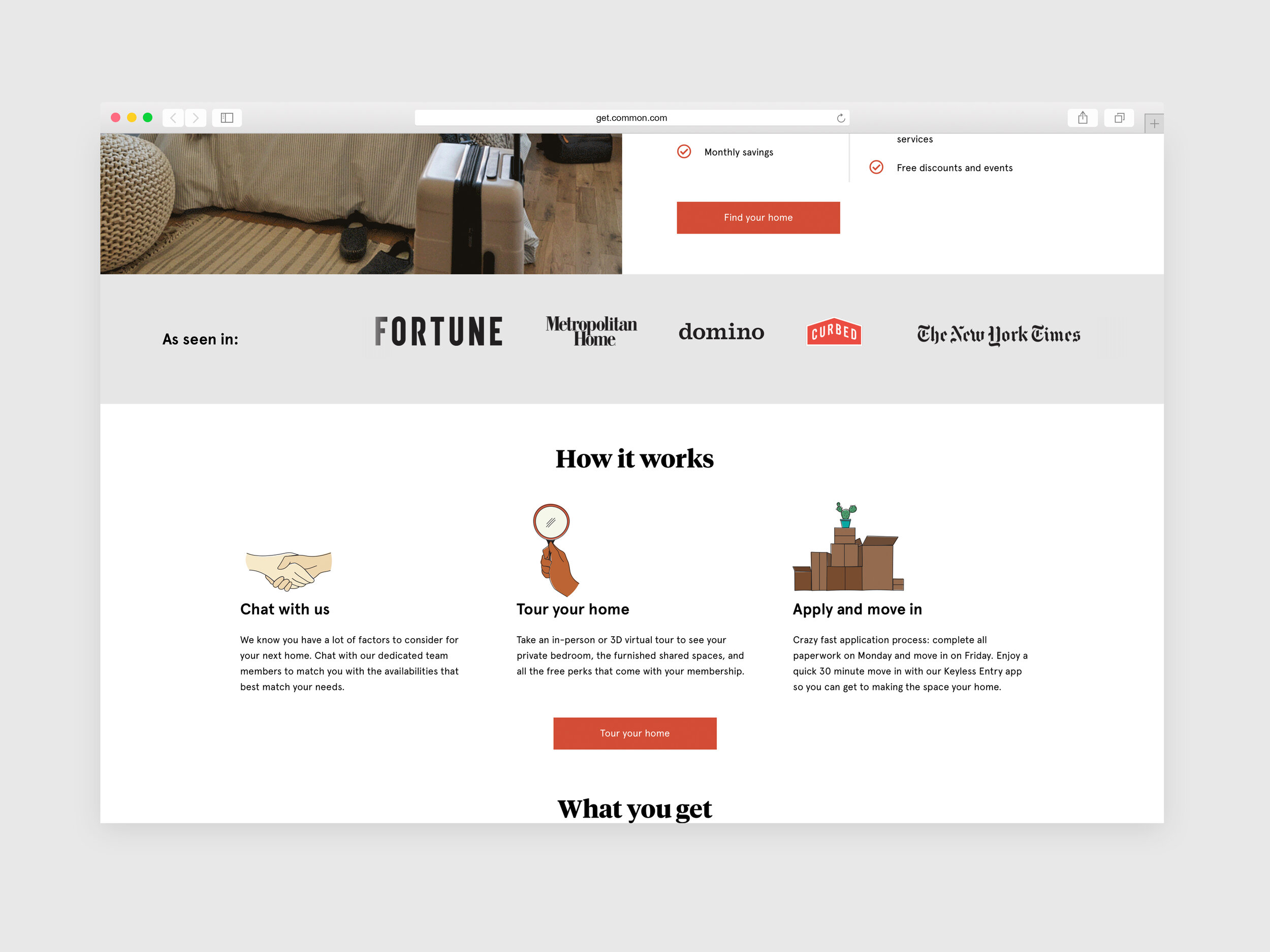
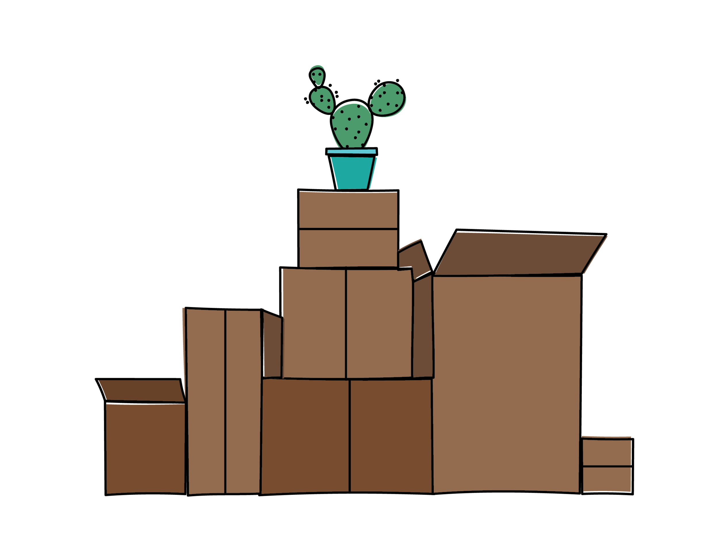
Common
Site illustrations created for co-living startup, Common.


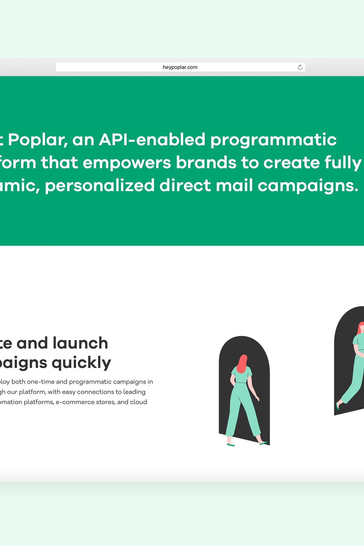
Poplar
Marketing site + collateral for Poplar, a programmatic direct mail platform.
Studio Mast for branding
Extended Play for site development
Monica Garwood for illustration
Nathan Stanton & Chris Korhonen for site + product leadership
Notes included
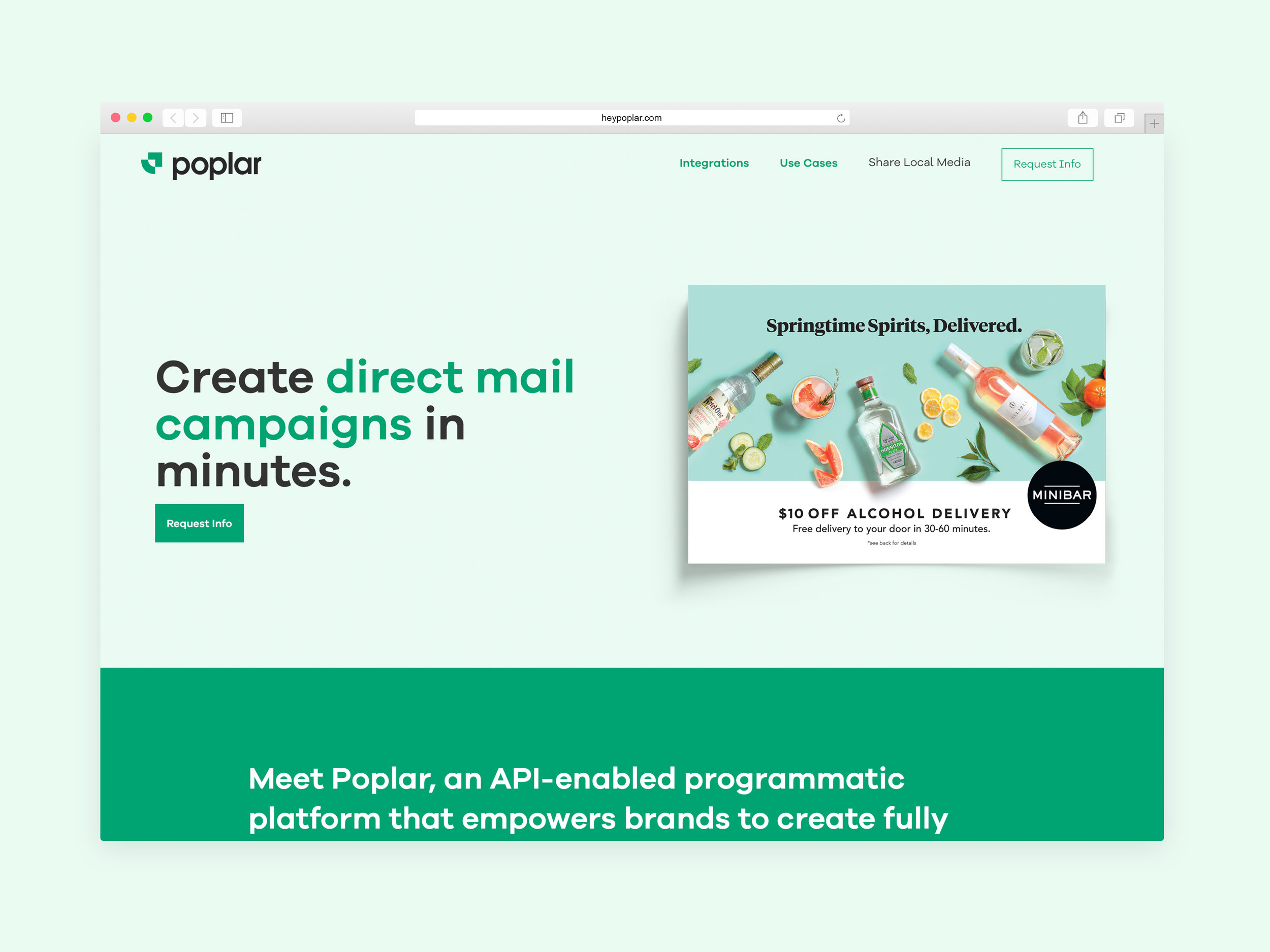
Poplar — a SaaS product of Share Local Media — was built with the intent to help D2C brands create personalized, best in class, direct mail campaigns. Working closely with internal product and engineering leads, site was designed to be informative, yet simple enough for folks who may be green to the DM space.

Our team worked closely with both Extended Play and Studio Mast on content strategy, branding, and final site development. On my end, I lead the overall design of the marketing site.


SF based illustrator, Monica Garwood, was tapped by our team + Studio Mast to produce all illustrative elements throughout the marketing site. Illustrations were developed to explain all aspects of the product in a fun, simple, and digestible way.


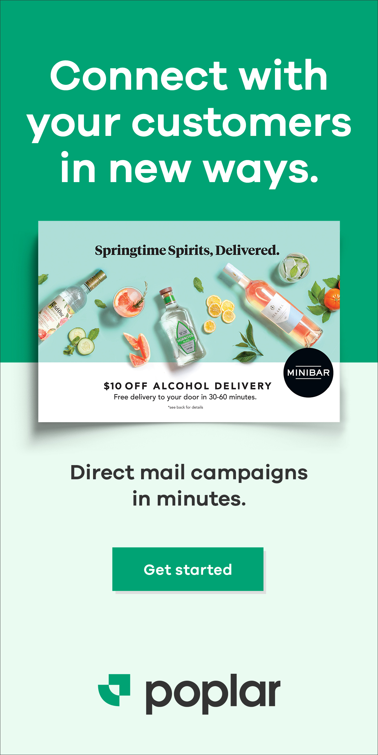
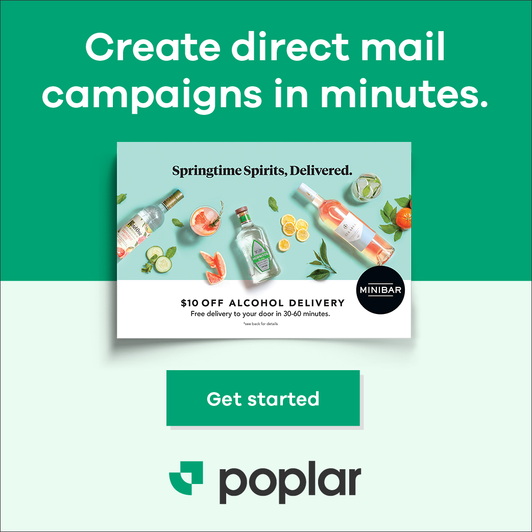
Retargeting ads were pushed to accompany the launch of Poplar’s marketing site.


Icons were developed to help express key differentiators/competencies across the platform.

Geotarget
Select

Lookalike (audience)

Production
And marketing collateral such as business cards.

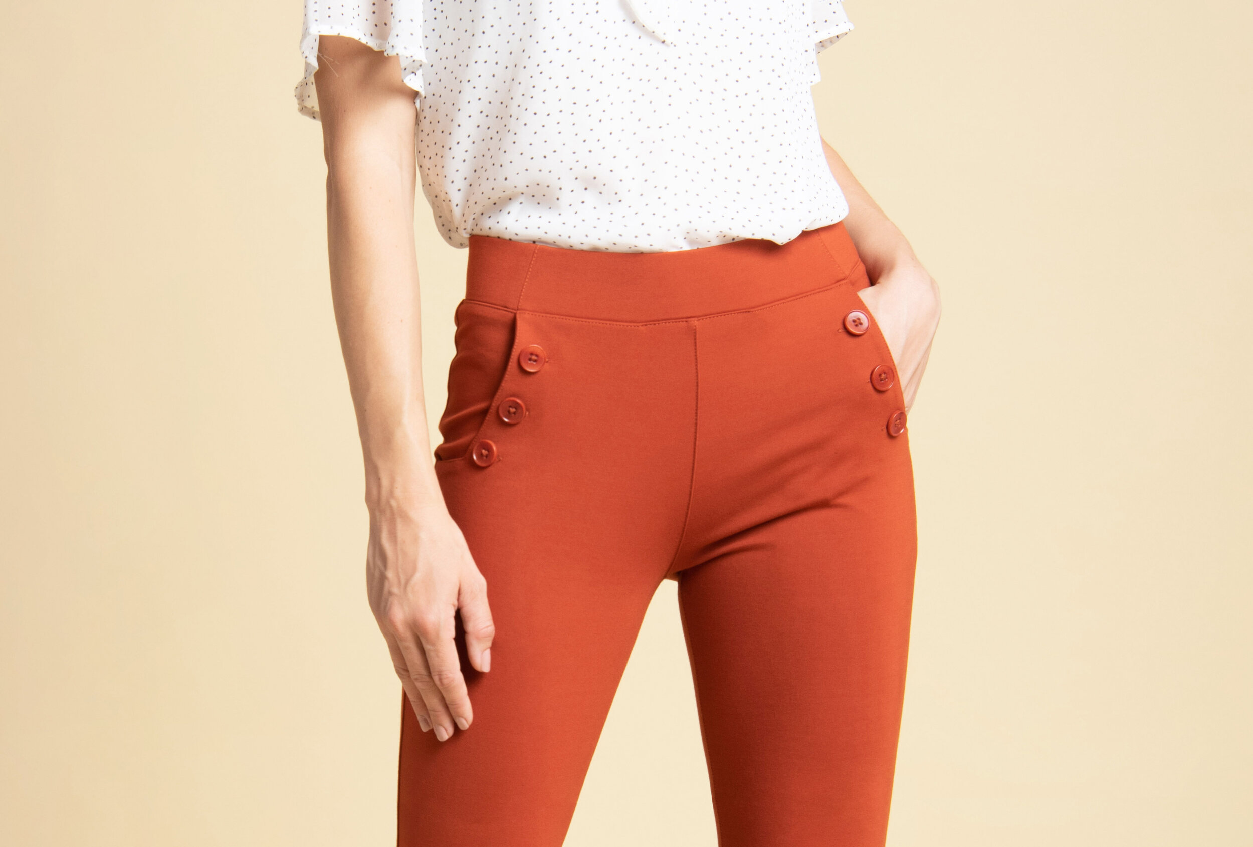
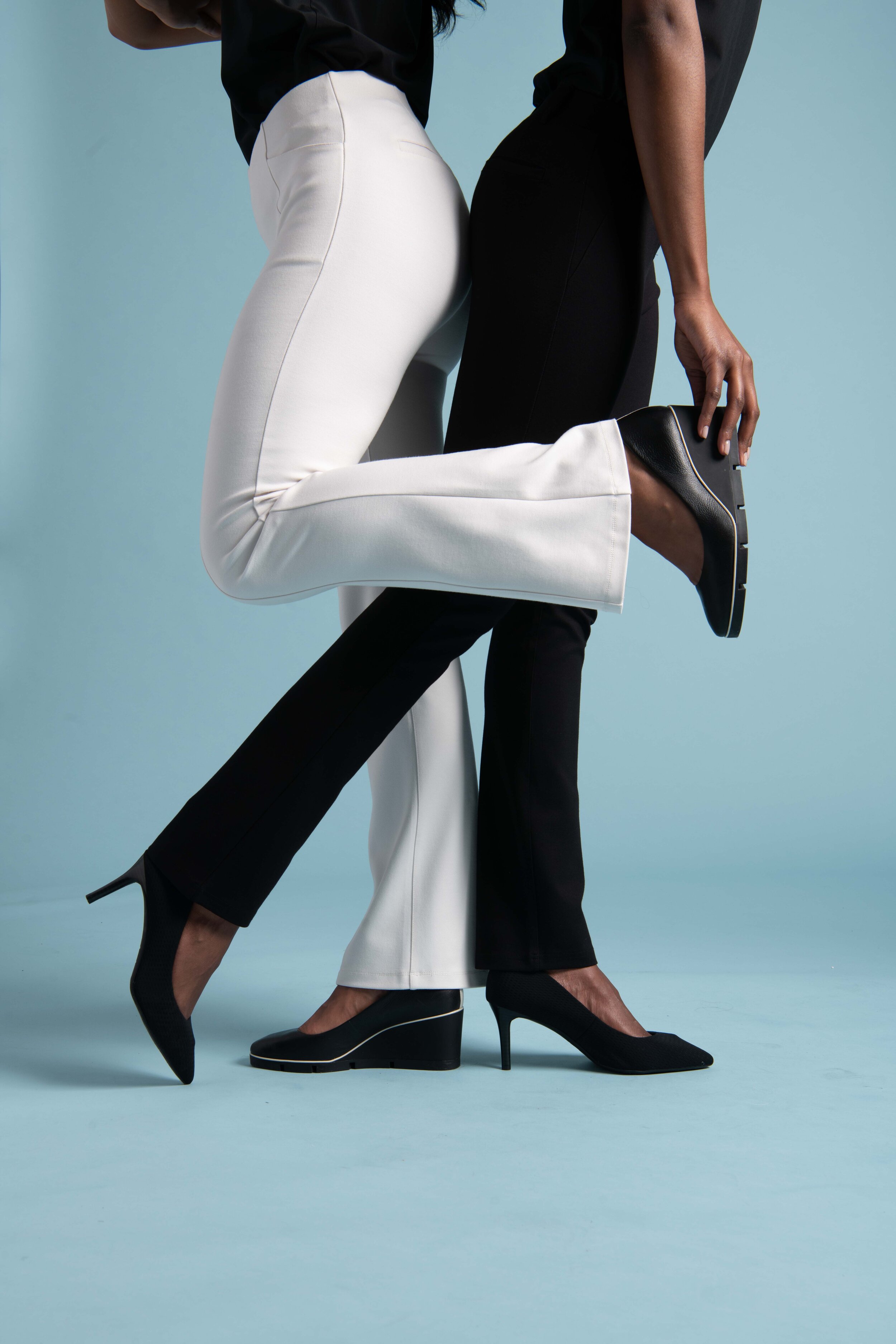
Betabrand
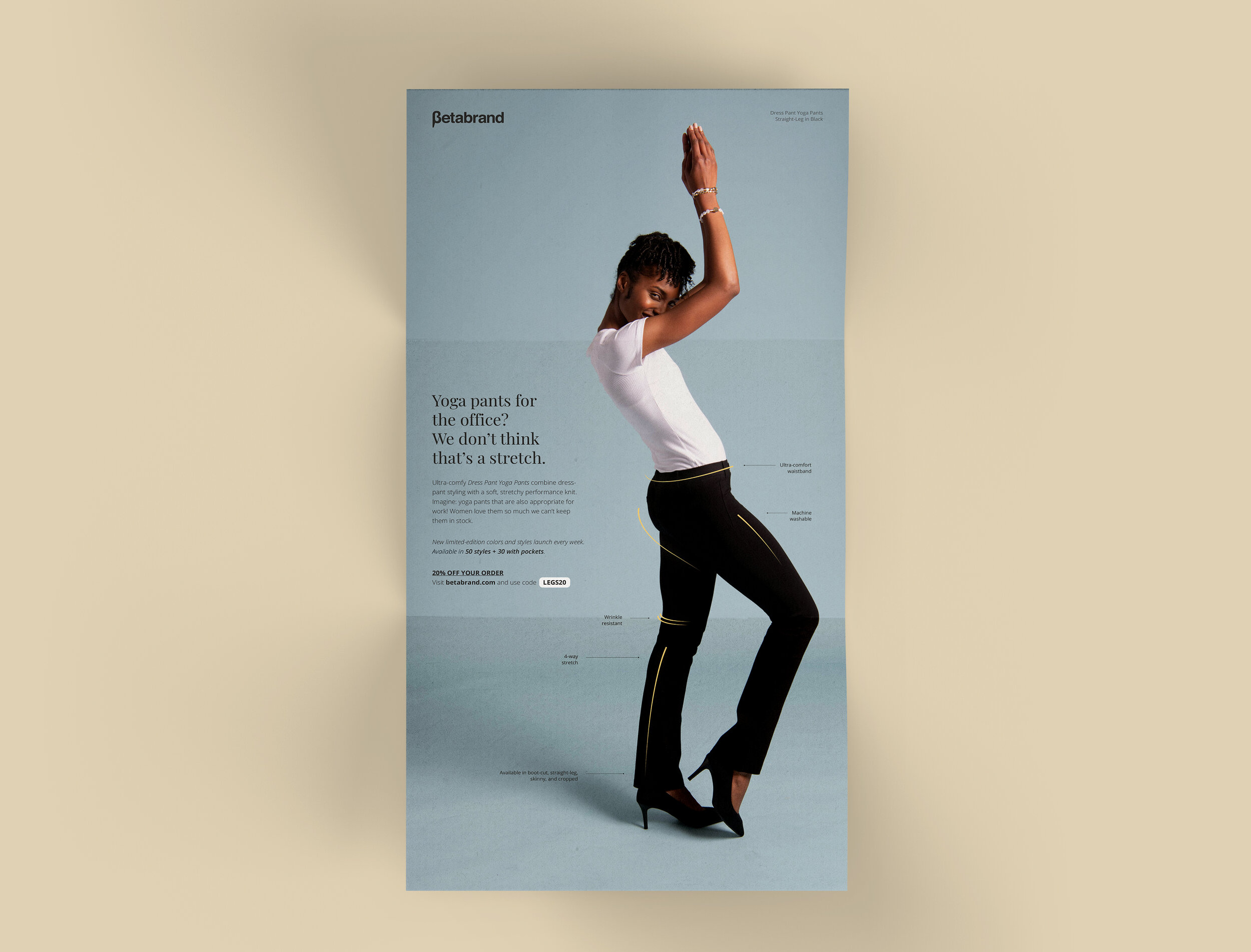
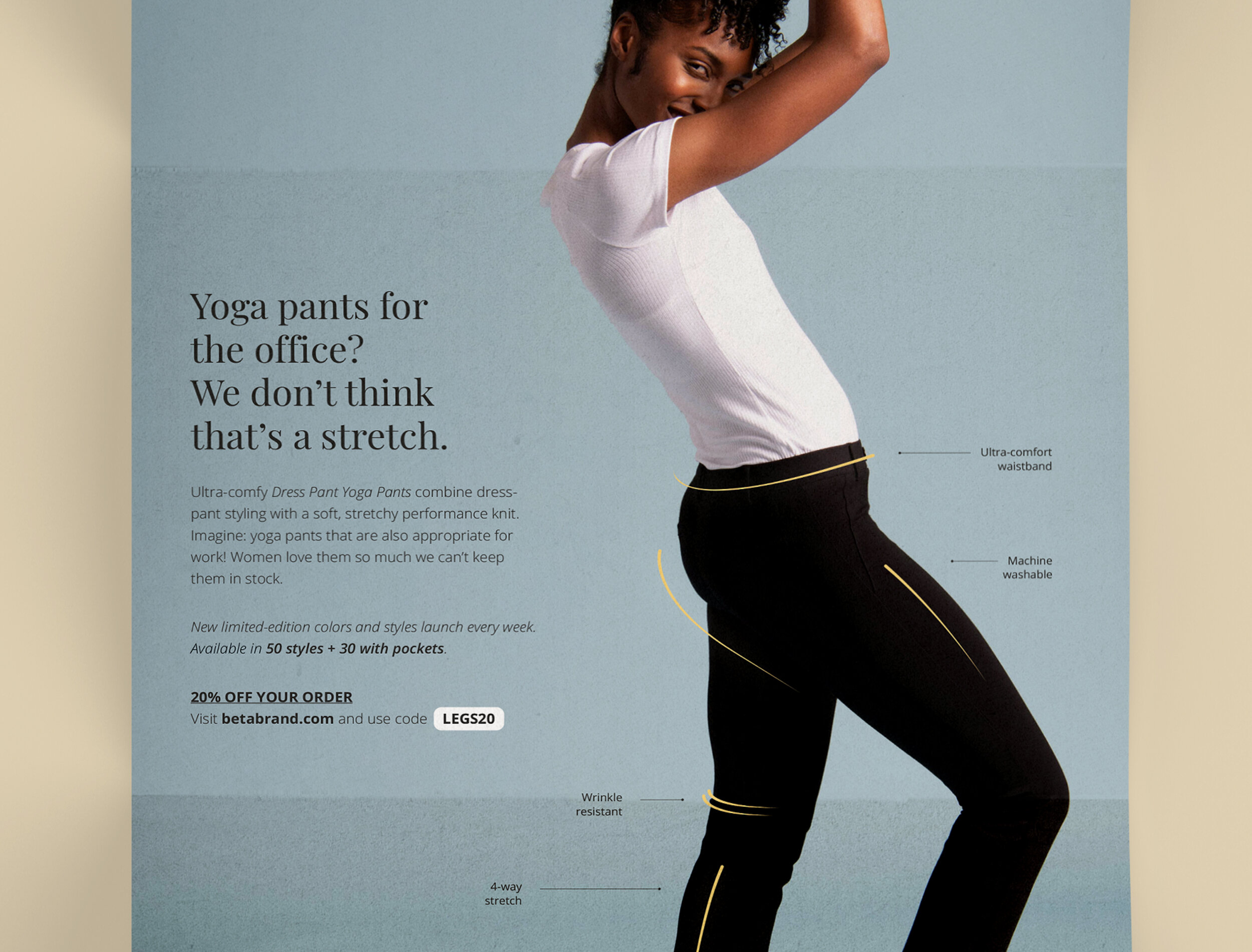
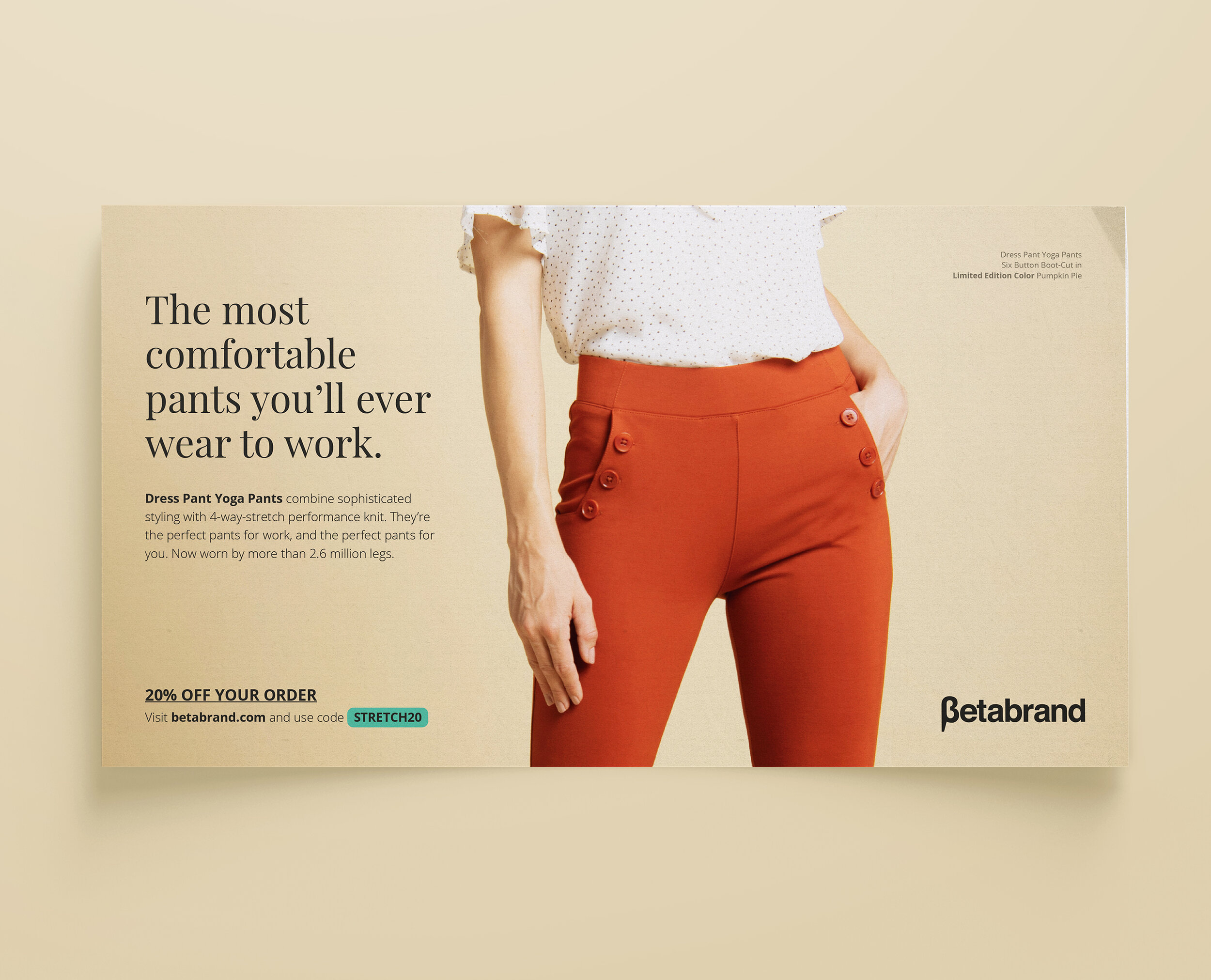
DM campaign/testing for Betabrand — SF-based clothing brand best known for the “Dress Pant Yoga Pant.”
Notes included

Best know for their Dress Pant Yoga Pant, Betabrand tapped SLM’s creative team to develop creative that would focus on said product. They were looking for in depth guidance on creative testing strategy + best practices for direct response.

Aim for the creative was to outline core features of the Dress Pant Yoga Pants. With over 50 styles and a ton of accompanying features, we set forth to push the product in an attractive yet utility-focused light.
To fully measure performance for the campaign, the team decided to move forward with a variable test of format + creative — postcard vs. tri-fold.
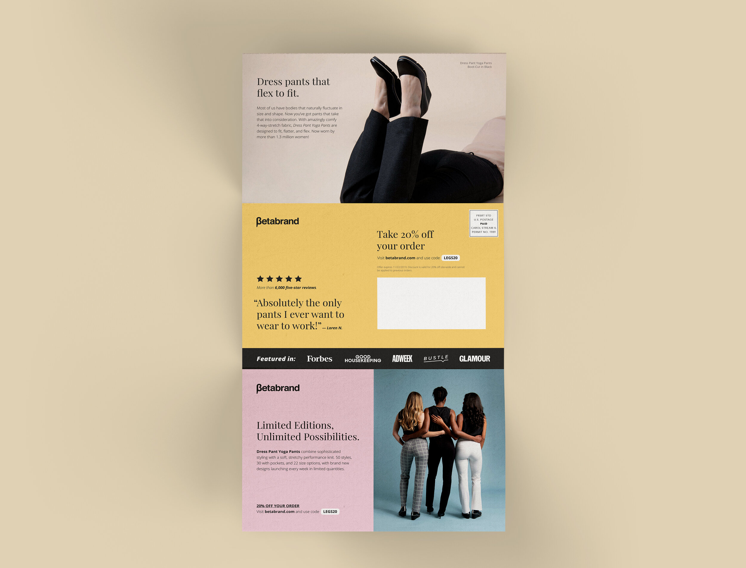
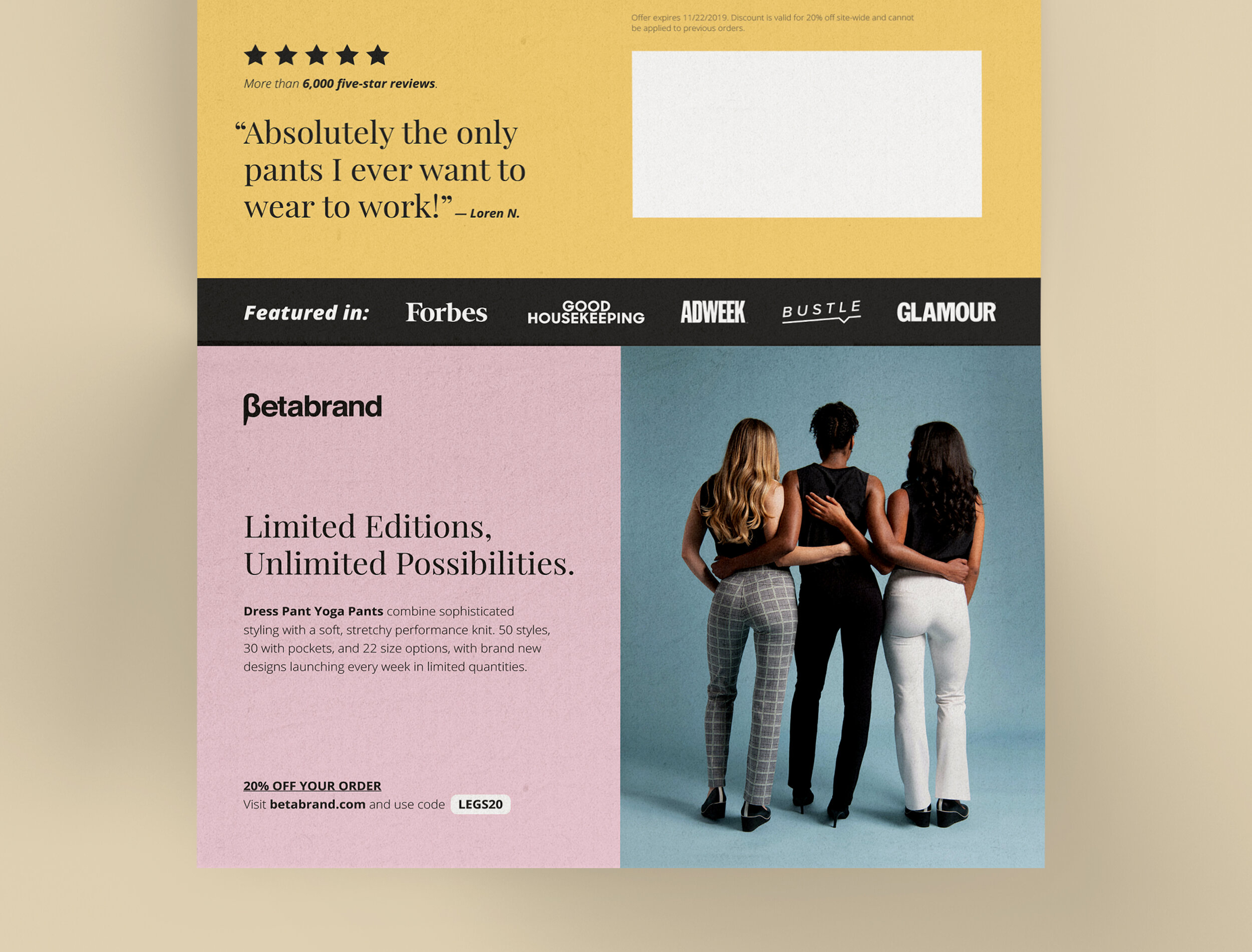
The tri-fold creative tested an alternate image and messaging. Additionally, a larger form factor (in comparison to the 6” x 11” postcard) gave room to expand more on core features of the product.

Both creatives saw a large spike in overall redemptions among recipients in comparison to other prospecting campaigns they had previously sent out.
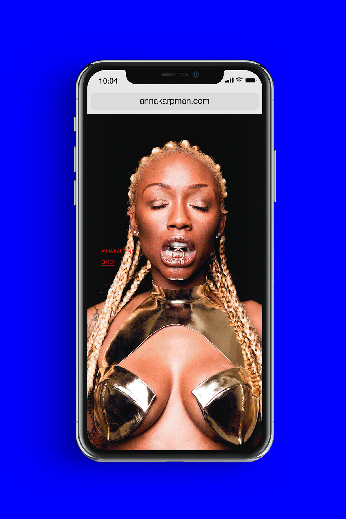
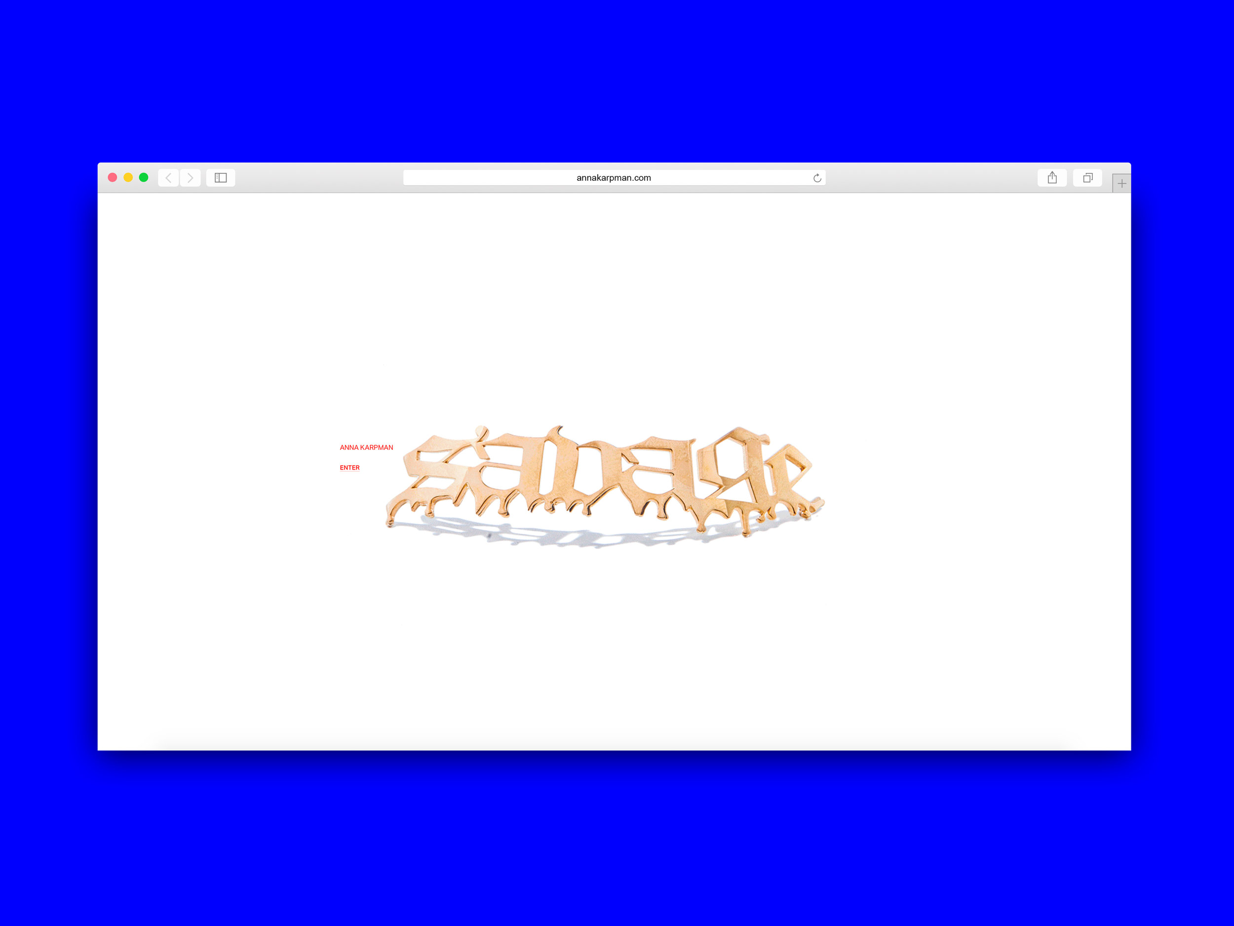
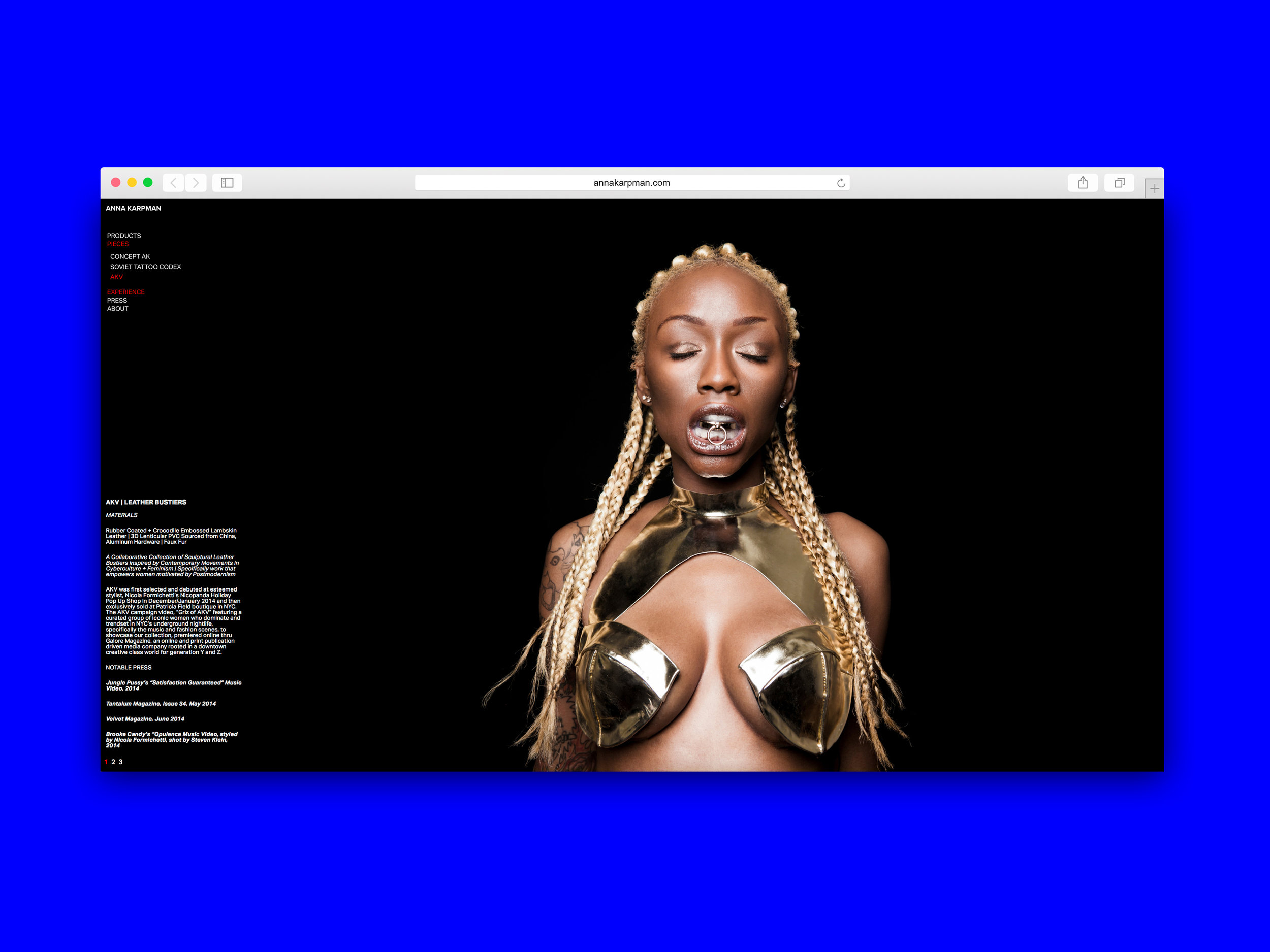
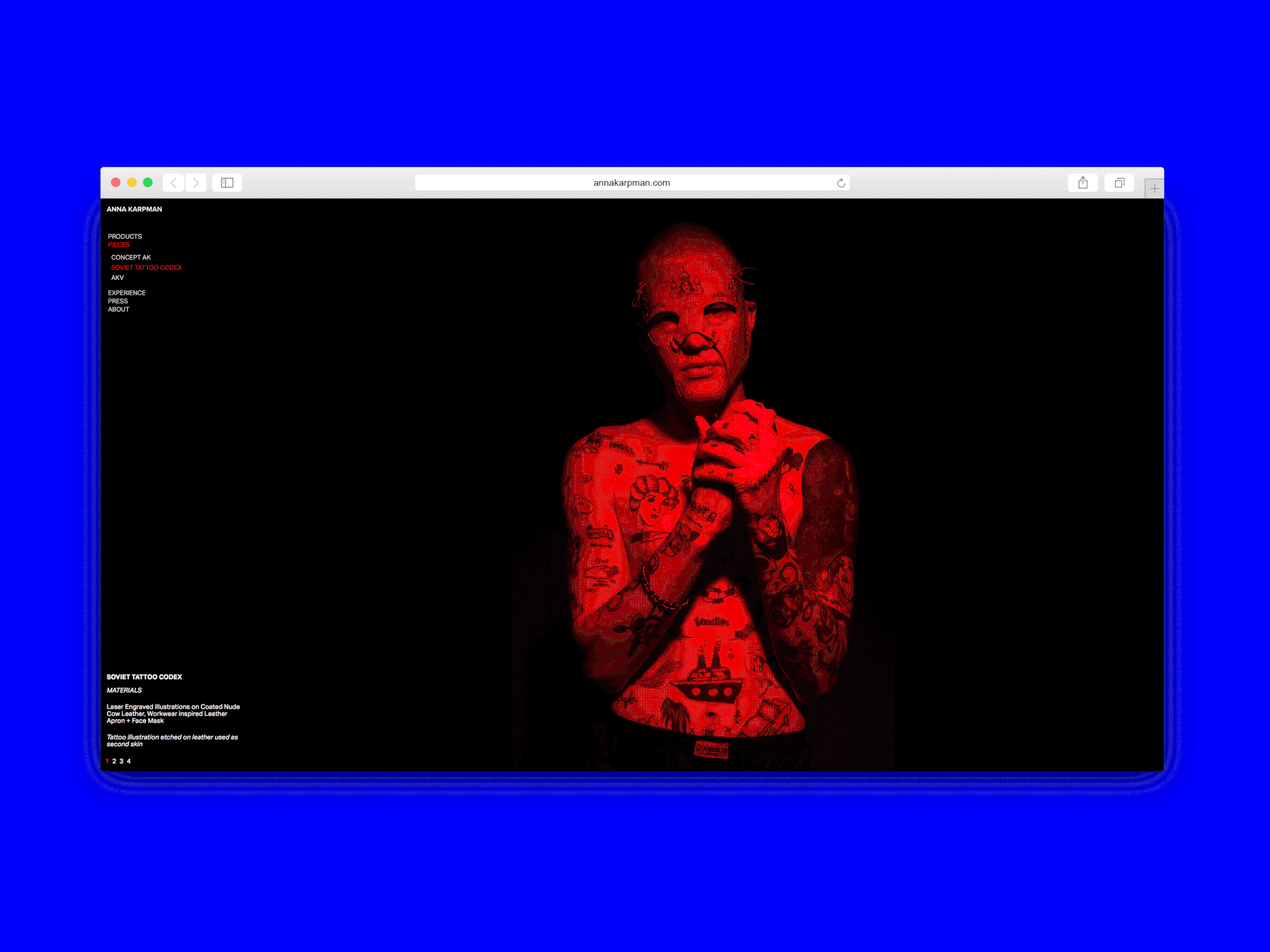
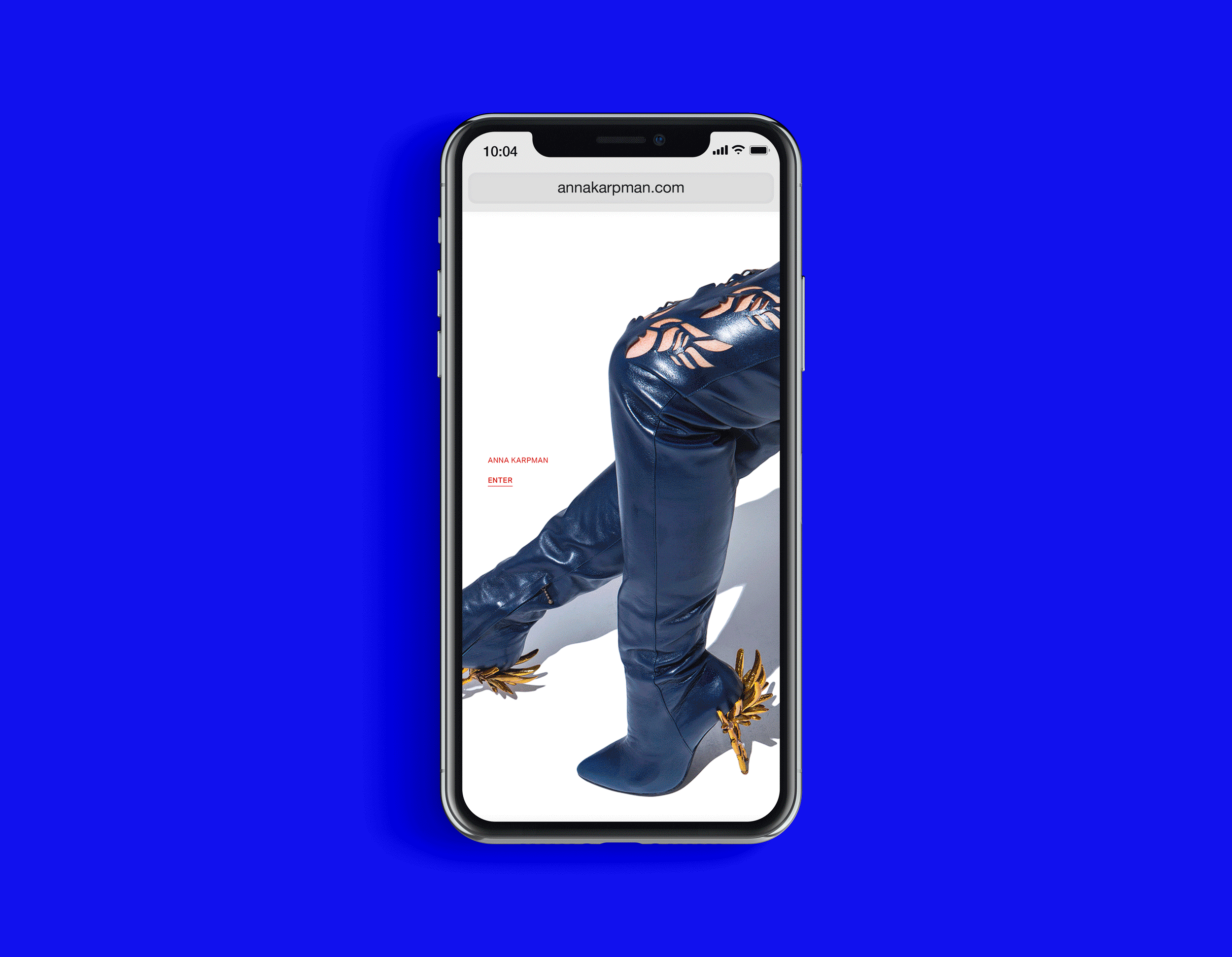
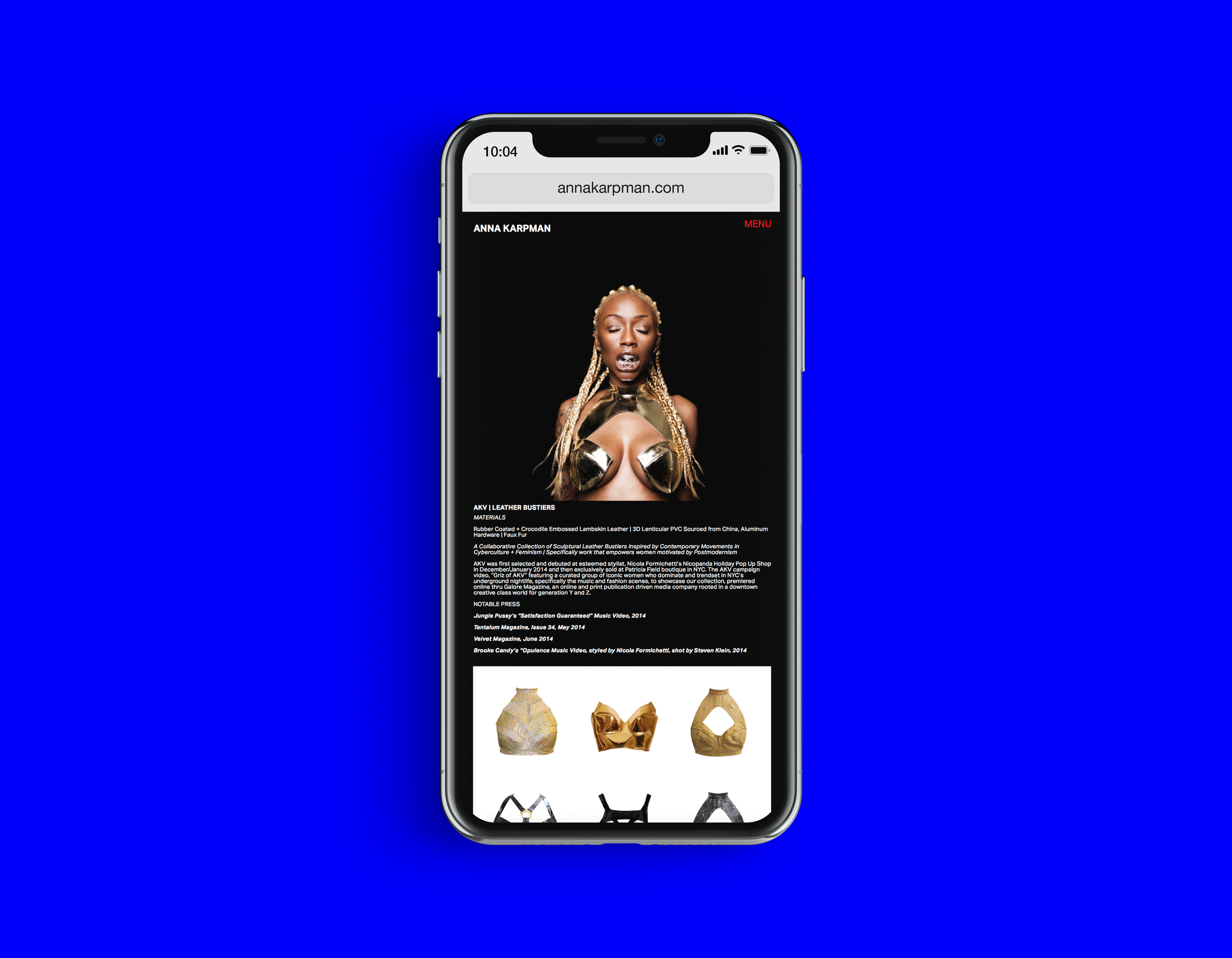
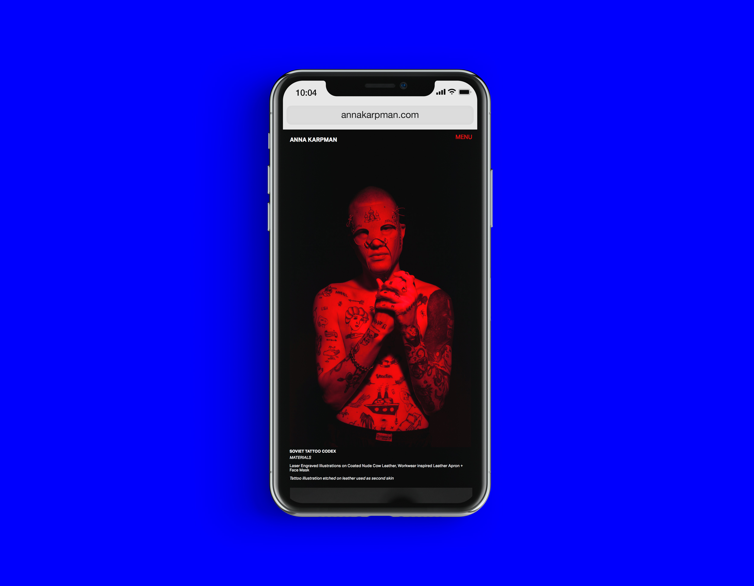
Anna Karpman ANNAKARPMAN.COM
Website design/build + animation for 3D designer, Anna Karpman.


Iconography Library
Vectored icons created for both SLM & Poplar business lines.
Designed in collaboration with Mike Vassari

Printing

Beginning to end

Guarantee

Geotarget
The design team at SLM worked to build out a custom iconography library to help define a number of company values and competencies across marketing, product and creative.

Icons were formatted to work effectively against various backgrounds.

Price


Speed

Ellipses were used to help define size and other elements within each symbol — with a goal to maintain a unified feel across the board.

Tracking/Measurability

Turnkey

Results

Honesty

Execute

Low cost

Household income

Halo effect

Lookalike (audience)

Production

Select

Education

Goals

Strategy

Experience

Highscale
Google Hardware
AD/Design for Google Hardware DM campaign.
Targeting folks on the west coast building a smart home with Google Nest products.
Lisa Stasiulewicz for Creative Direction


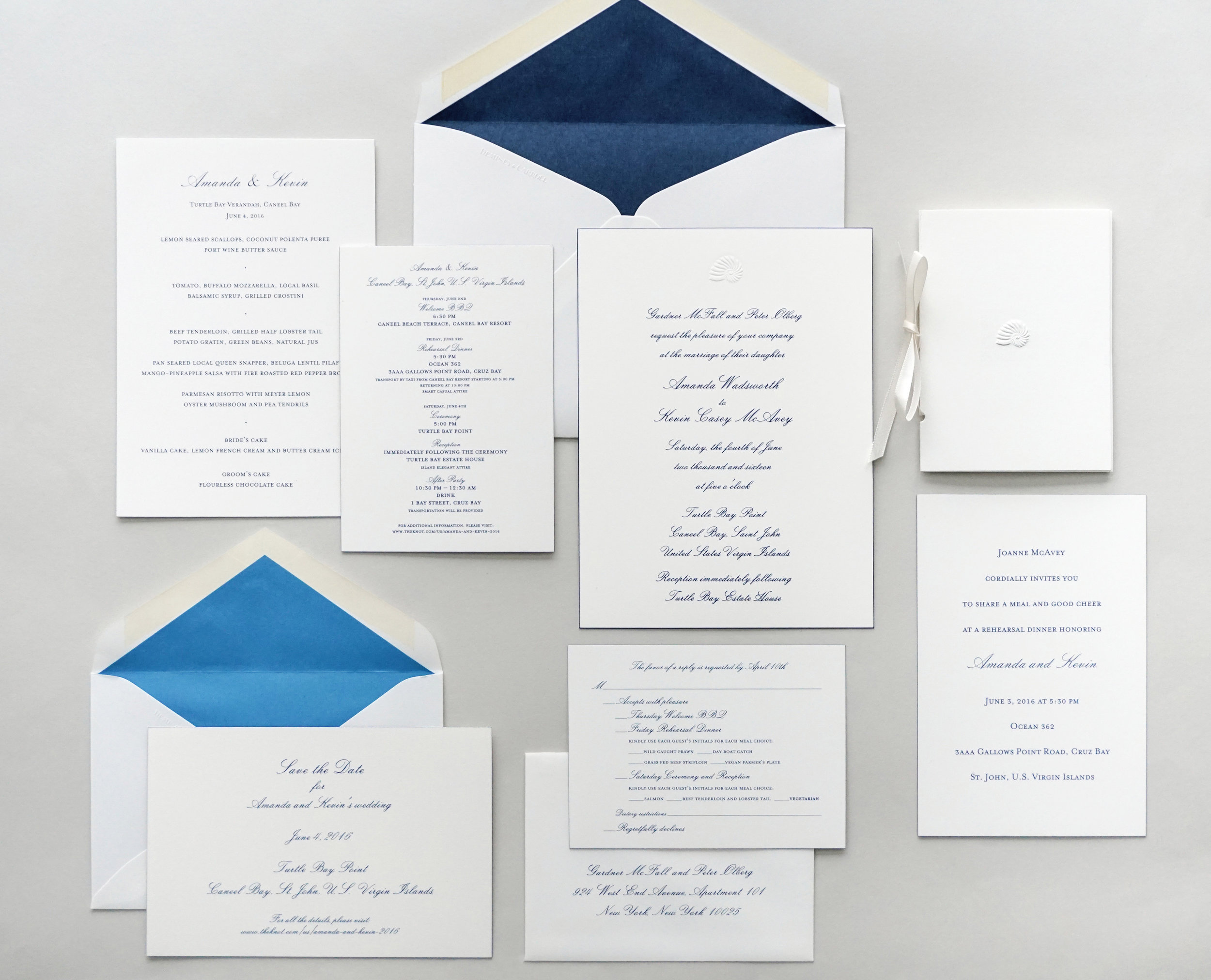
Turtle Bay Wedding Suite
Wedding Suite including Save the Date, Invitation, RSVP card, Rehearsal Dinner Card, Menu and Day-of Program.
Notes included
Austin Ackles for Copy
Austin Ackles also for Creative Direction

Dempsey & Carroll was tapped to produce a full wedding suite — drawing inspirational elements from Turtle Bay Beach (U.S. Virgin Islands). The end goal was to implement these elements into the creative in a mature and sophisticated way.

Copy was developed, in-house, on the client’s behalf by Wedding & Ceremonies Director, Austin Ackles. Printing methods included blind embossing, engraving and offset printing.
I defined typography and layout.

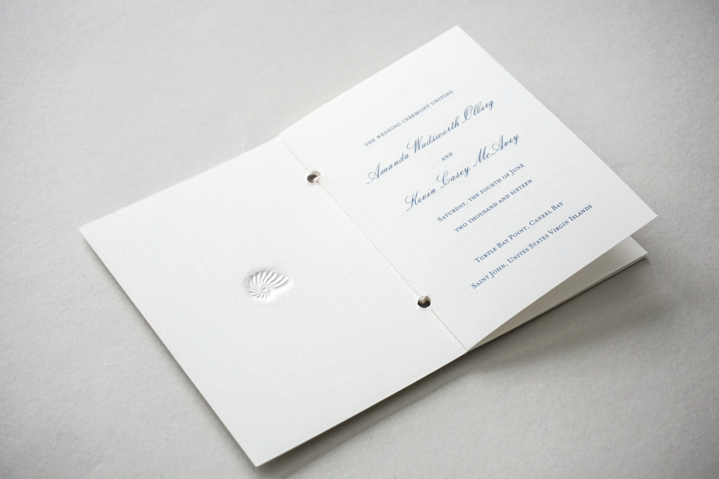
Seashell motif was used throughout the wedding suite — tying back to this destination wedding’s significance. For the Ceremony Program, design required pulling in bodies of delicate information and laying them out in a clear and concise way.

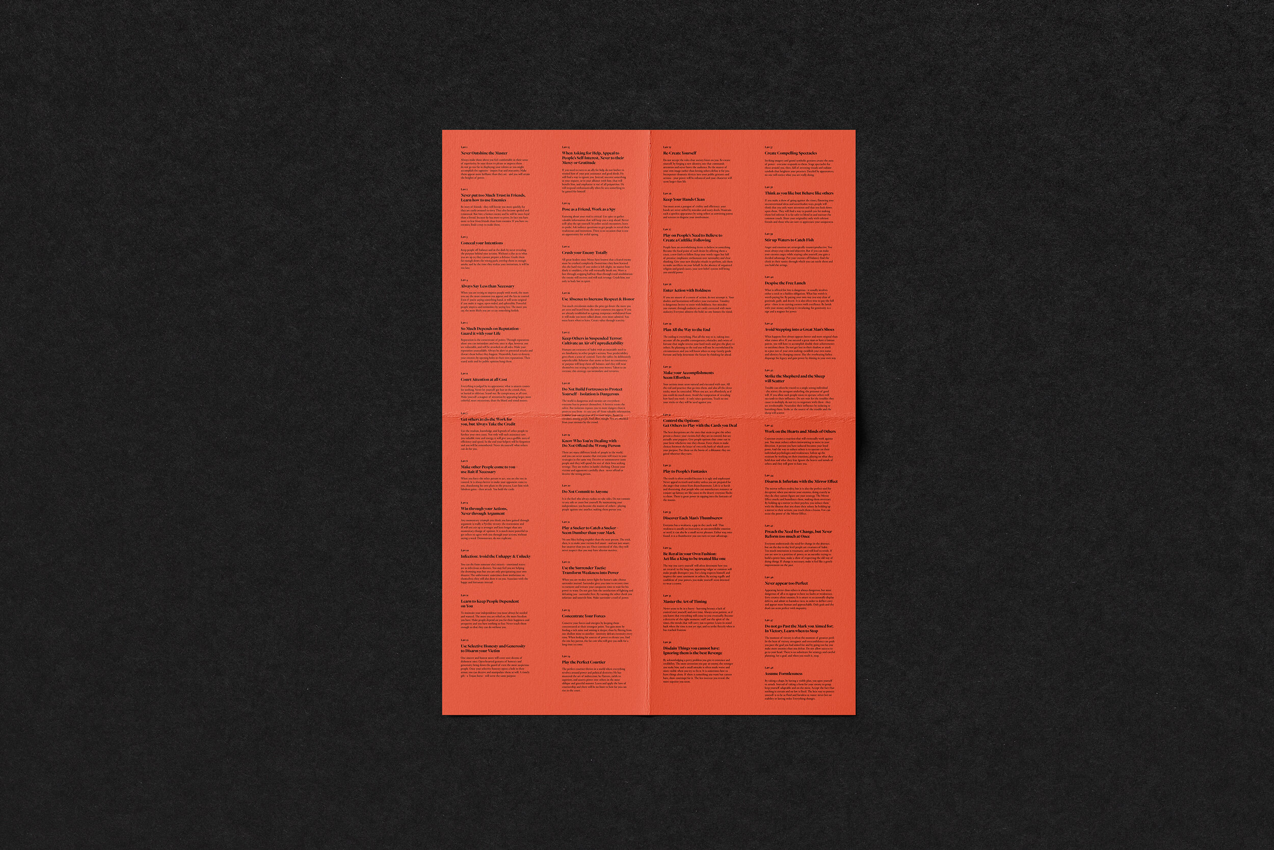
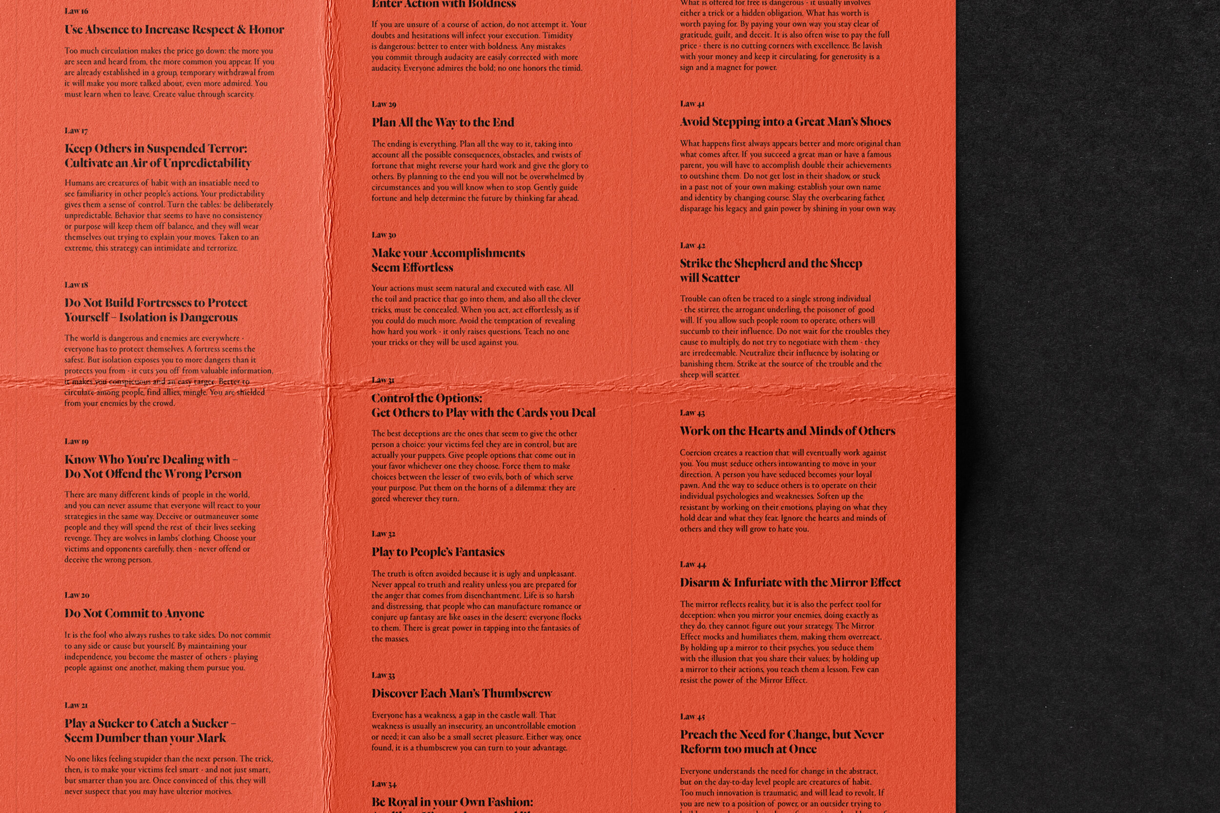
The 48 Laws of Power
Poster of Laws.
18” x 24”
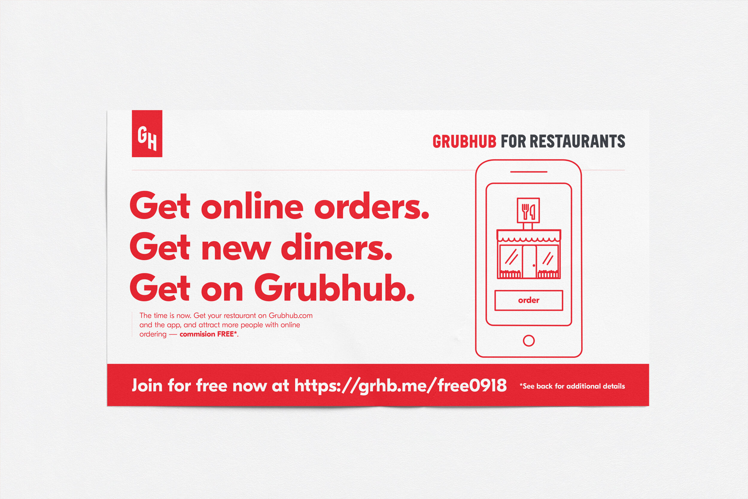
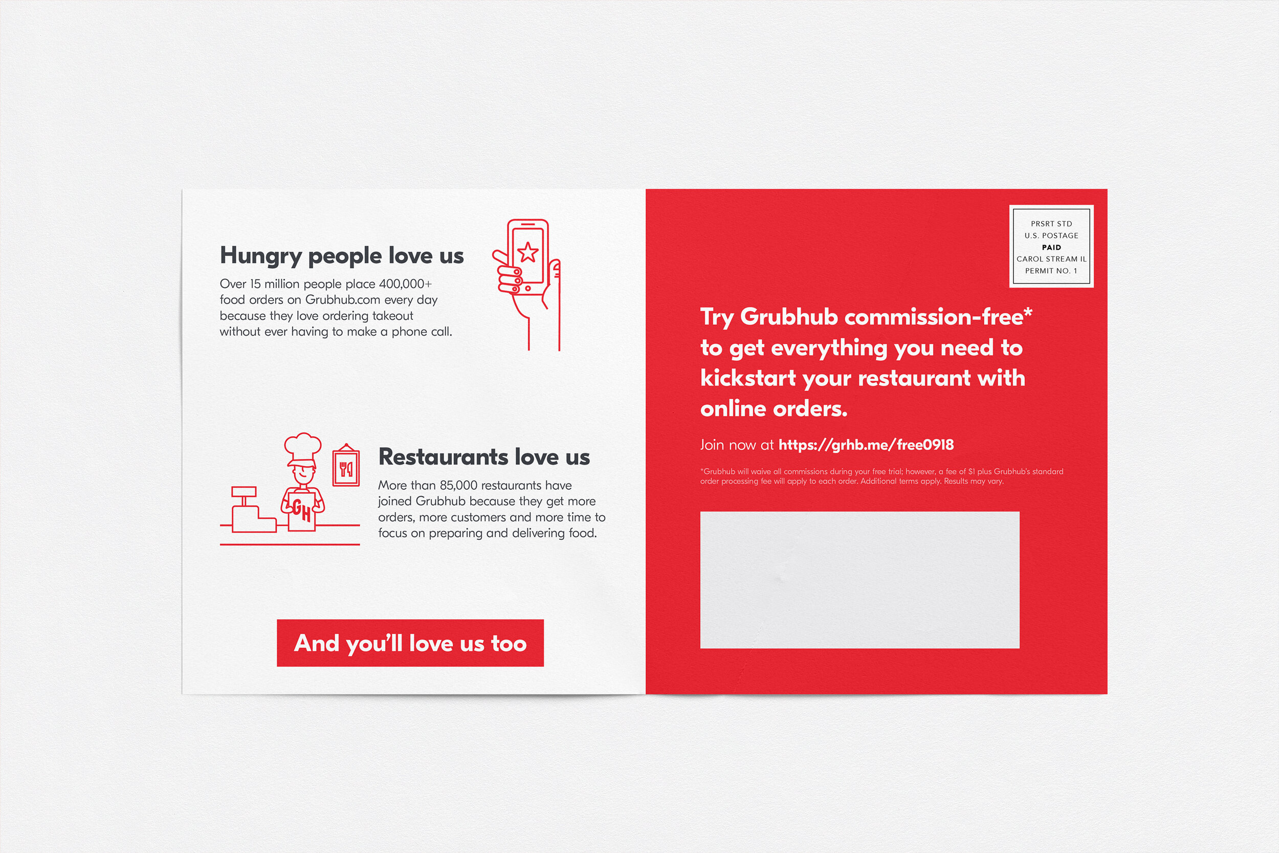
Grubhub for Restaurants
6” x 11” acquisition mailer reaching restaurants to join Grubhub.

Vines
Typography
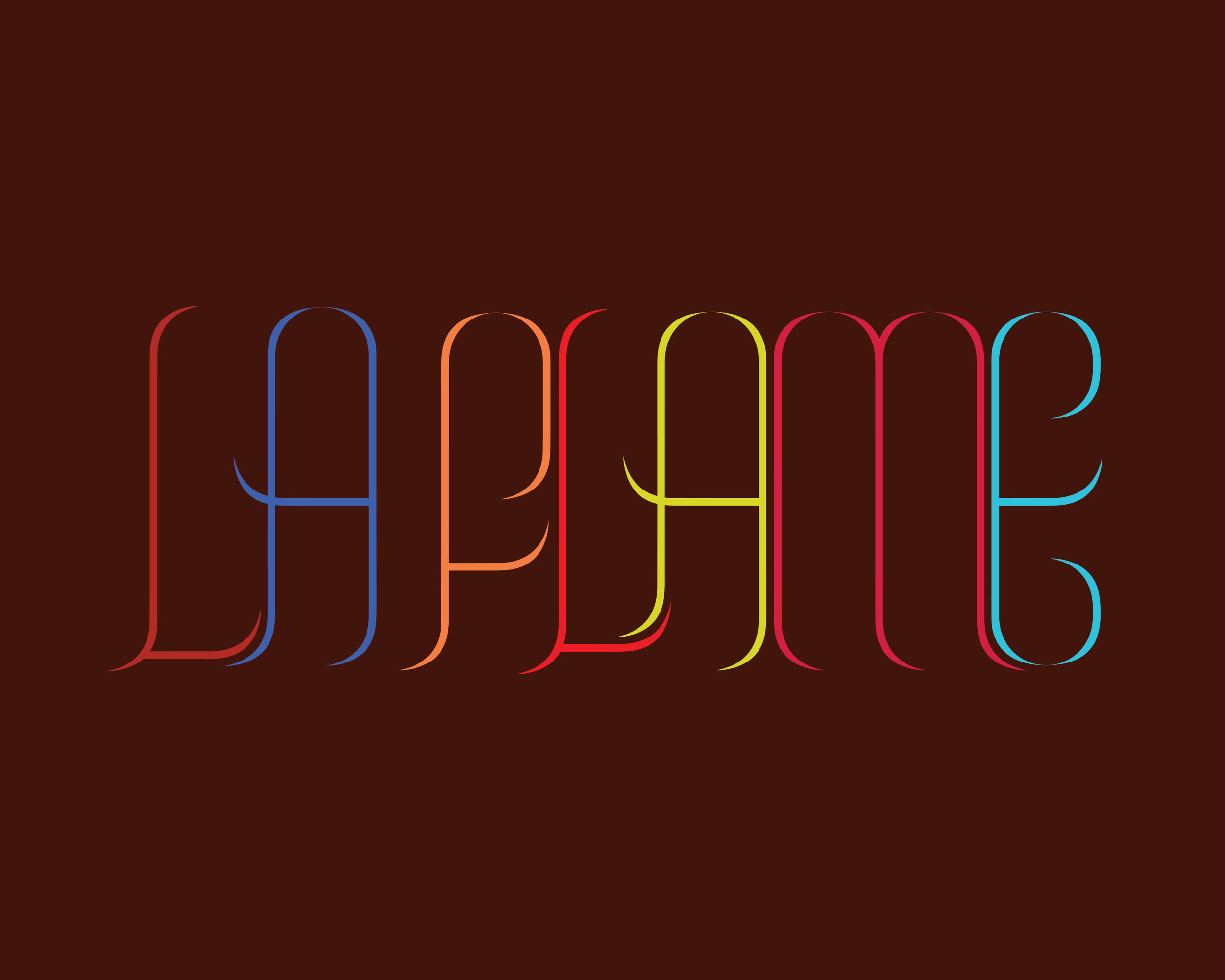
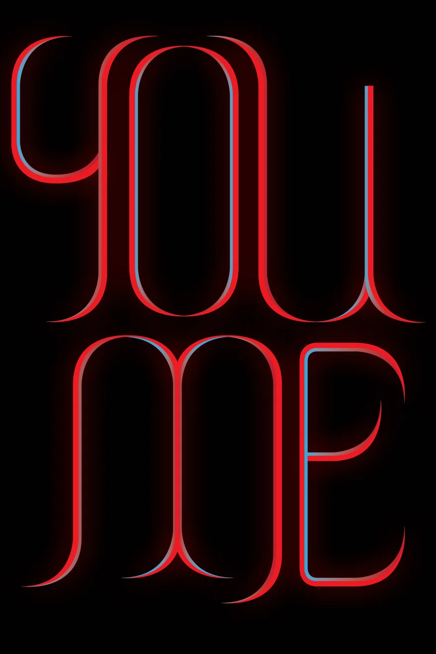
Vines is a personal typographic exploration that I’ve been slowly working on since 2016.
What I’ve found in the years that I’ve spent playing with this form is that it takes on a lot of the characteristic that vines do. Its sharp endings, height and a need to constantly trail/attach — whether vertical or horizontally — with other letter forms allow for a number of interesting explorations.
In leisurely moments, I craft variations of names, words and phrases.

Over time, I began to play around with various treatments including width, height and color.
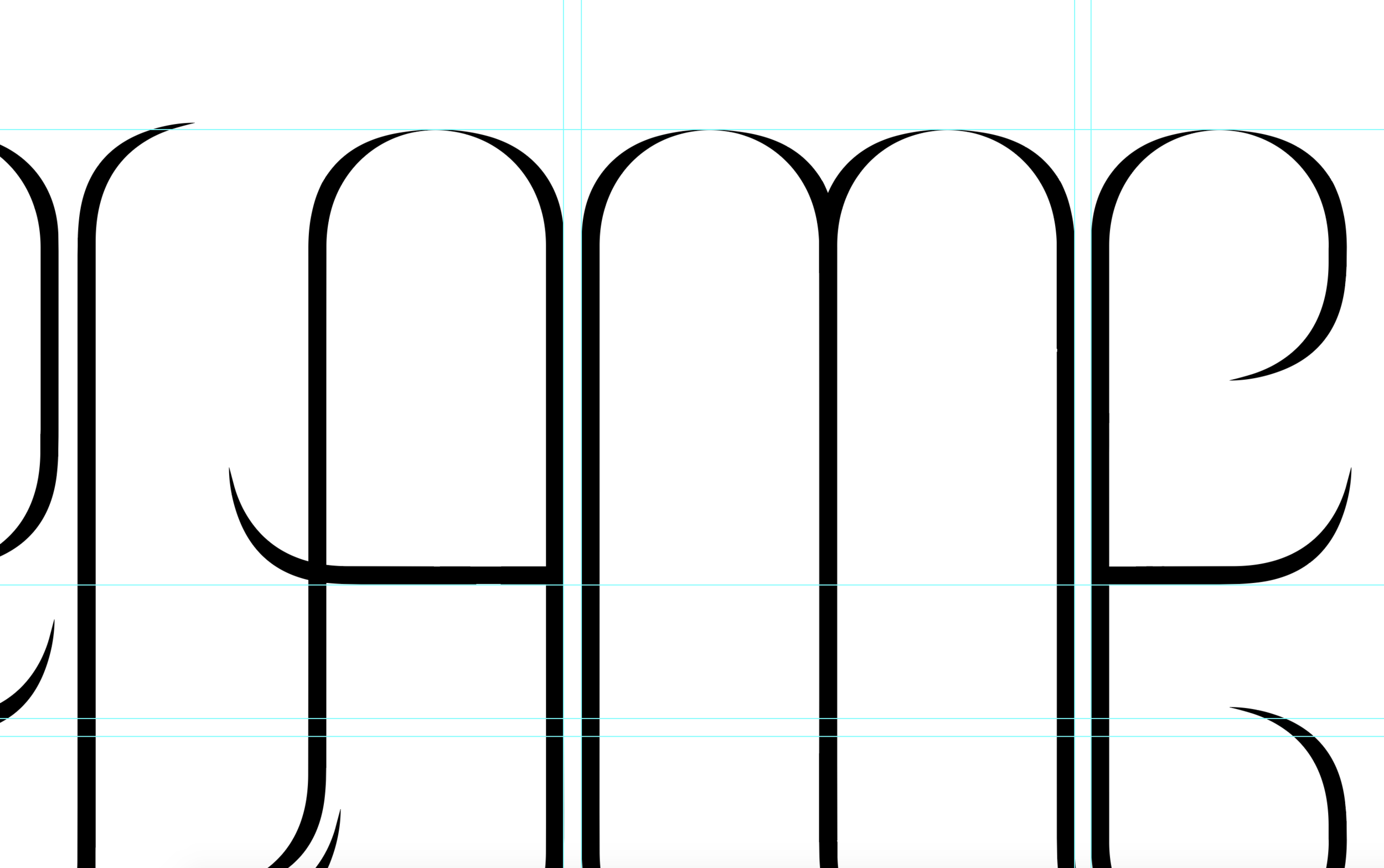
ABOVE: A few early stage explorations from late 2016.
BELOW: Letters on the left are originals and letters on the right have been remodeled.


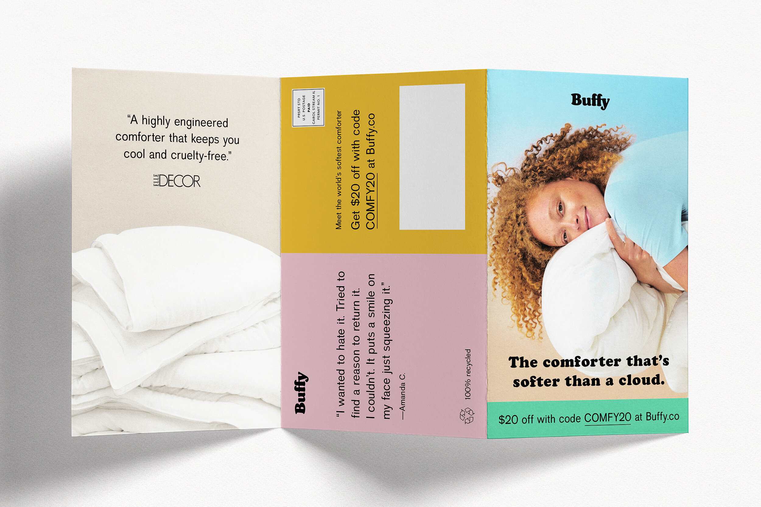
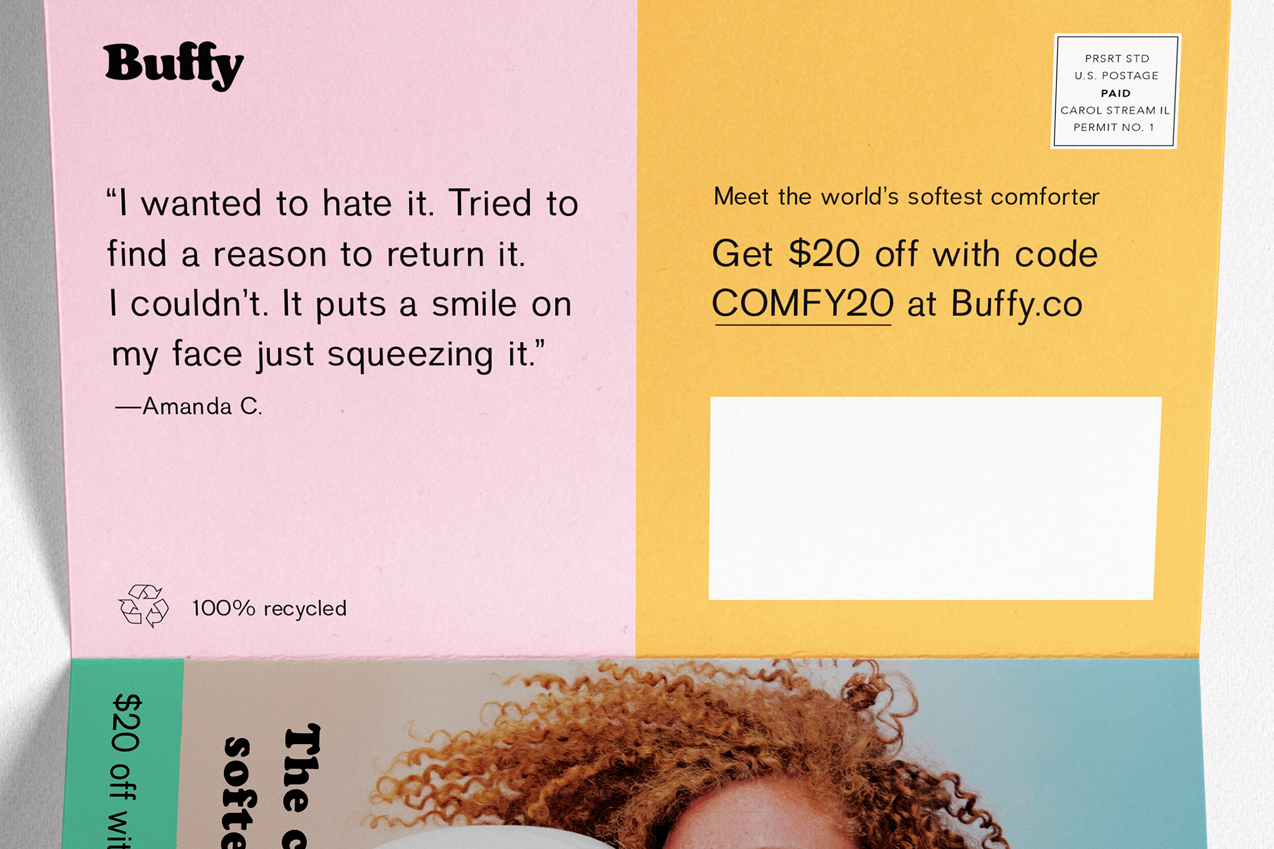
Buffy
Tri-fold DM designed for Buffy, the Cloud Comforter.