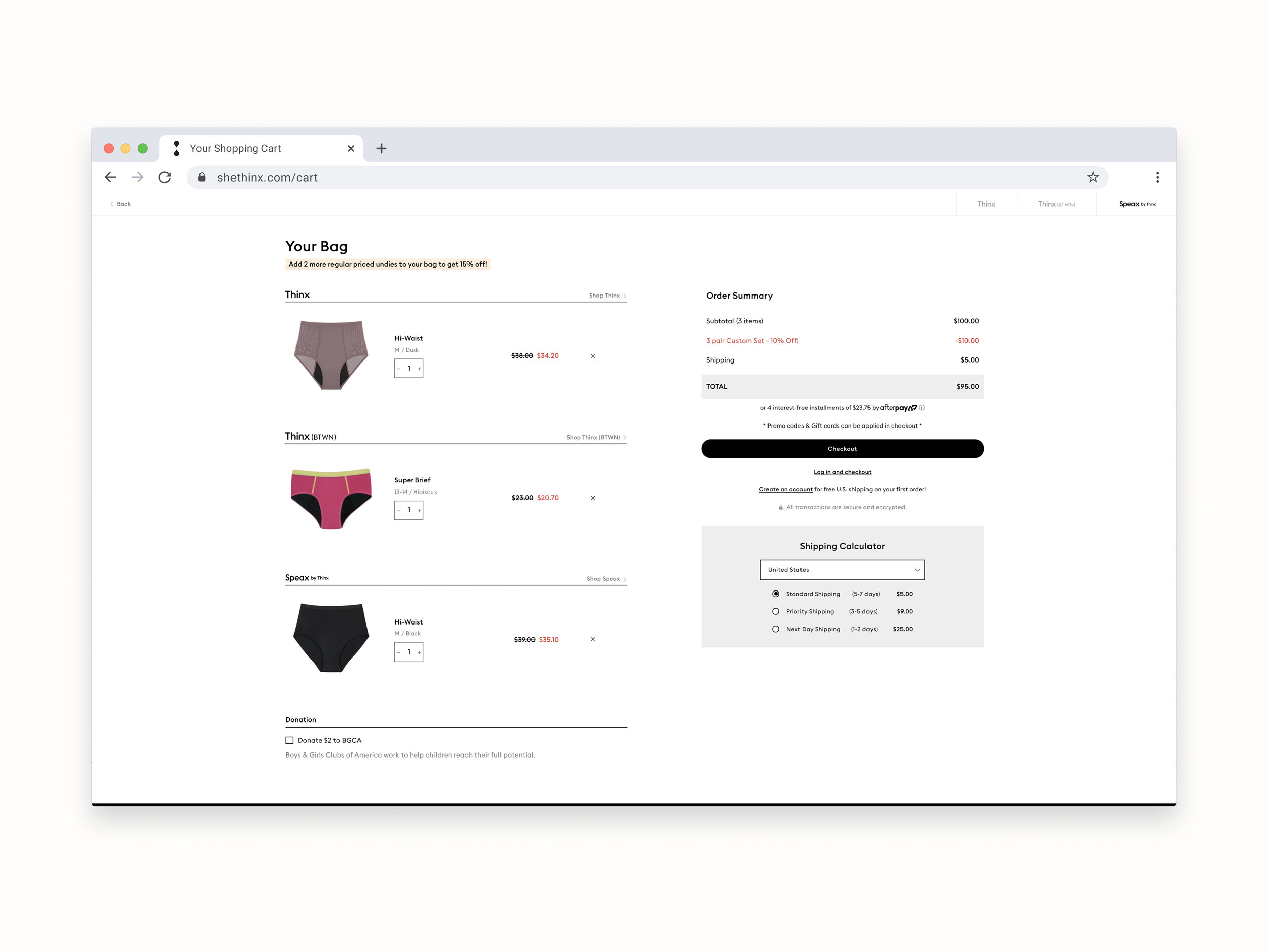
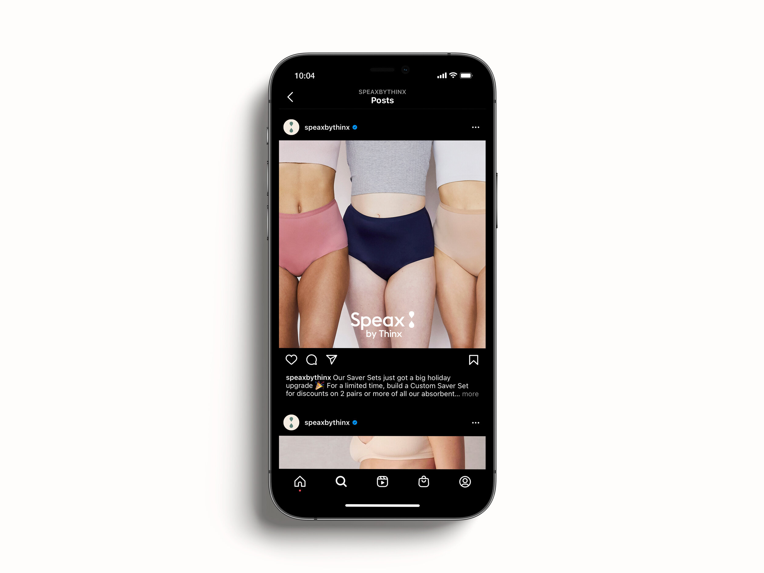
Cover.jpg

Speax by Thinx

Speax by Thinx

Identity update for Speax by Thinx.

Meng Shui for Creative Direction
Notes included.


Logo_B.jpg
 

Speax by Thinx (formerly Speax) focuses on underwear that supports bladder incontinence. Being one of the three flagship brands under Thinx Inc. BUT not having much of a visible/clear relationship to the other two brands — Thinx & Thinx(BTWN) — Thinx Inc. wanted to change that. In-house, we worked together to do an update to the Speax by Thinx identity and color palette.

 
Logo_A.jpg
Before

Before

After

After


The final output consisted of a lockup with “Speax” and “by Thinx”. A large component was also finding a balance of how, visually, this would all come together while maintaining a clear hierachy.

Primary logo: To be used for all larger brand placements.

Primary logo: To be used for all larger brand placements.

Secondary logo: To be used in conjunction with the tri-brand lockup for Thinx, Thinx(BTWN), and Speax by Thinx.

Secondary logo: To be used in conjunction with the tri-brand lockup for Thinx, Thinx(BTWN), and Speax by Thinx.

Secondary logotype: To only be used across smaller brand placements.

Secondary logotype: To only be used across smaller brand placements.


Tri-brand-insert.jpg

The liquiform — a mark that has been used across both Thinx and Thinx(BTWN) logos — was permanently shifted onto the Speax by Thinx logo .

Liquiform.gif


A fresh primary and secondary color palette was applied to the identity update.

PrimaryPalette.jpg
SecondaryPalette.jpg

Key edits made across letterforms within final logotype include slightly higher/thinner cross bars as well as an opening in the counter of letters such as “A” and “E”
Secondary_clearspace.jpg
SecondaryLogotype_clearspace.jpg

Mark
Sitepage_C.jpg
Sitepage_B.jpg
Sitepage_A.jpg